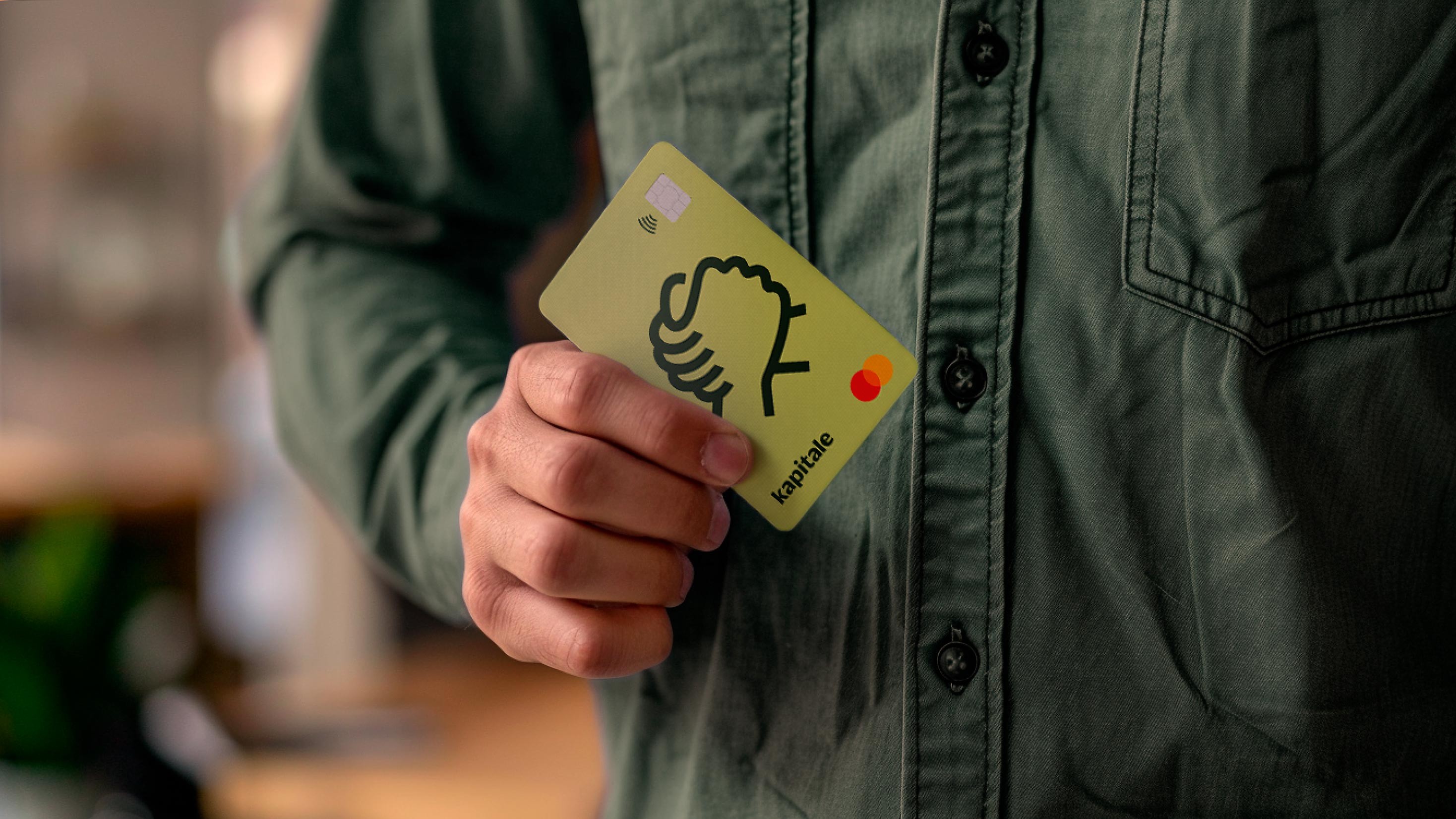
Kapitale was created to solve obstacles to credit access, providing a more humanized approach to financing. It is a Brazilian fintech specializing in advancing credit card receivables for small entrepreneurs. Clients receive their credit card sales amounts immediately, eliminating bureaucracy and long waiting periods.
Hardcuore took on the challenge of repositioning the brand to stand out in a rigid market, putting entrepreneurs at the center of the narrative. Our goal was to create a brand that reflects the reality of small businesses and helps them grow.
First, we immersed ourselves in Brazilian culture to understand the struggles of small entrepreneurs, especially regarding bureaucracy and lack of technological access. We also identified a trust crisis in traditional financial institutions and an opportunity for a more friendly approach. From this, we redefined the idea of capital, emphasizing circularity as a more human and horizontal premise. We devised a strategy to bring Kapitale closer to the community of small entrepreneurs, offering the best credit contracting experience, and focusing on simplicity, agility, and security.
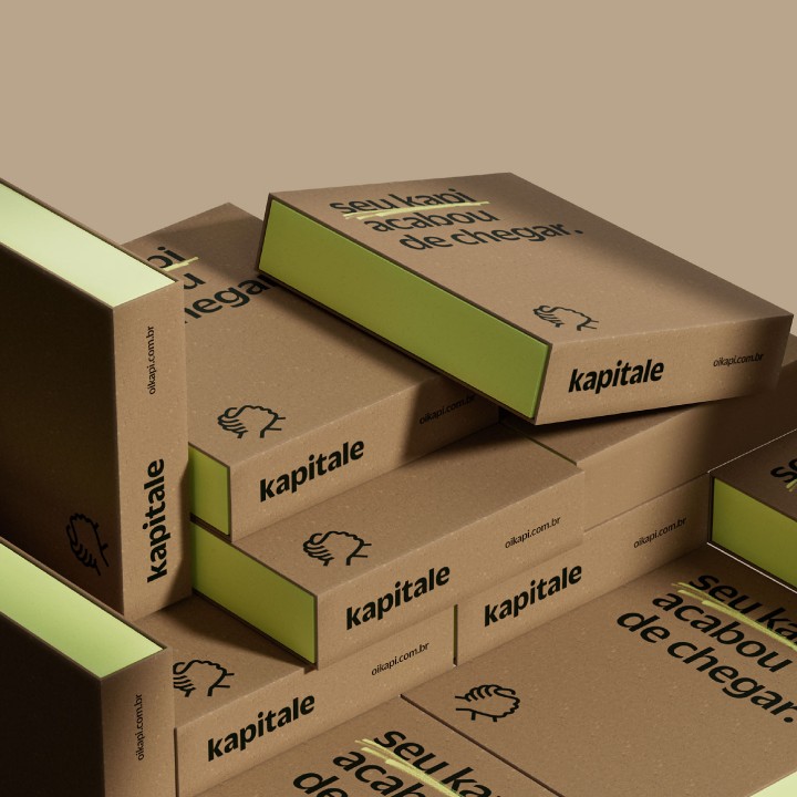
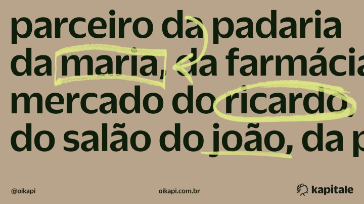
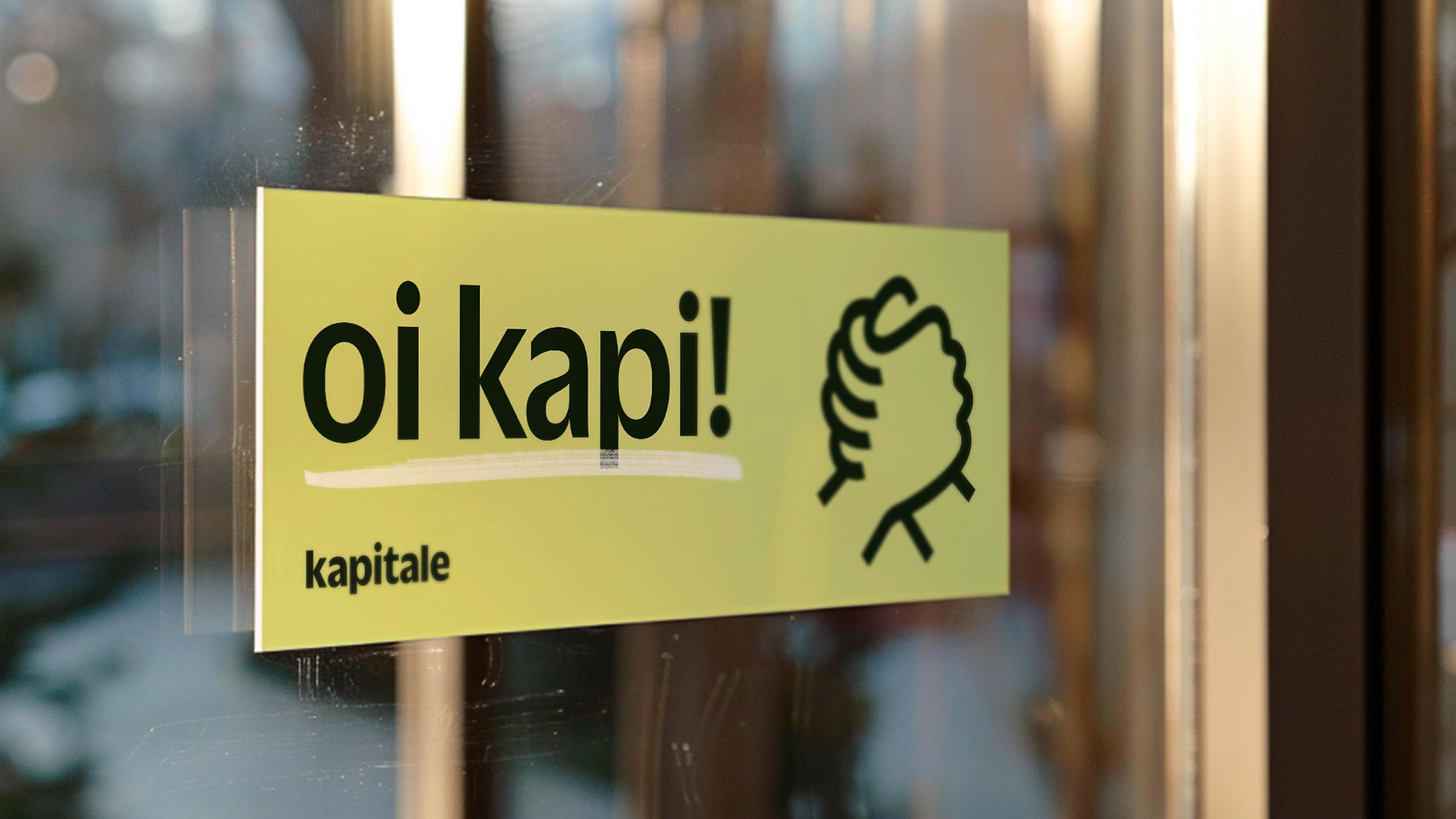
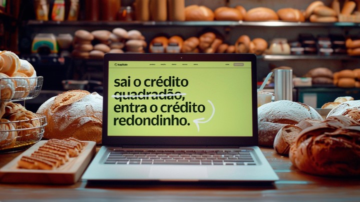
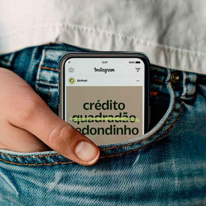
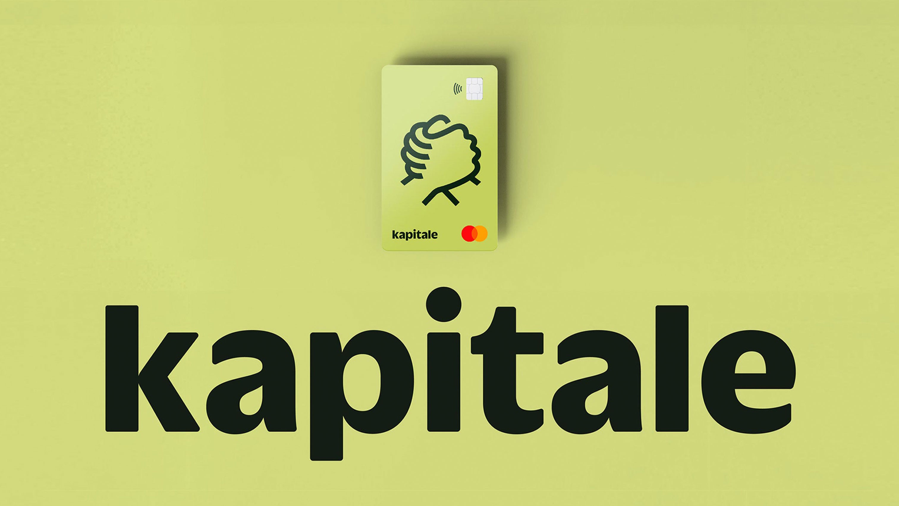
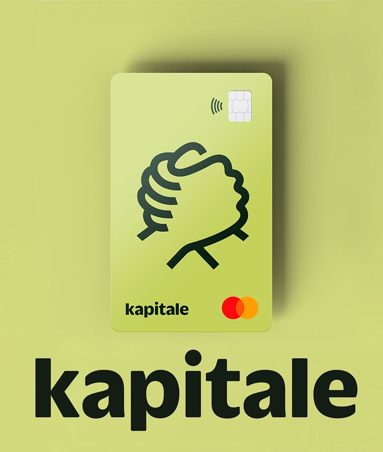
Our mission was to break the mold and move closer to a more popular and relaxed universe without losing reliability. The design reflected this new perspective. The old rigid codes gave way to a rounded visual.We developed a lowercase logo, bringing lightness and conveying more accessibility and simplicity through a curvy typography. The details of the font strokes also contributed to a more modern and friendly look.
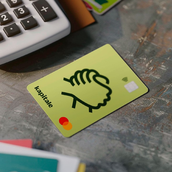
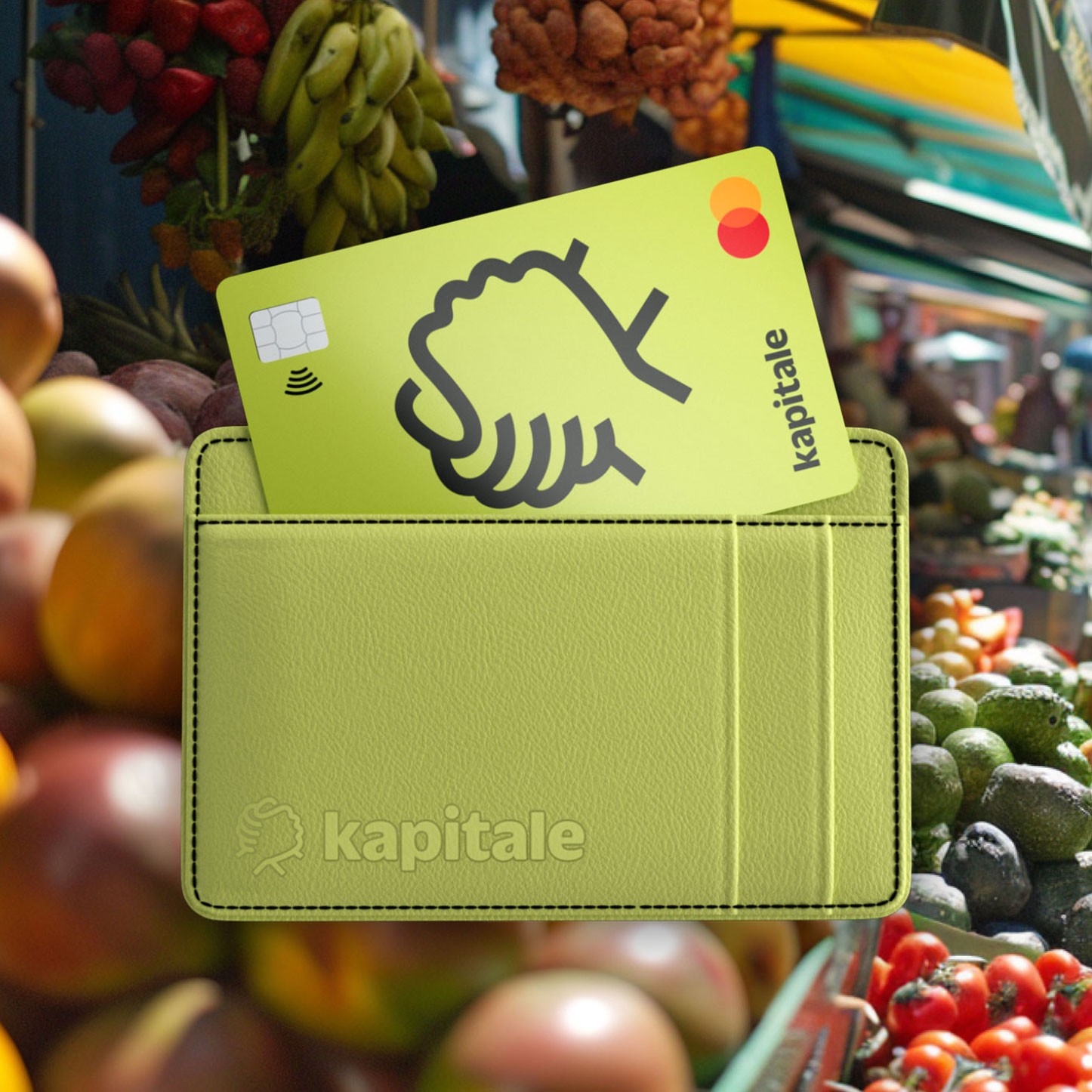
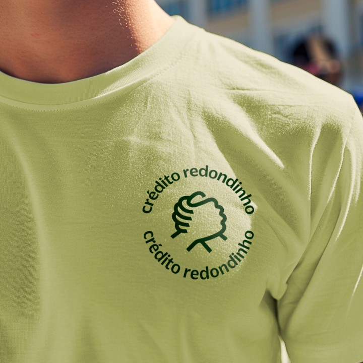
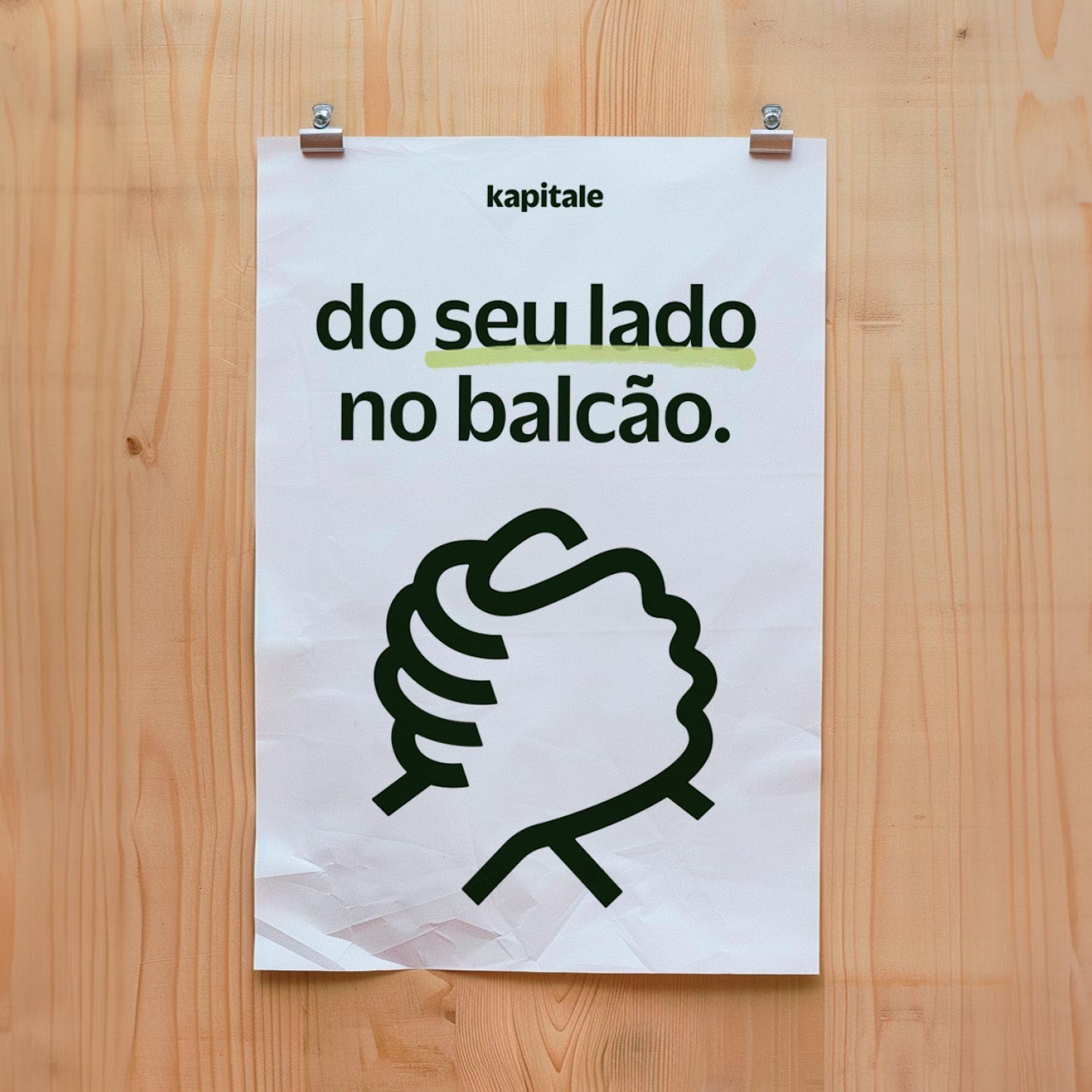
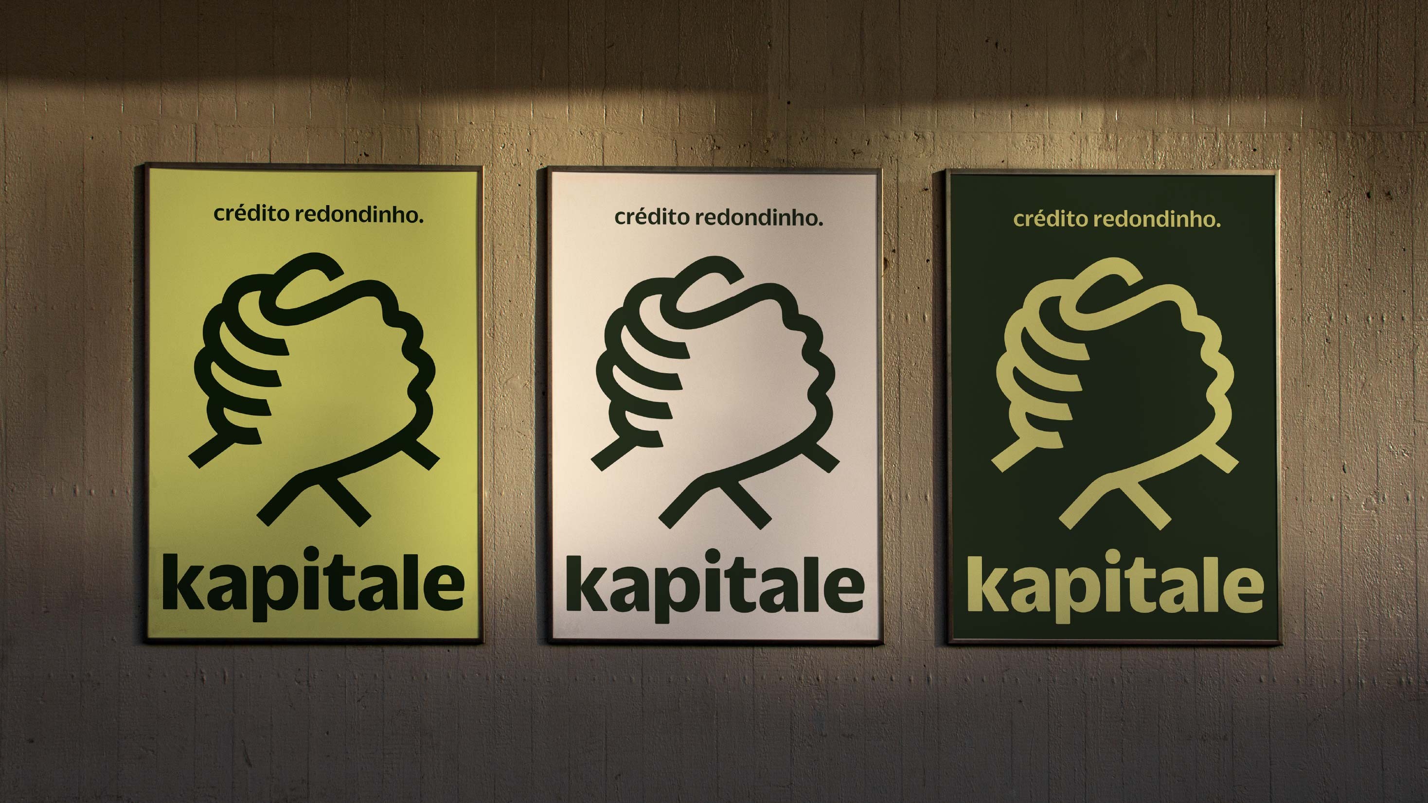
We started with a study to create an identity symbolizing a continuous union between Kapitale and its clients. We identified the gesture of shaking hands as an expression of trust and complementarity. This idea of balance and fluidity was visually translated into a stylized handshake, reinforcing the brand's collaborative essence.
Kapitale's color palette is versatile, with Lime being the predominant color, representing "the light at the end of the cash register." In photography, we focused on the small entrepreneur. We opted for images capturing real moments of their journey, from effort to success, to create an authentic emotional connection. We chose a more documentary aesthetic to highlight the entrepreneur as the protagonist, avoiding the traditional advertising approach.
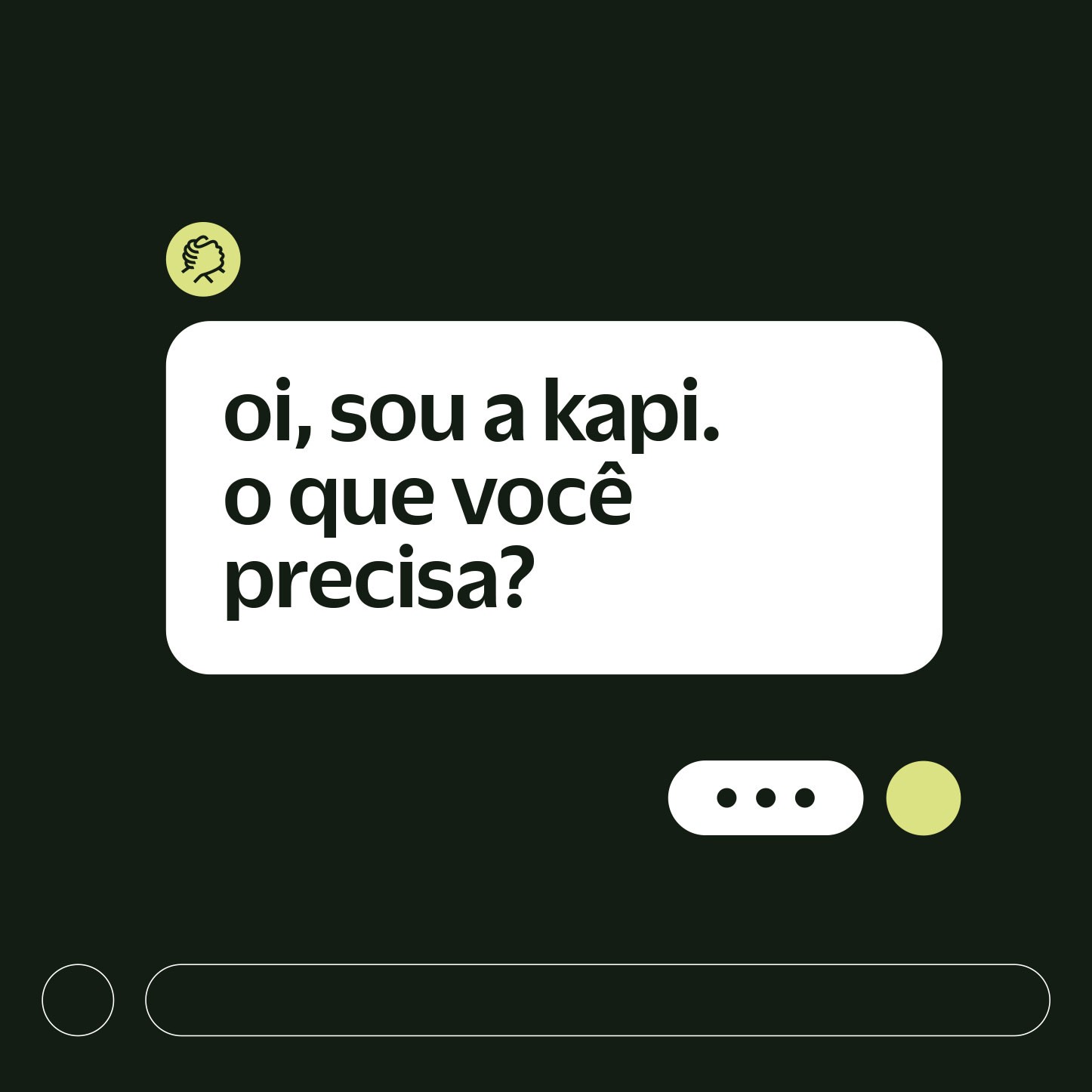
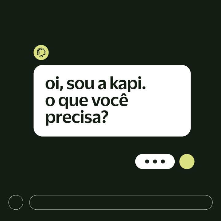
We also created a tone of voice that motivates, informs, and engages. The tagline “Rounded Credit” clearly and casually expresses the brand's value proposition: uncomplicated, fast, and accessible credit. The central message is clear: to make entrepreneurs' lives easier, making their dreams viable simply and directly.