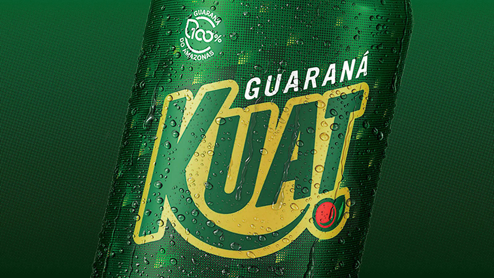
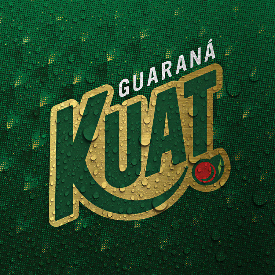
Guaraná Kuat
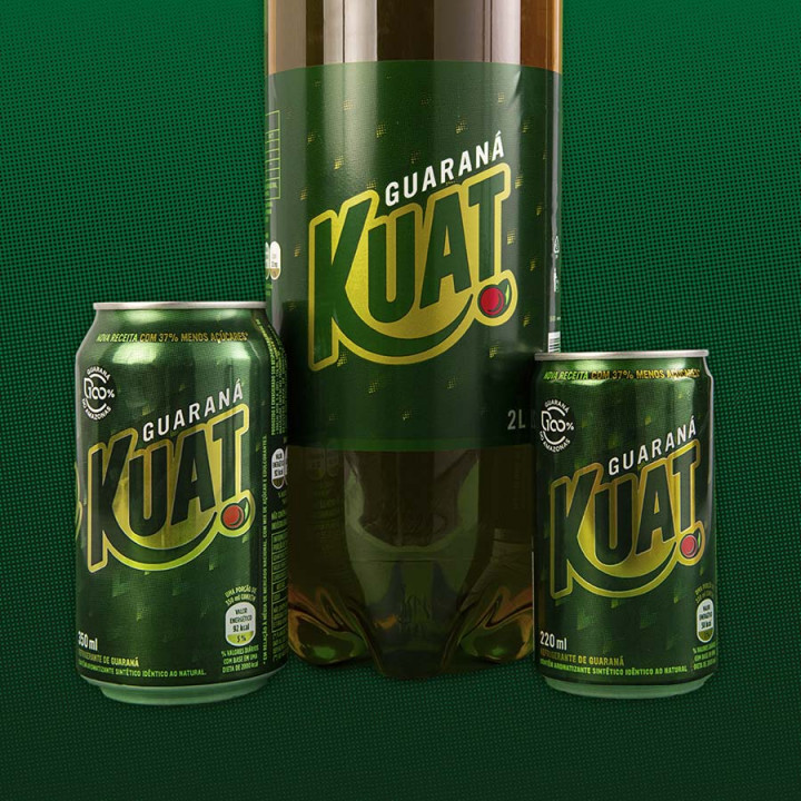
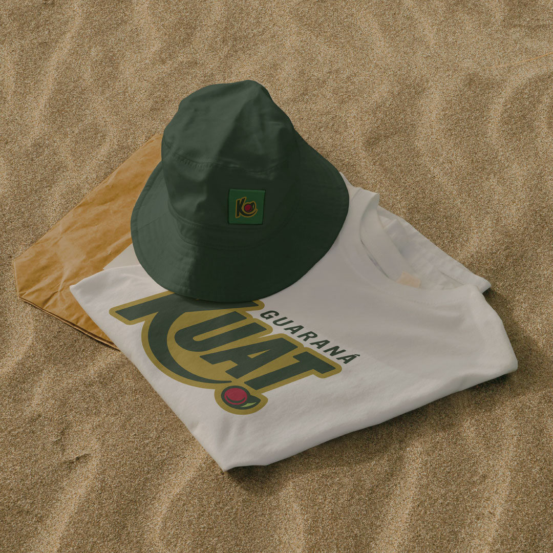
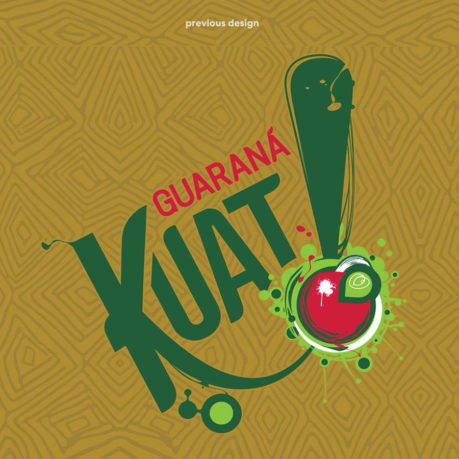
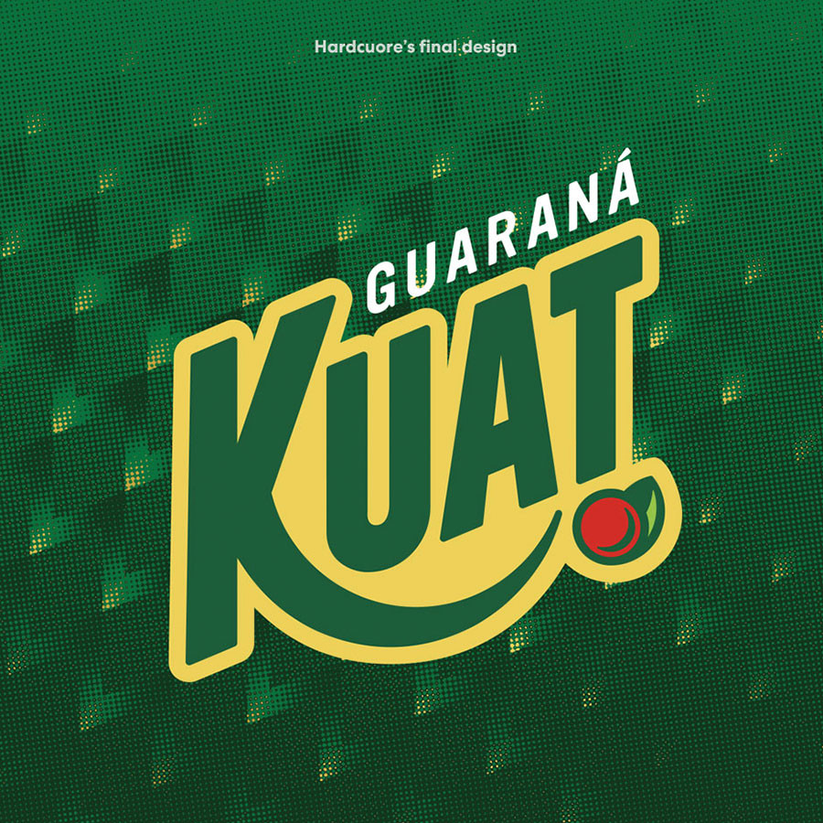
HardCuore was responsible for the rebranding of Kuat, playing a crucial role in its market repositioning, specifically targeting the C and D audience. We developed a new visual identity and a communication strategy that resonated with this audience, helping to strengthen Kuat's connection with these consumers and increasing its relevance and presence in the segment.
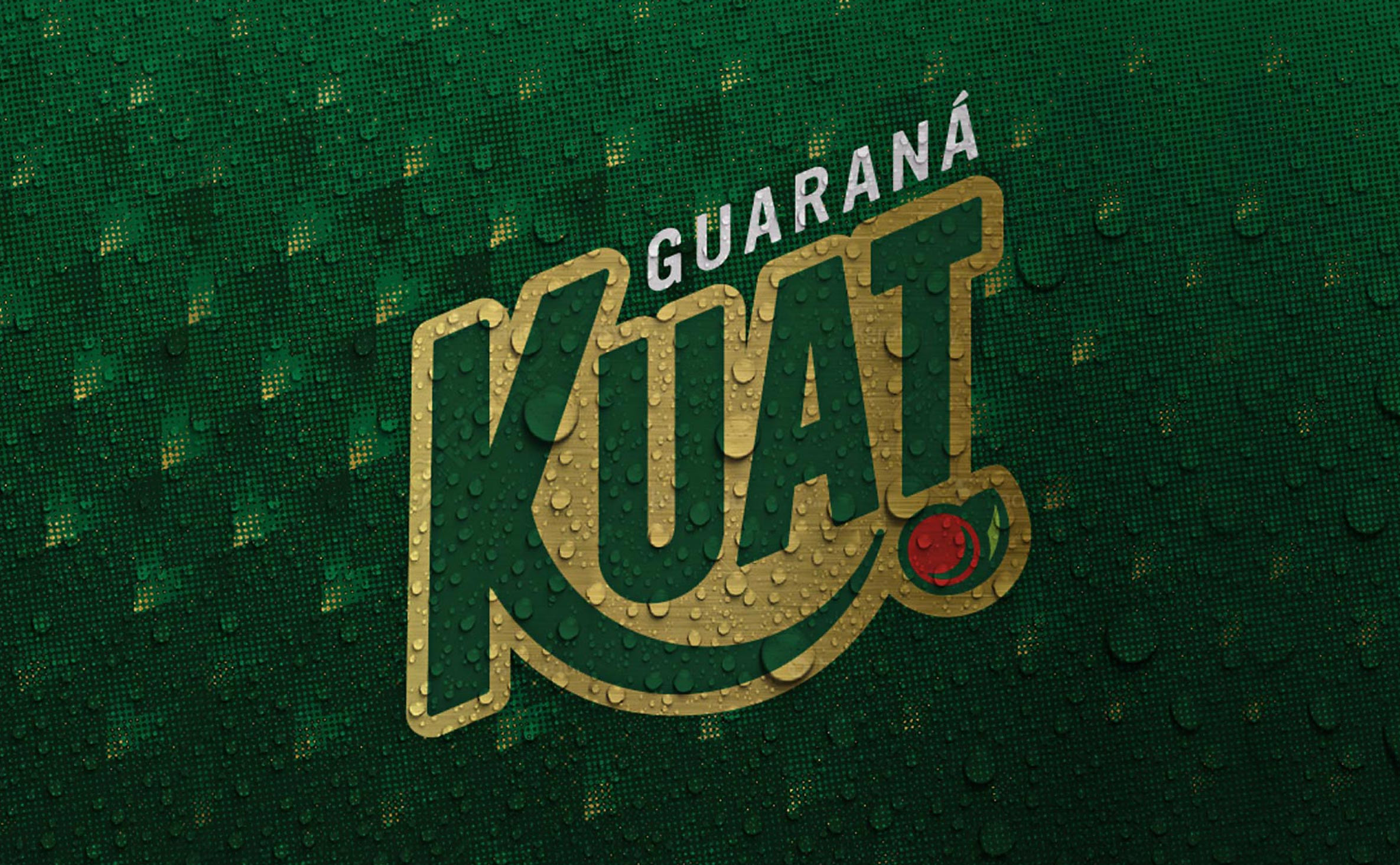

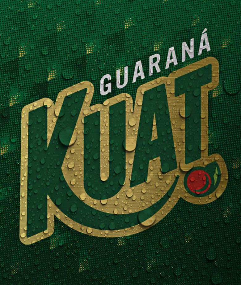

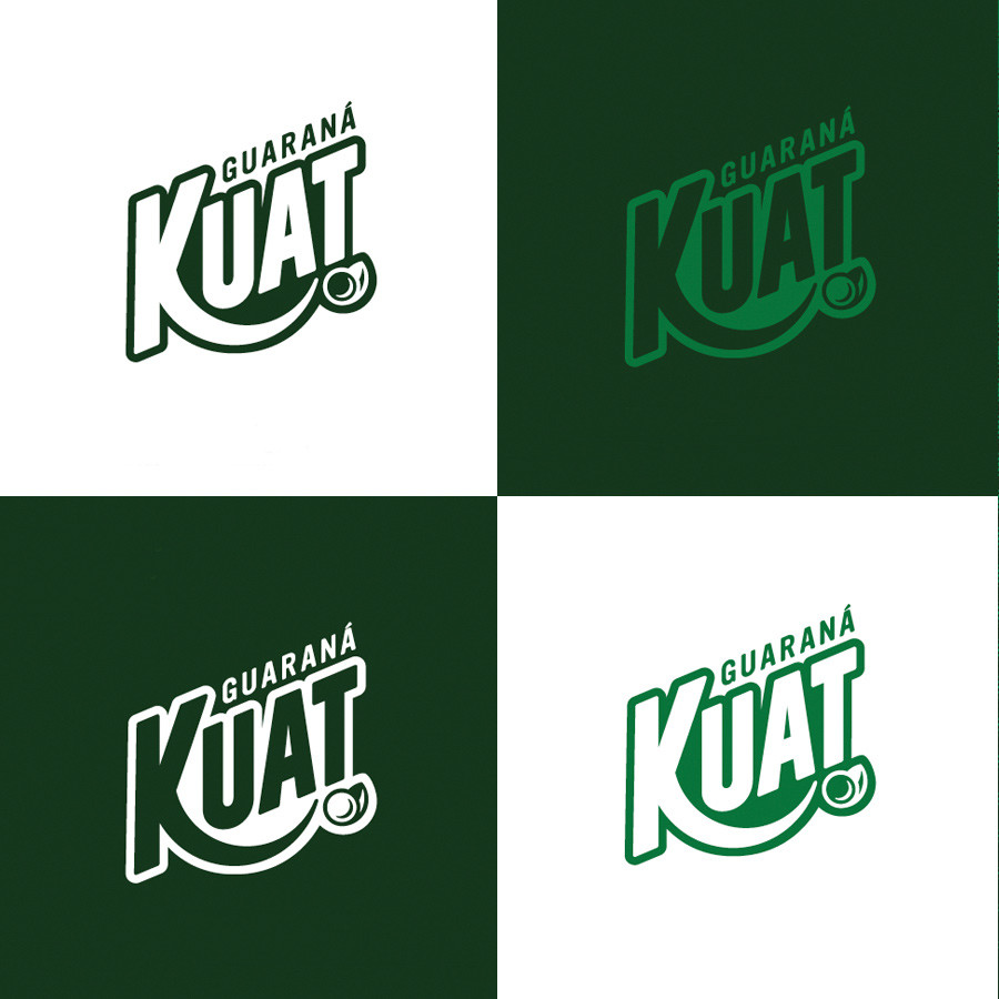
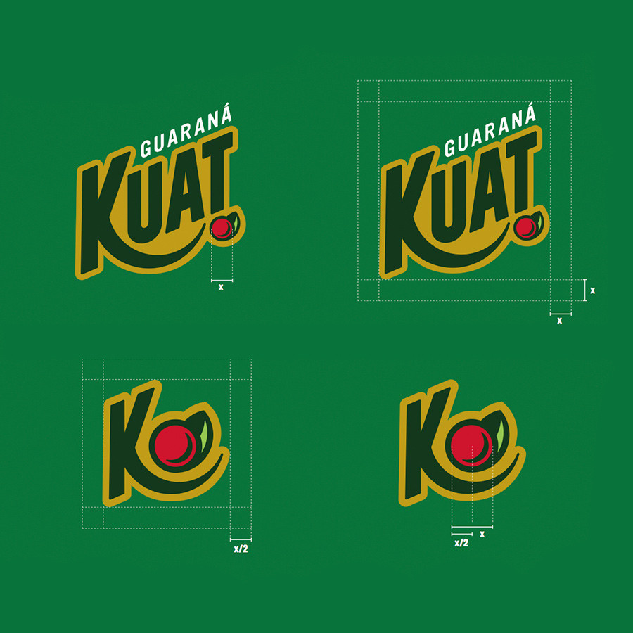
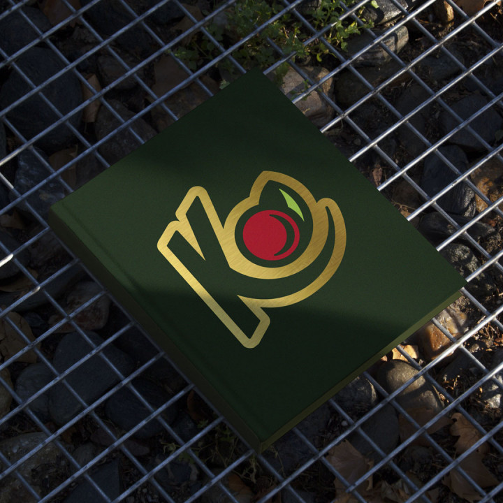
We created a new visual identity system for the brand, reflecting its irreverence and attitude in the design.


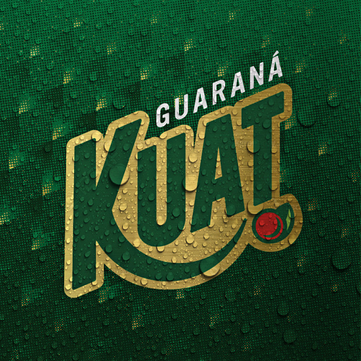

We were inspired by the shapes and geometries of the logos of the great American basketball teams, connecting Kuat with the aspirations of its target audience.


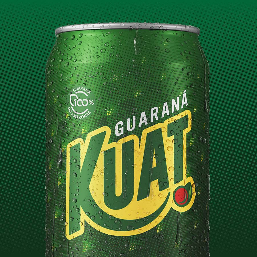
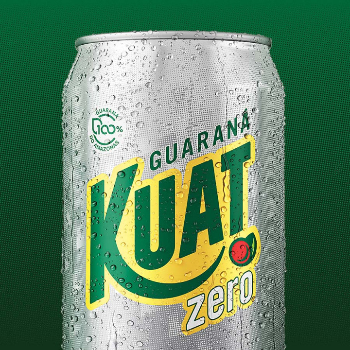
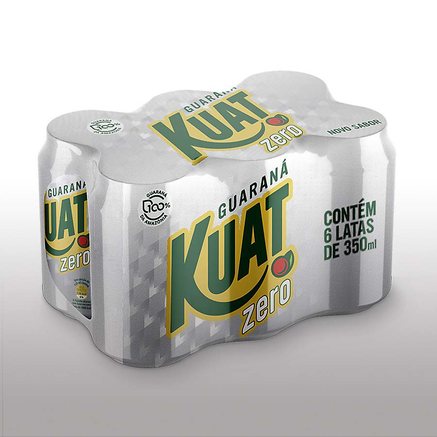
We unveiled the brand's new visual identity while also developing the design of its packaging.


See our works
-
Film -
Design -
Communication