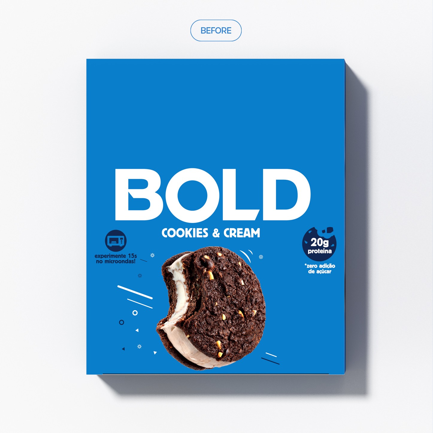
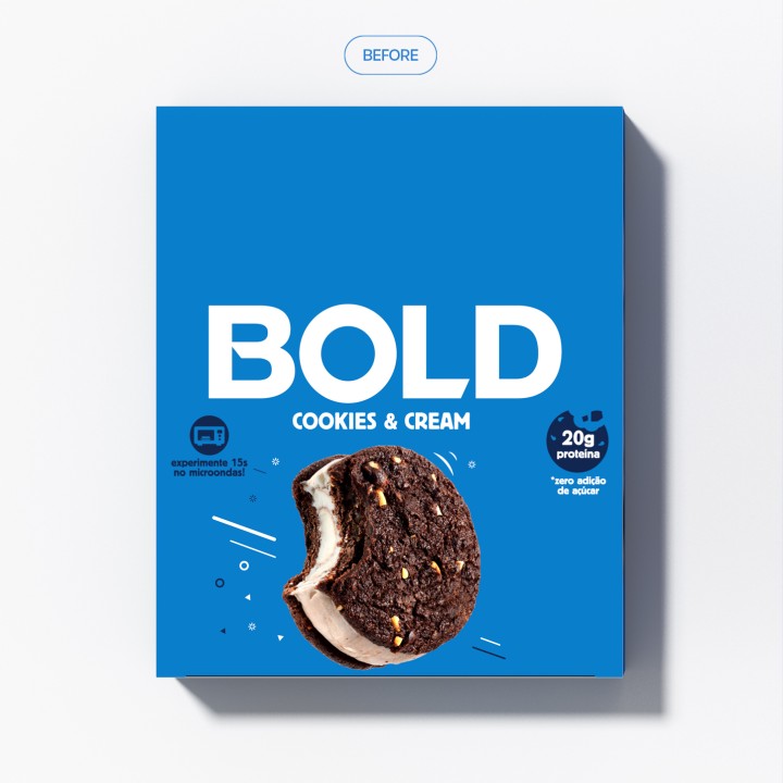
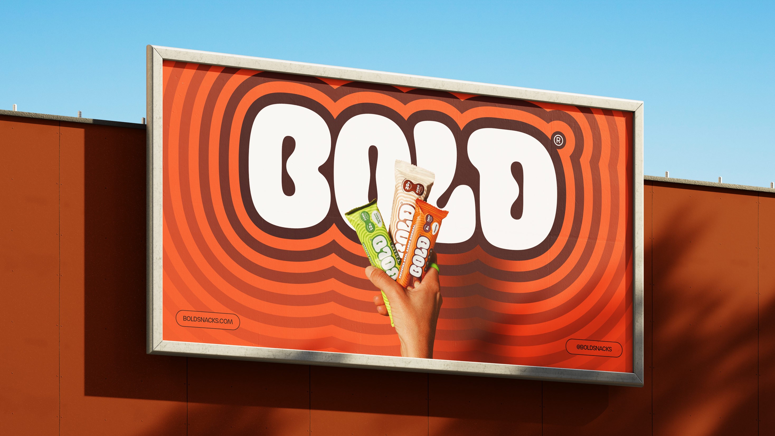
Bold Snacks, Rebranding
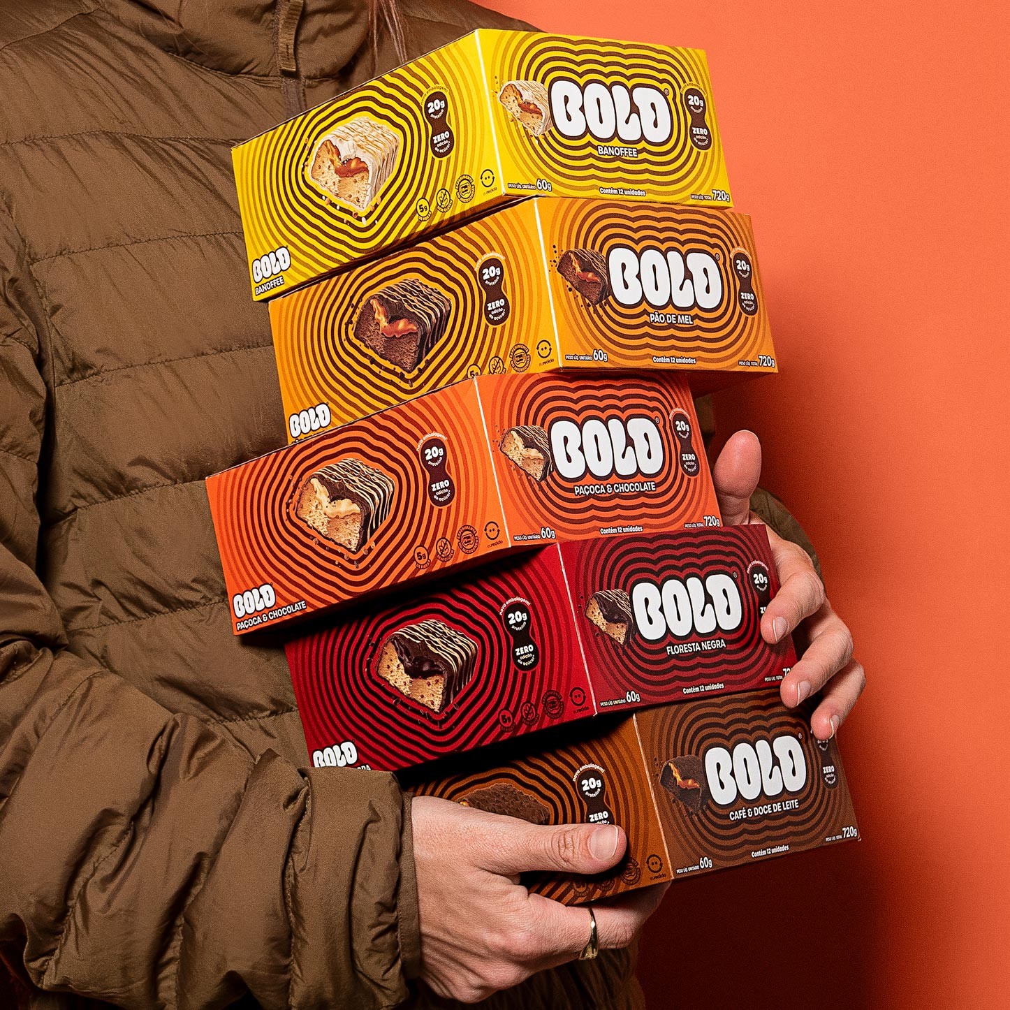
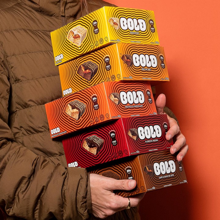
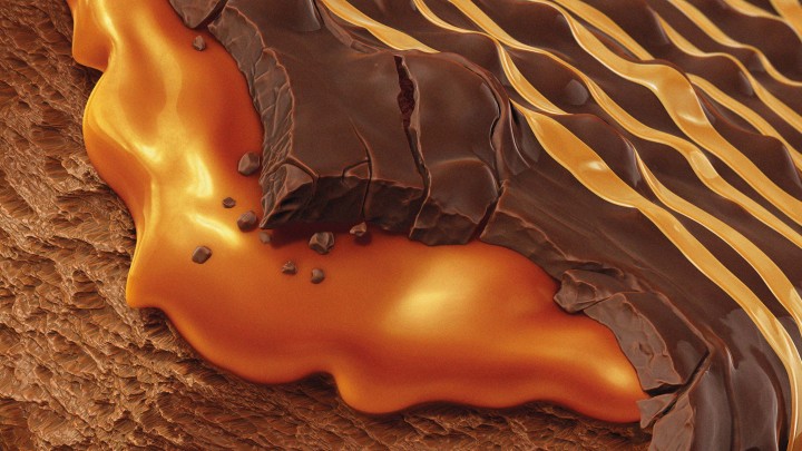
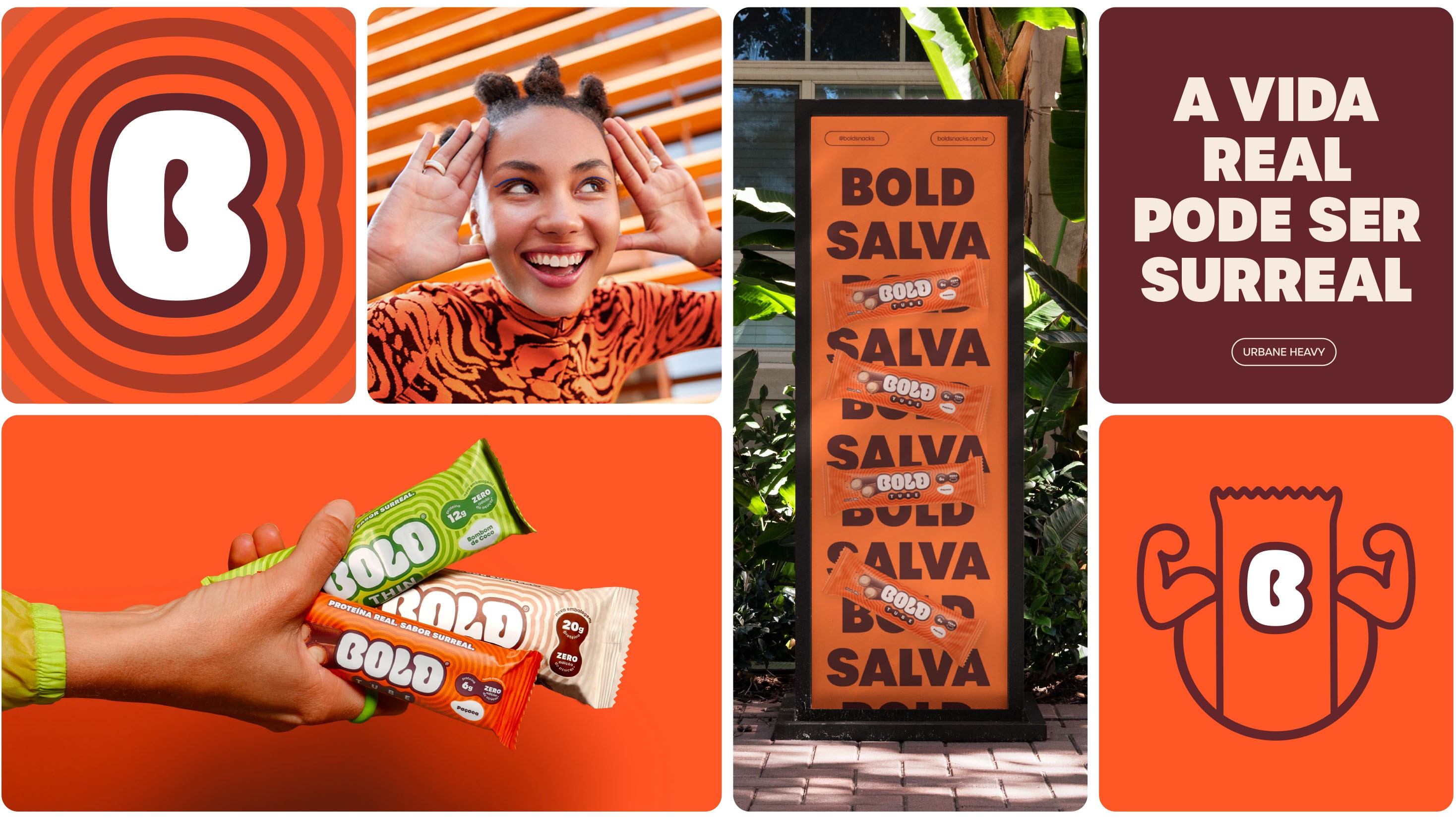
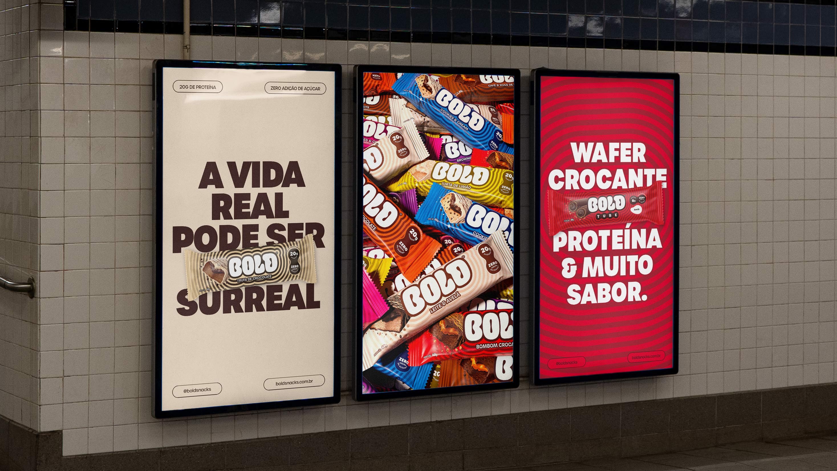
In a market often dominated by monotony and performance-driven messaging, we infused a bold dose of surrealism and flavor into Brazil's most beloved protein bar brand. The new hypnotic, vibrant, and iconic visual identity was inspired by the explosion of sensations that only a bite of Bold can deliver.
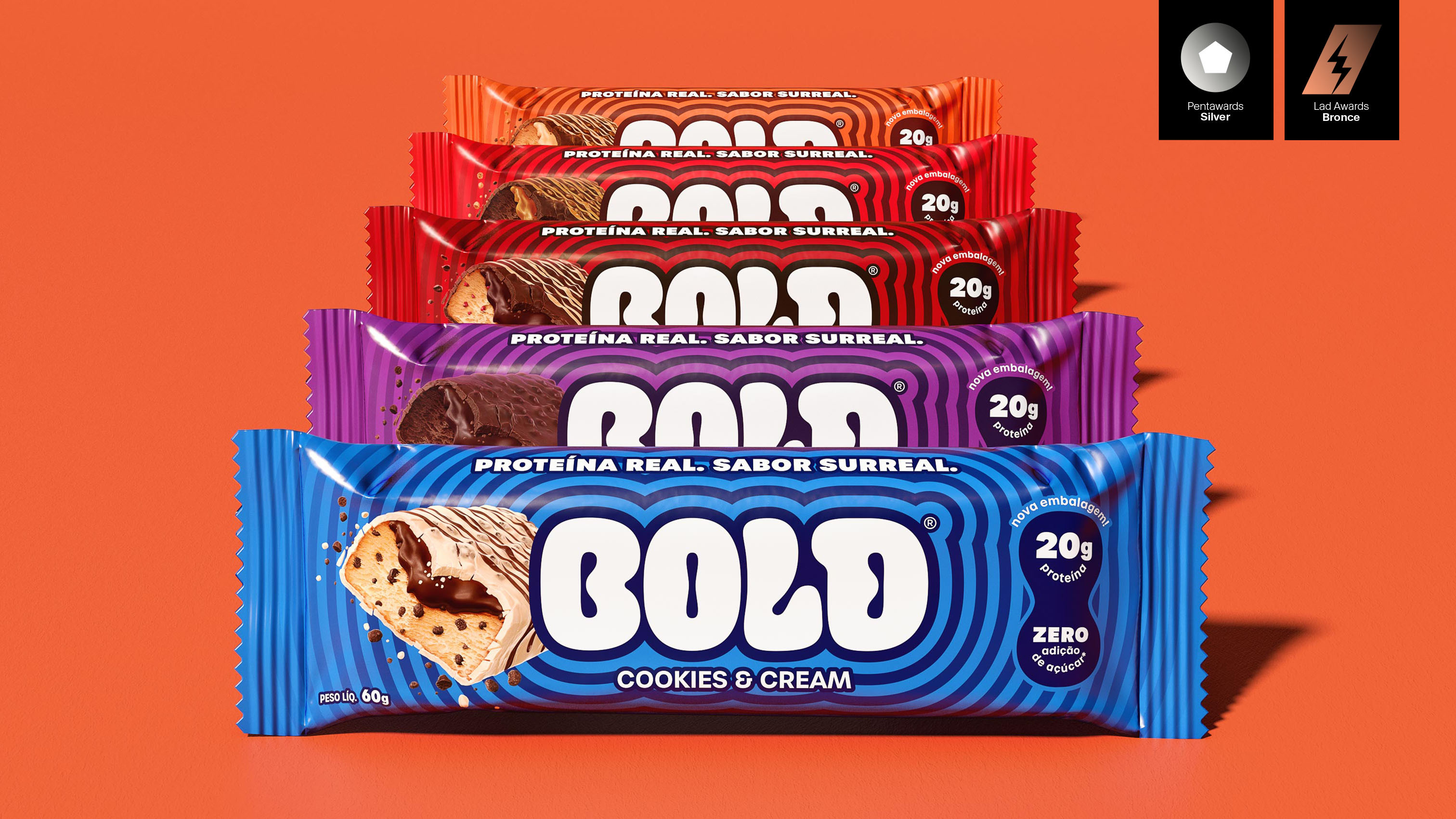

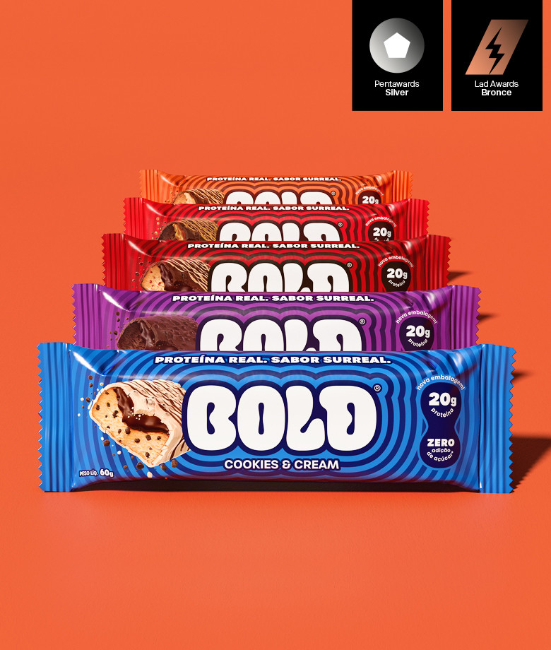

The new design is inspired by the layers, filling, and the explosion of flavors and sensations that only BOLD can offer.
With proprietary design, curvilinear shapes, and a vibrant color palette, BOLD redefines indulgence, turning each bite into an unforgettable sensory and visual experience.
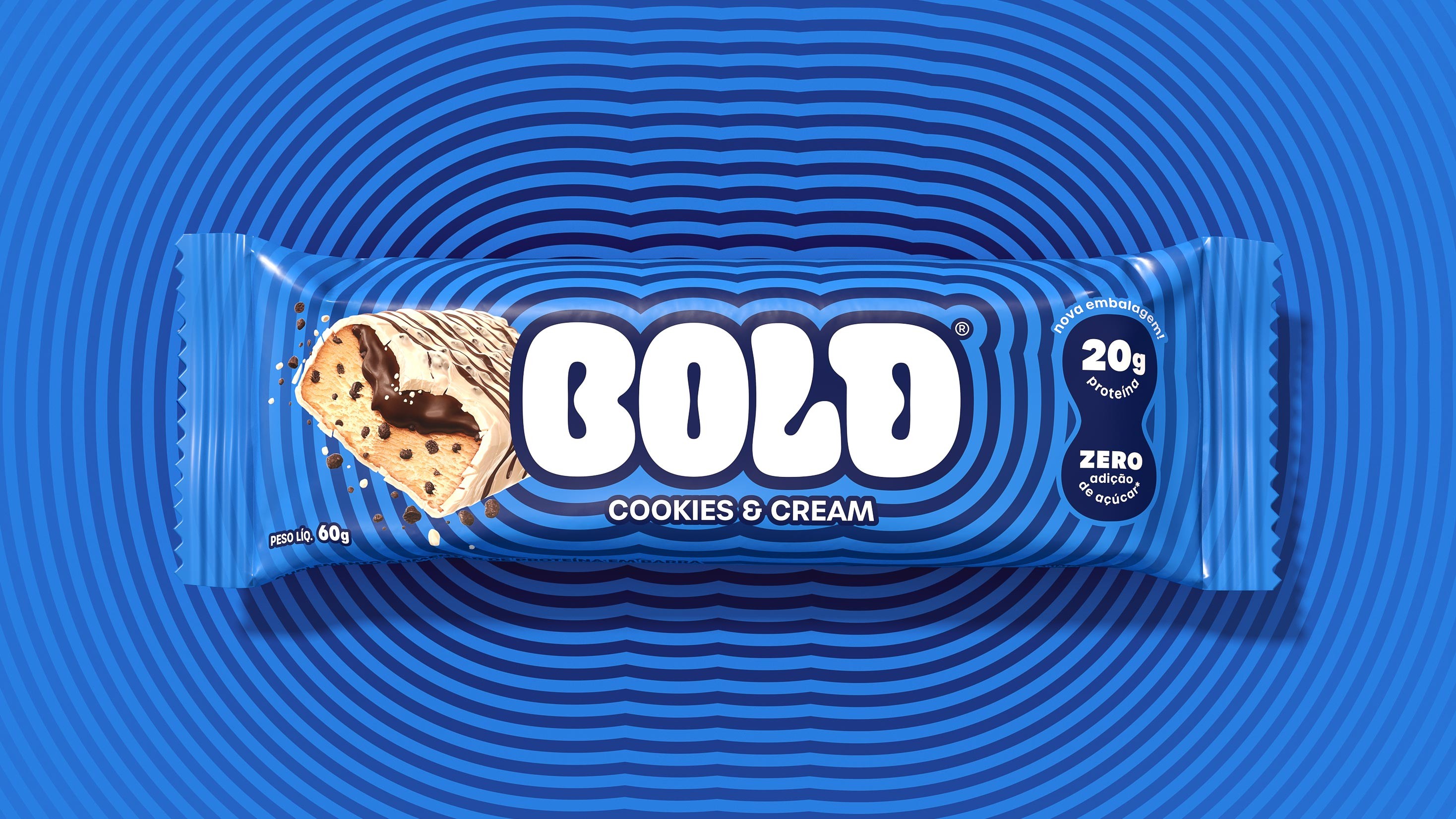
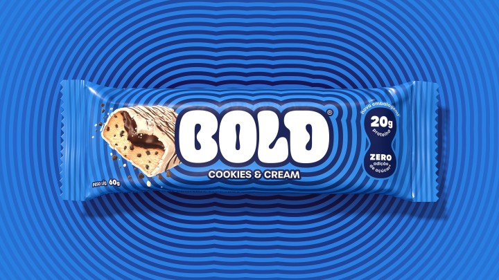

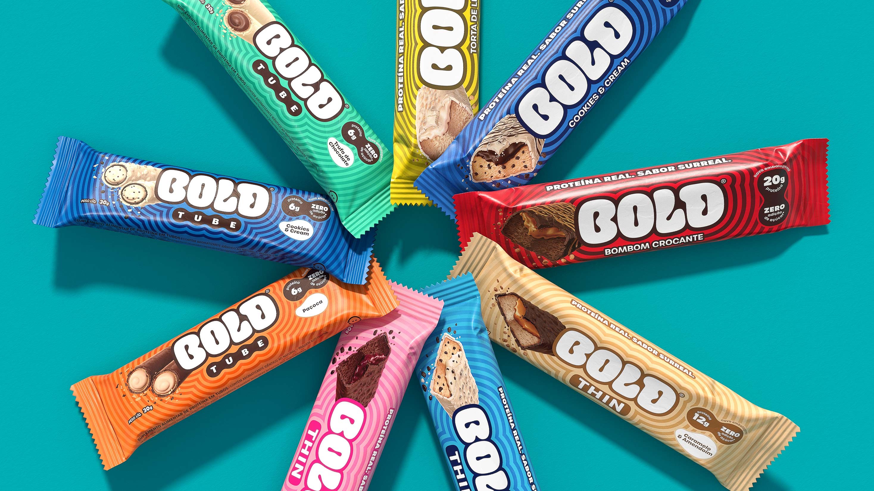
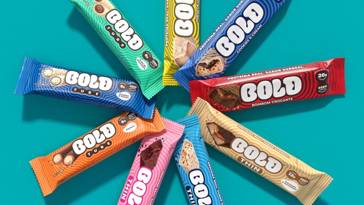


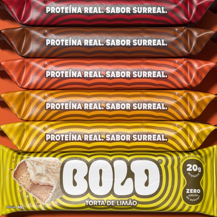


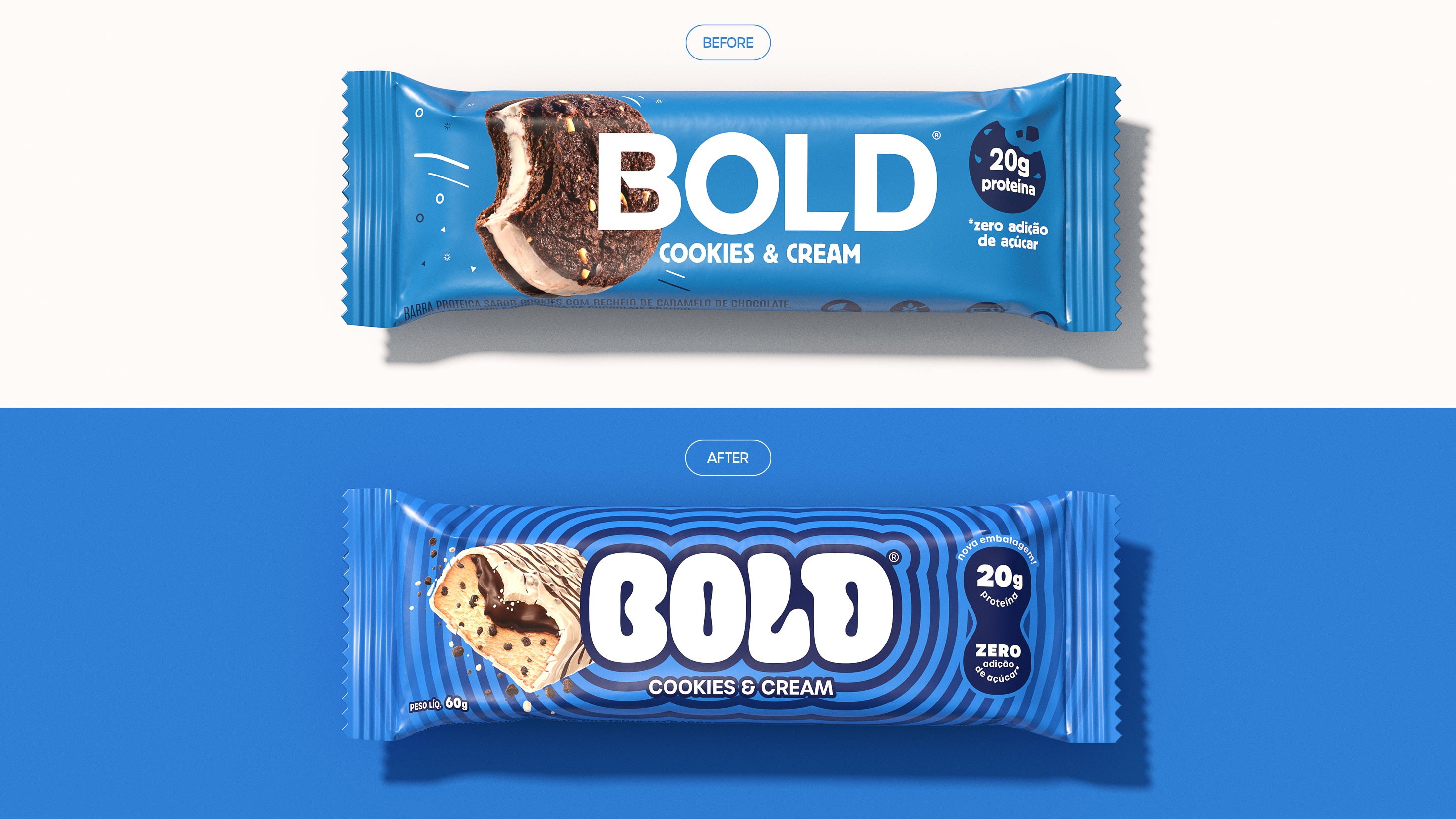


For Bold’s packaging, we used the "B" as the shape for the bite marks, creating a proprietary and appetizing visual language.


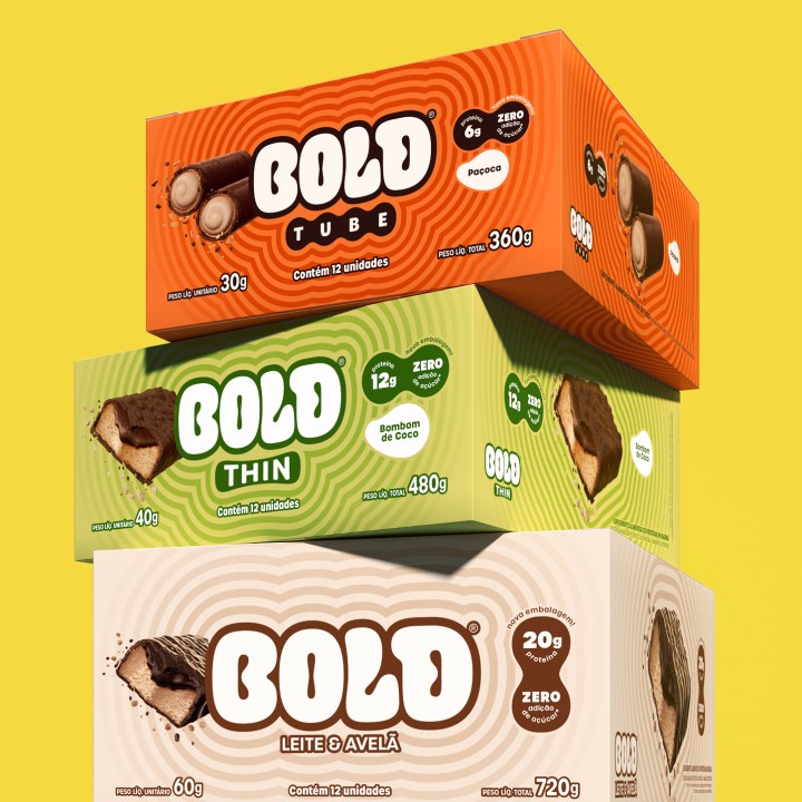

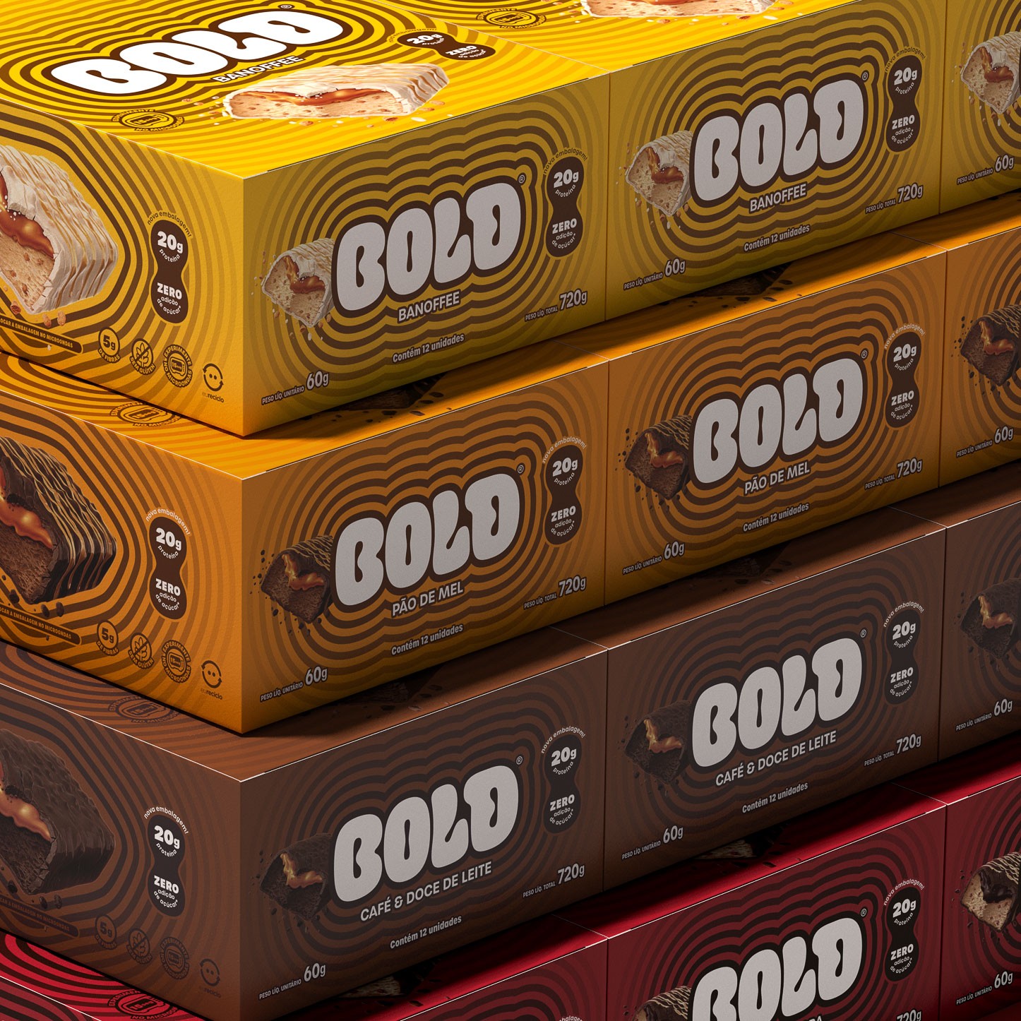


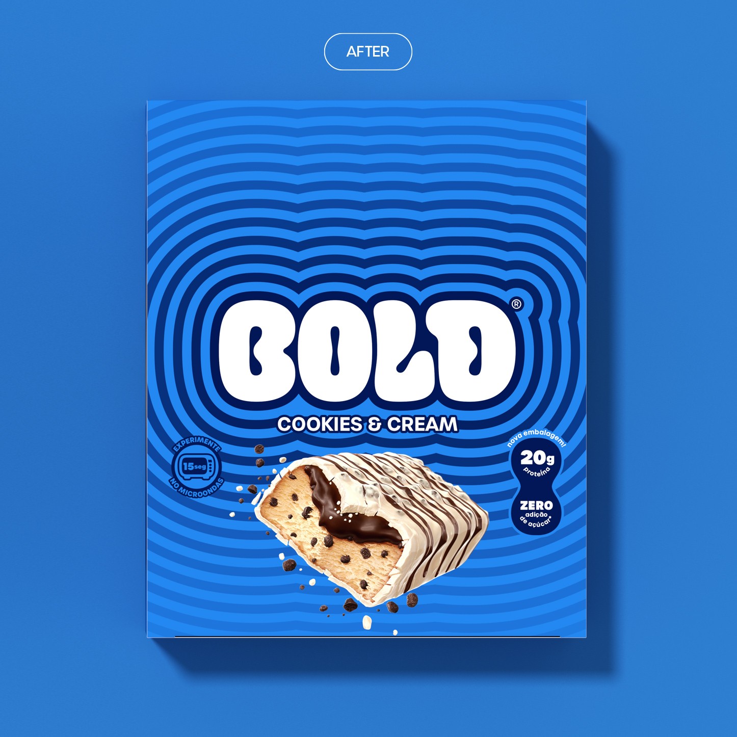


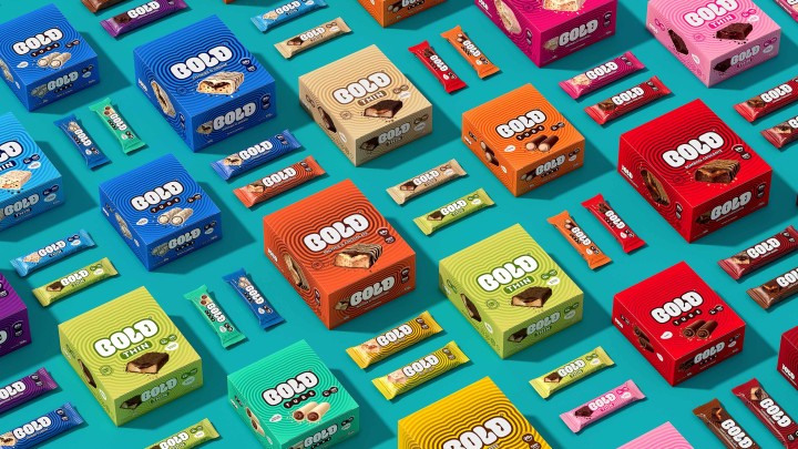

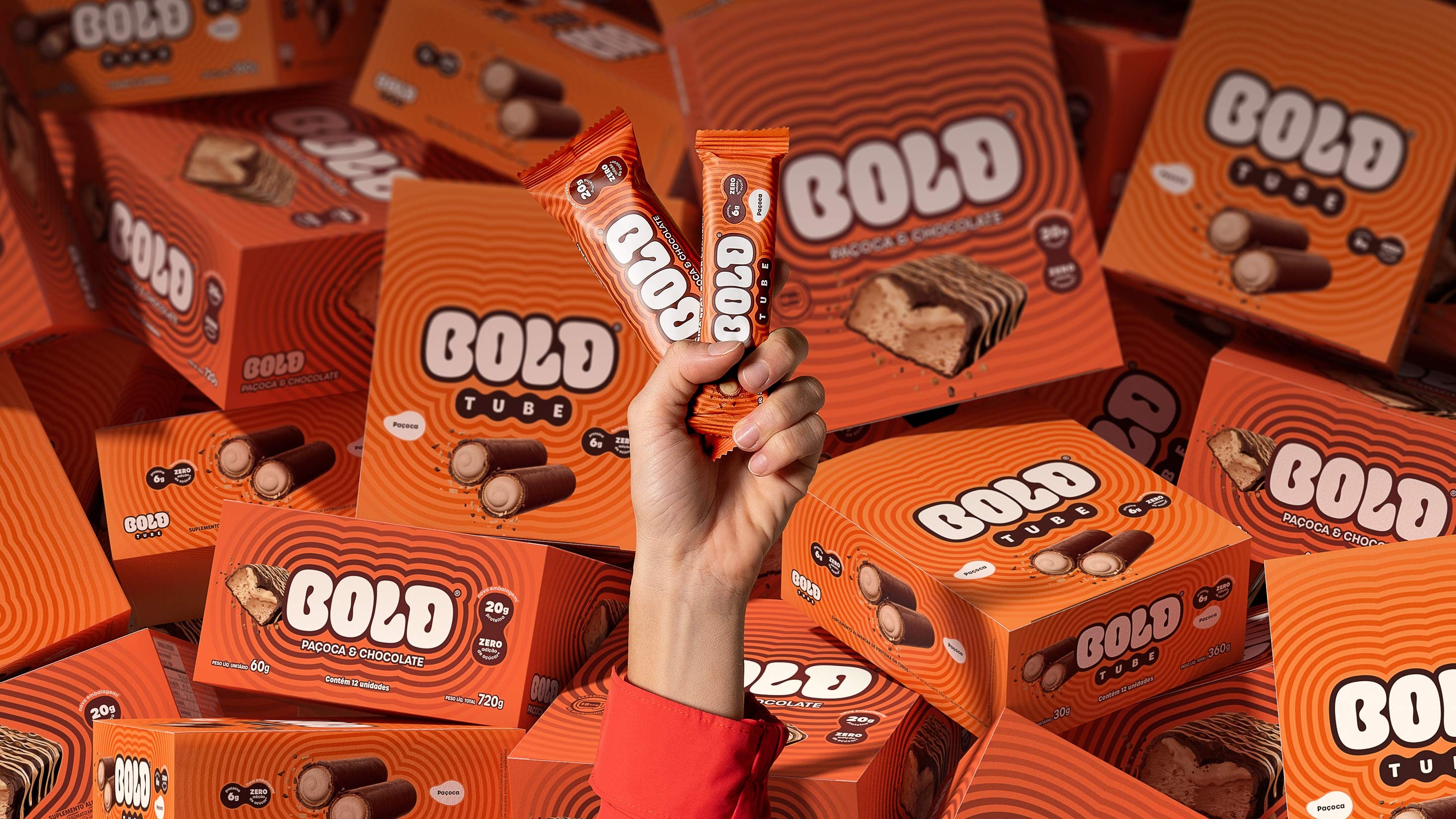
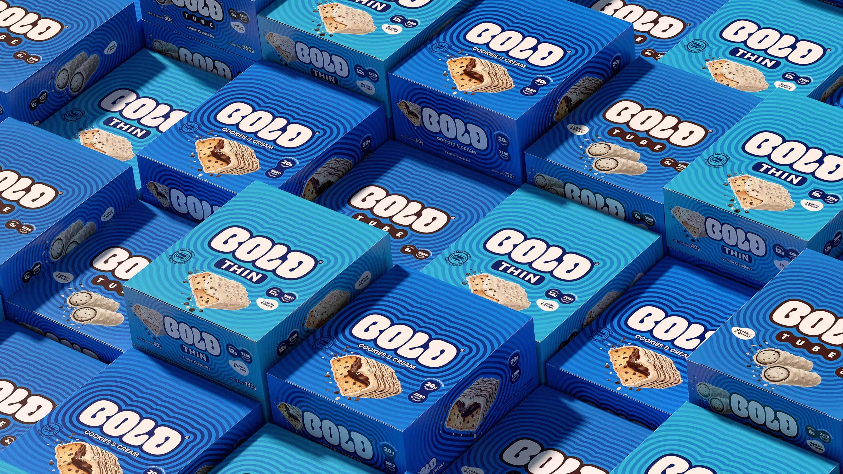
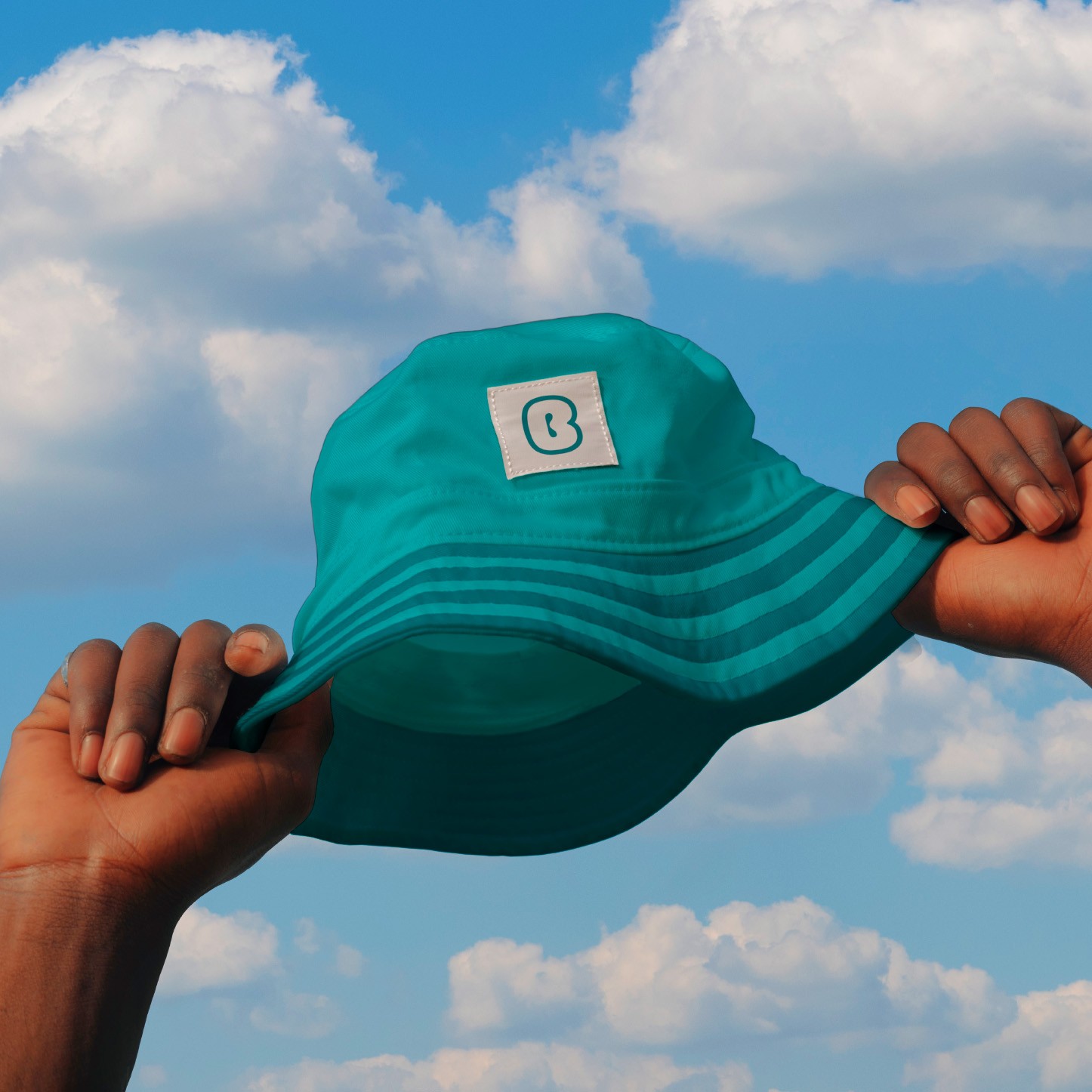
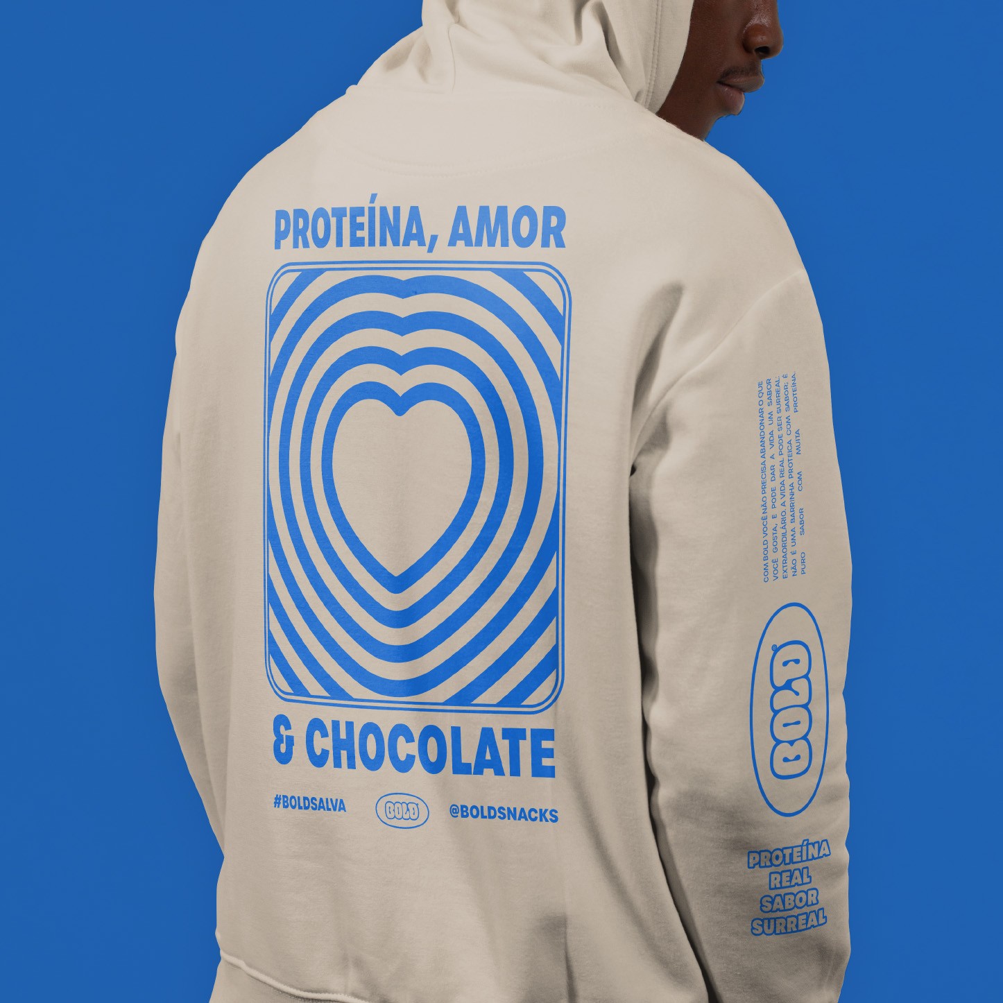
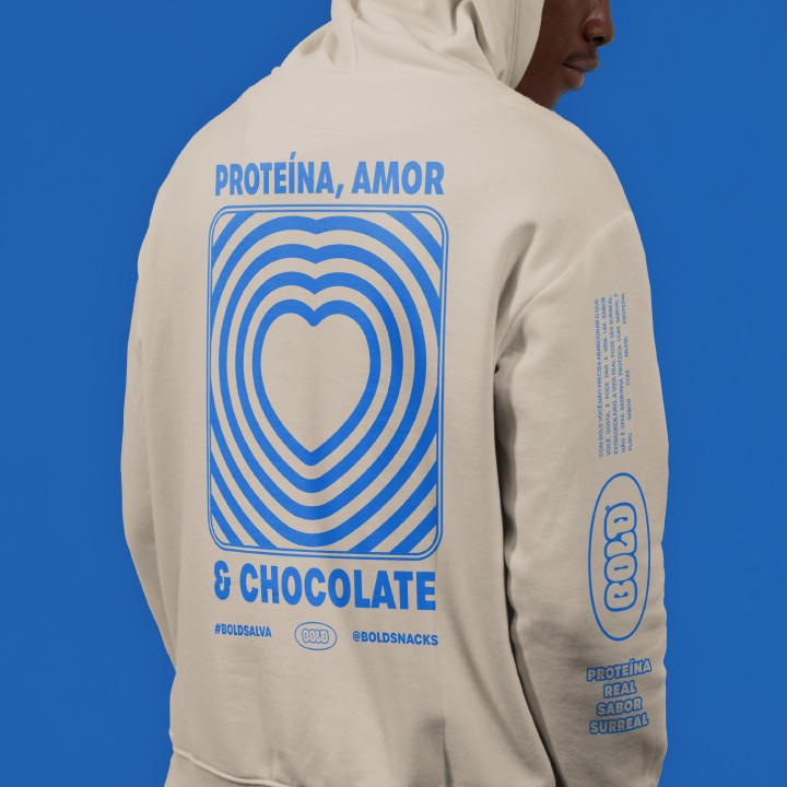
BOLD's visual identity goes beyond packaging, delivering a rich and memorable sensory experience, ensuring consistency and impact at every consumer touchpoint.


We created and produced a motion graphics film exploring the concept 'real protein, surreal flavor,' showcasing BOLD's new visual universe.
See our works
-
Film -
Design -
Communication