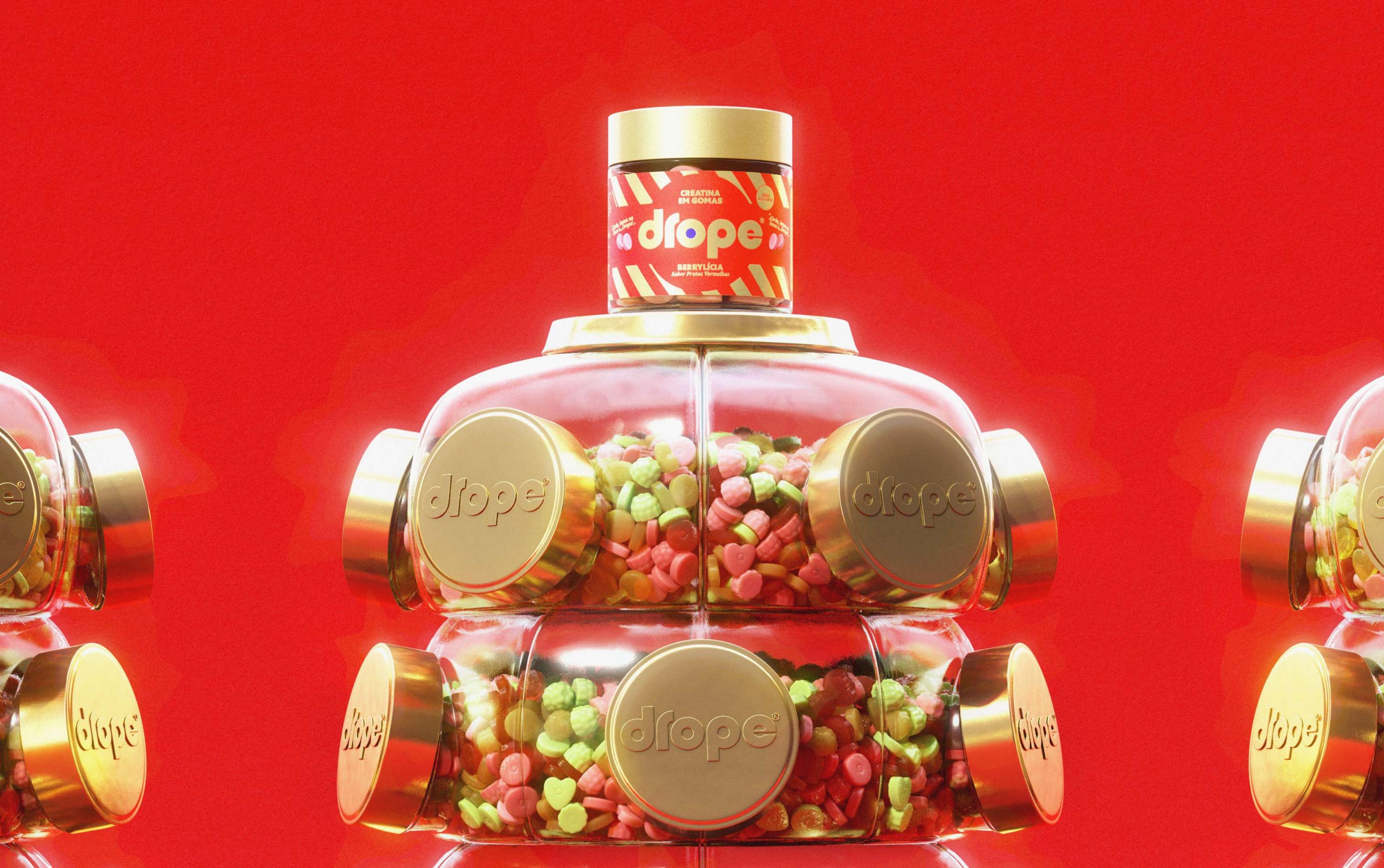
Wellness has become surrounded by the same familiar codes: performance claims, technical language and a visual world that has made “healthy” feel increasingly predictable. Drope was created to break away from that. A brand that swaps the seriousness of supplementation for the nostalgic world of the sweets many brazilians grew up with.
The name takes inspiration from classic drops and comes from reversing the name of the parent brand, Casas Pedro. It carries an immediate sense of familiarity, tied to childhood memories. More than just a name, Drope becomes part of the brand language itself: dropping in lightness, flavour and a new way of looking at wellbeing.
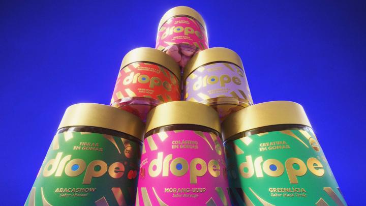
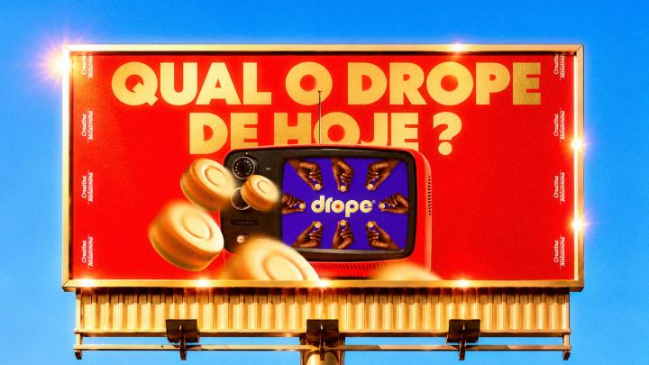
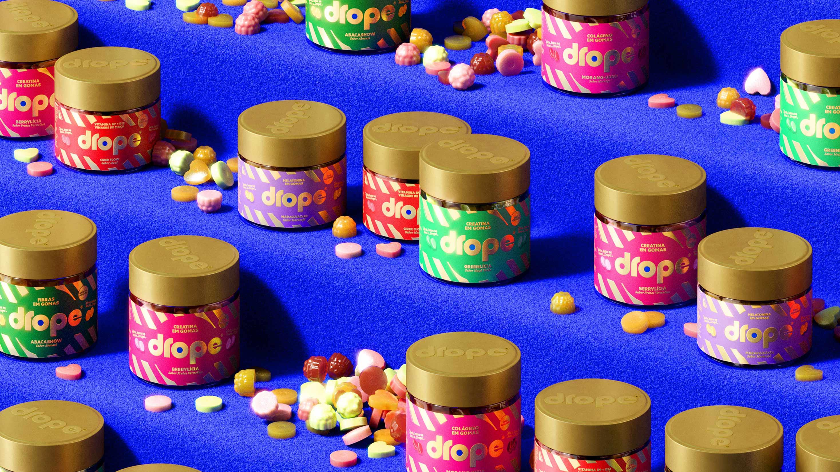
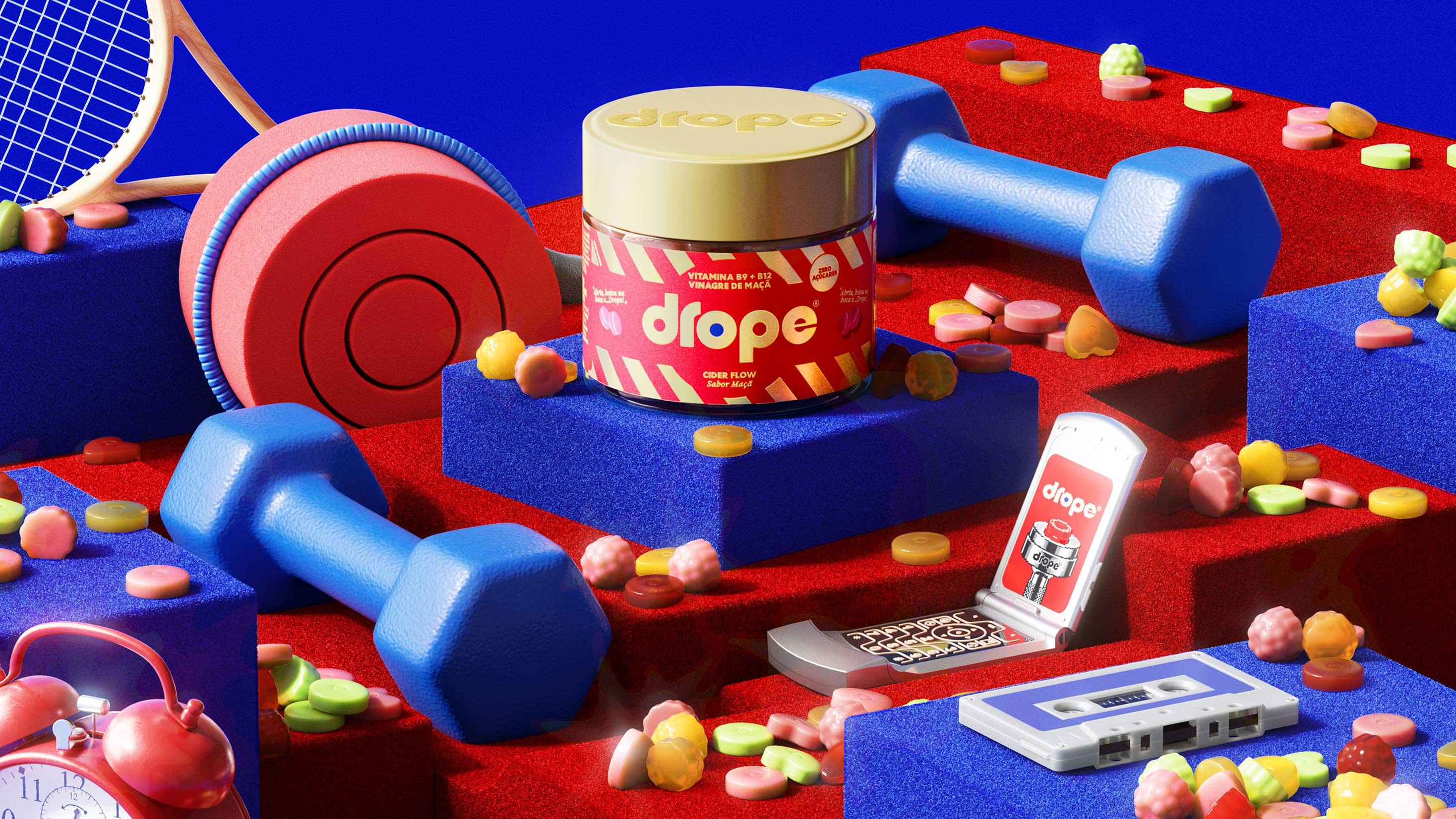
The visual identity is built around the contrast between nostalgia and function. Gummies, caramels, chewing gum and lozenges become more than products. They bring to life the idea of the perfect multifunctional sweet. References from Brazilian childhood are brought into a contemporary visual system, creating an identity that feels playful and distinctive while still bringing credibility to a category traditionally shaped by science and technical information.
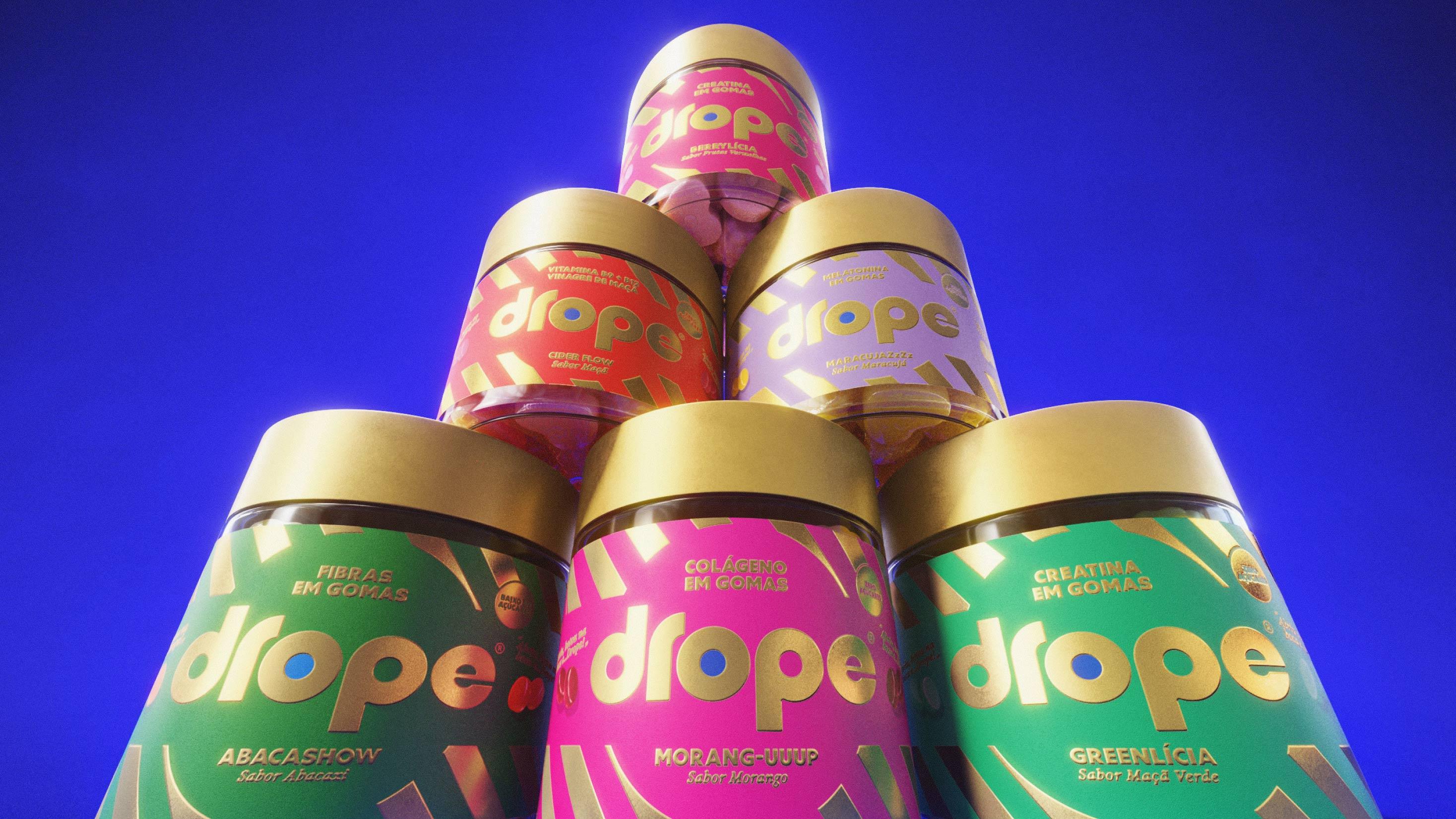
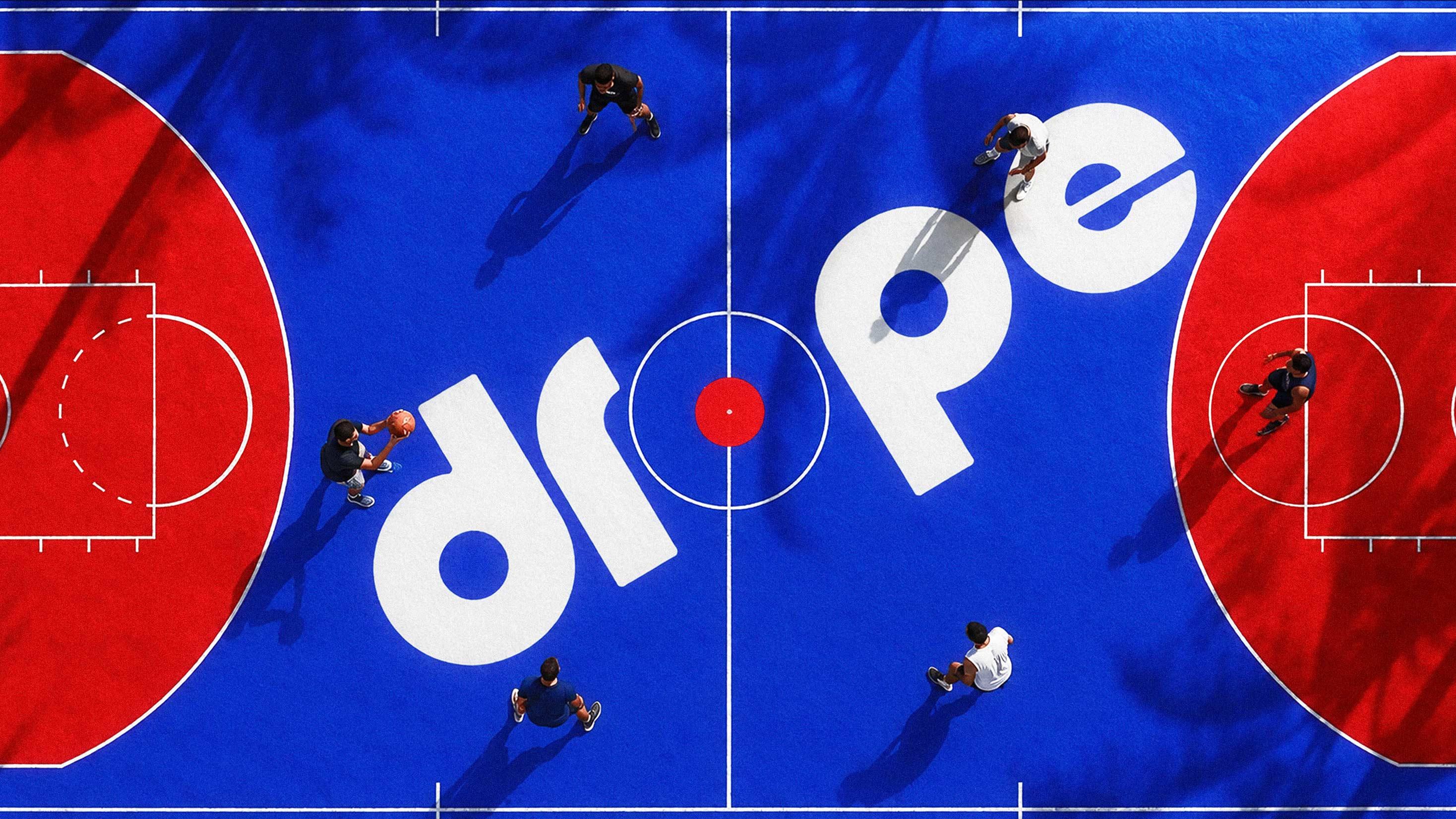
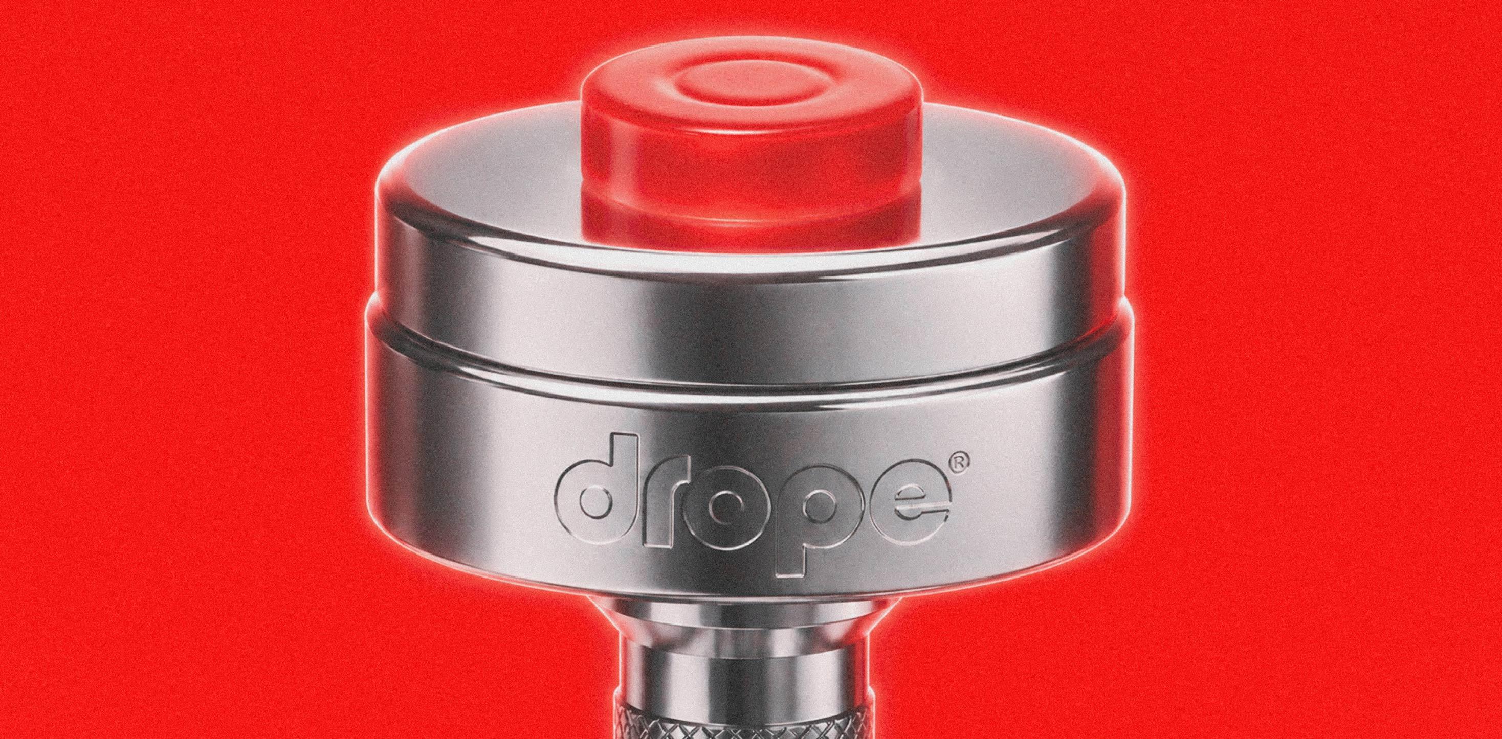
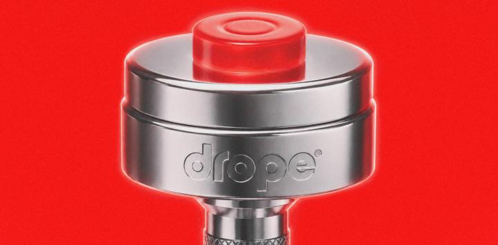
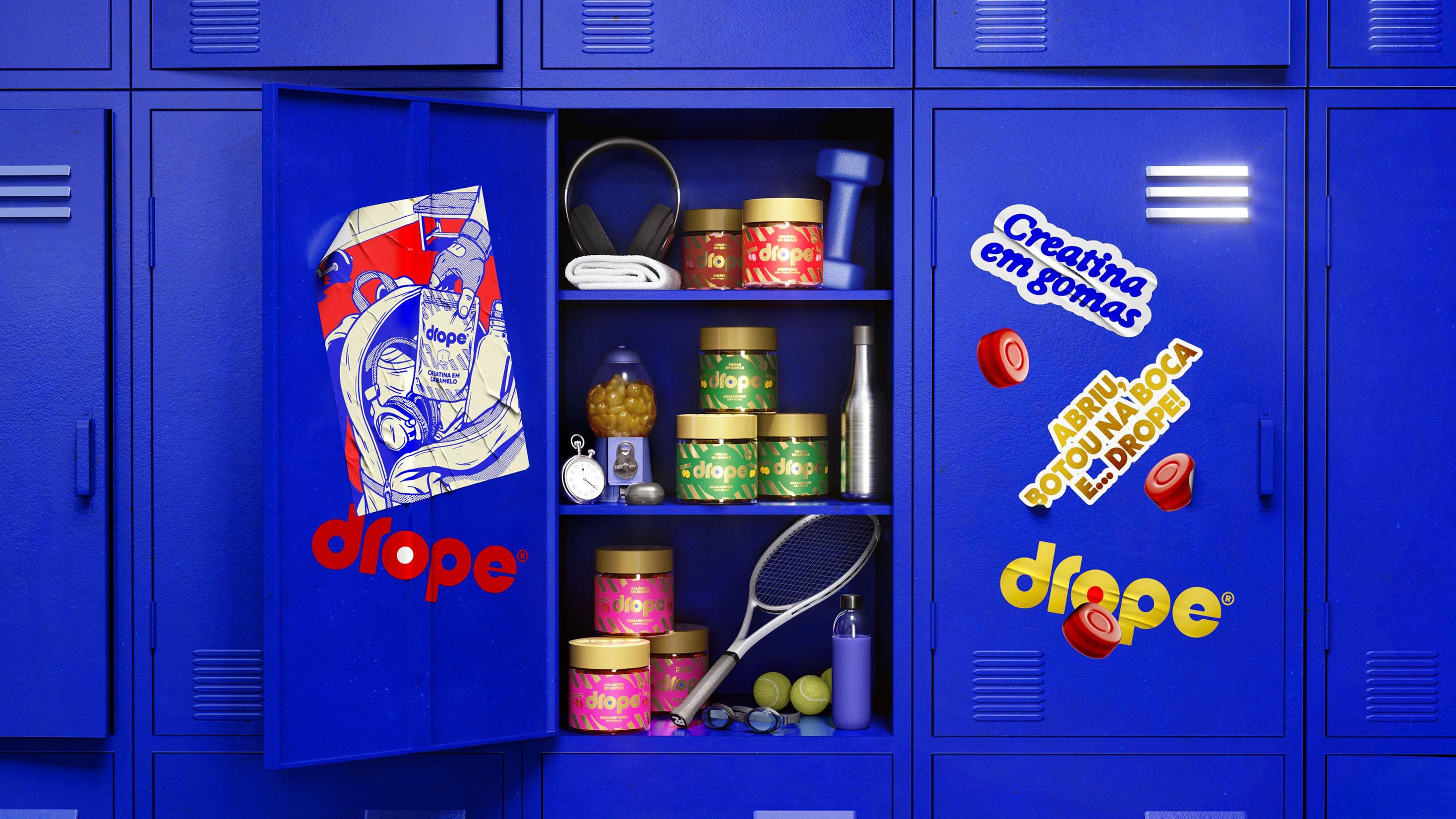
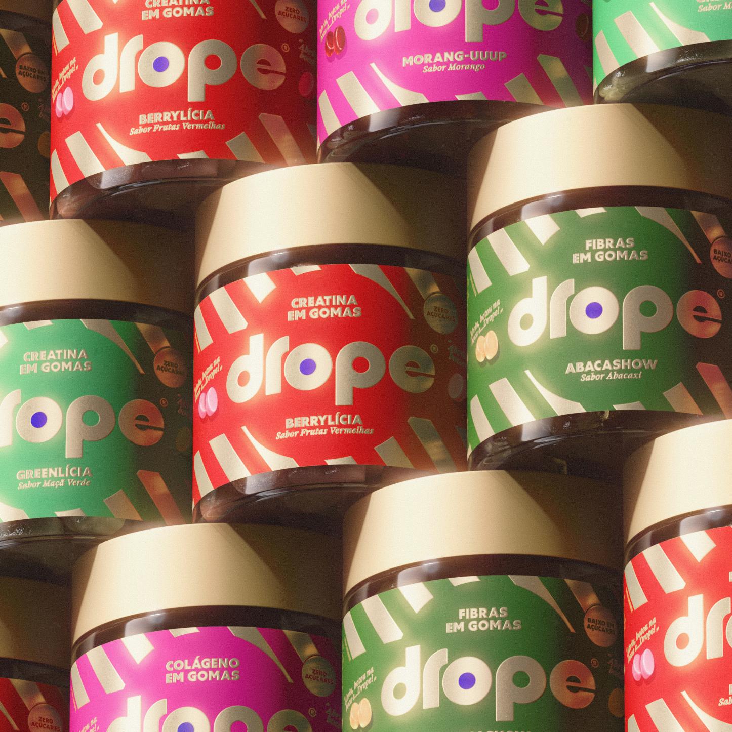
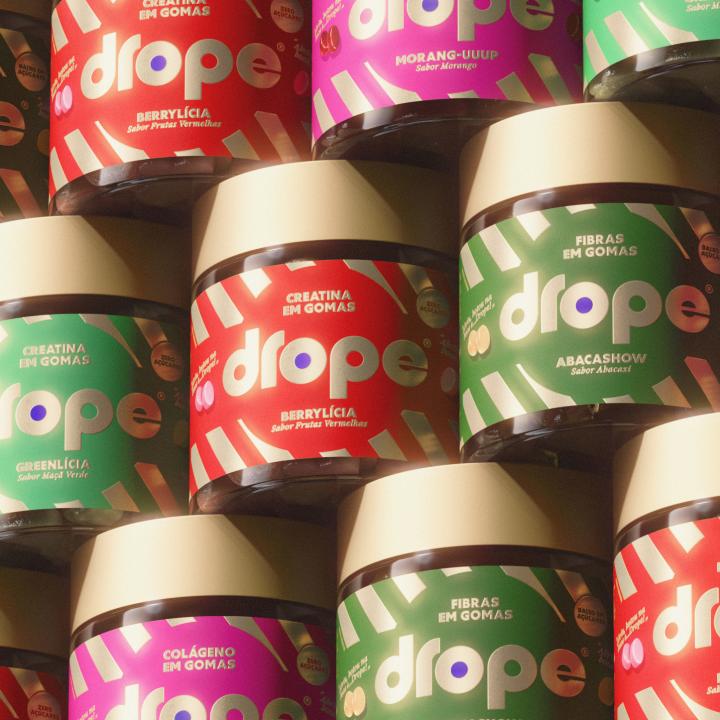
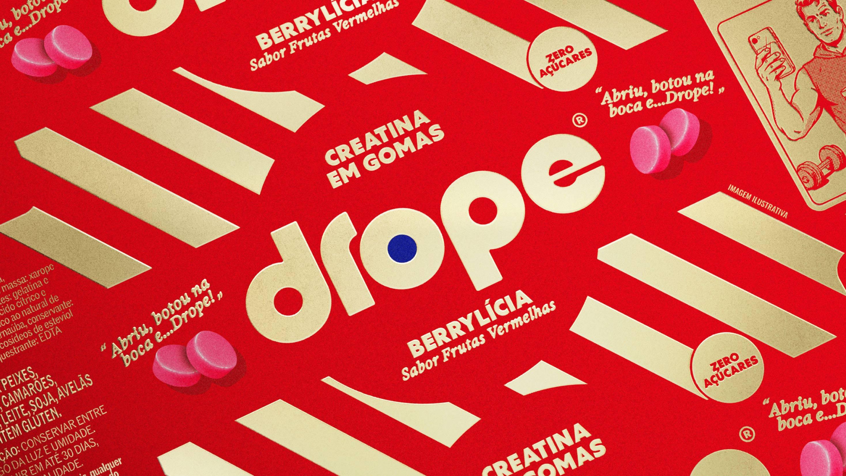
The logo plays a central role in the system. The filled-in “O” creates a focal point inspired by gummies, turning a simple typographic detail into an instantly recognisable brand asset.
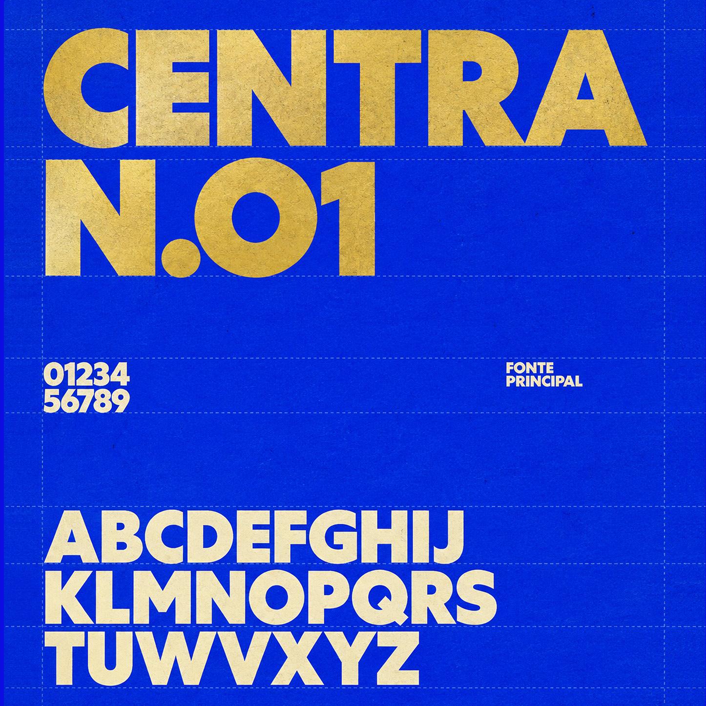
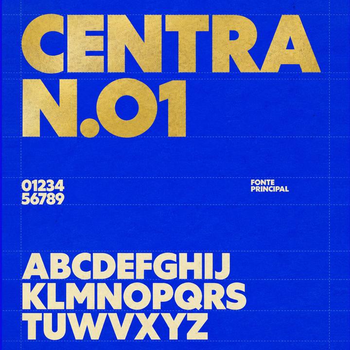
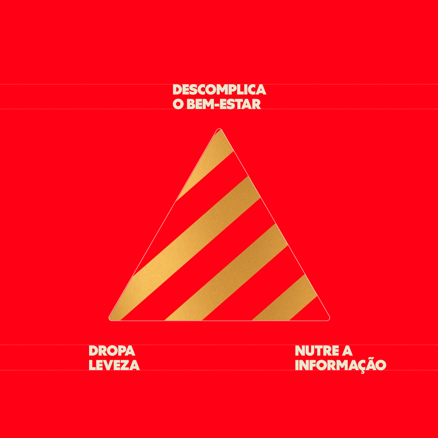
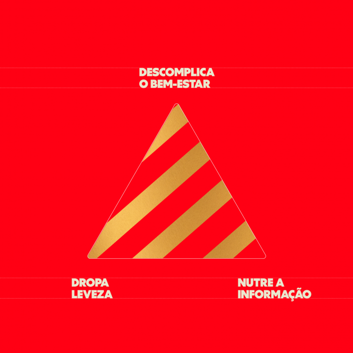
The typography balances impact and readability, bringing information and desire into the same space. Functional benefits remain clear without losing visual appeal. The colour palette pairs bright shades inspired by classic sweets with gold, adding sophistication and reinforcing the brand’s premium positioning. Secondary colours expand the system further, creating a flexible architecture designed to grow with the portfolio.
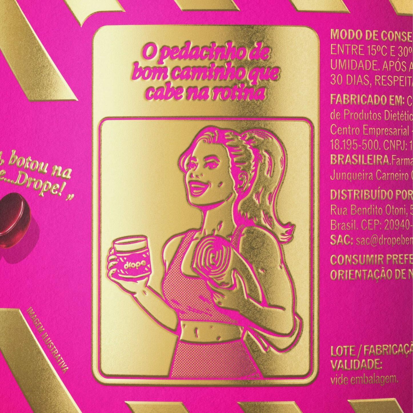
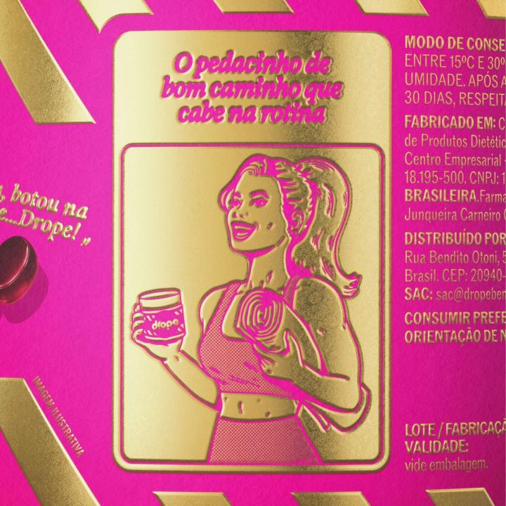
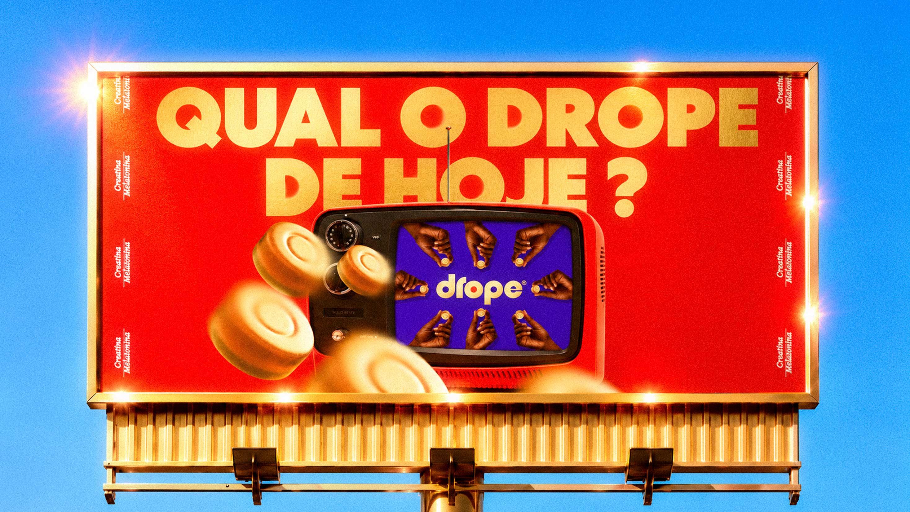
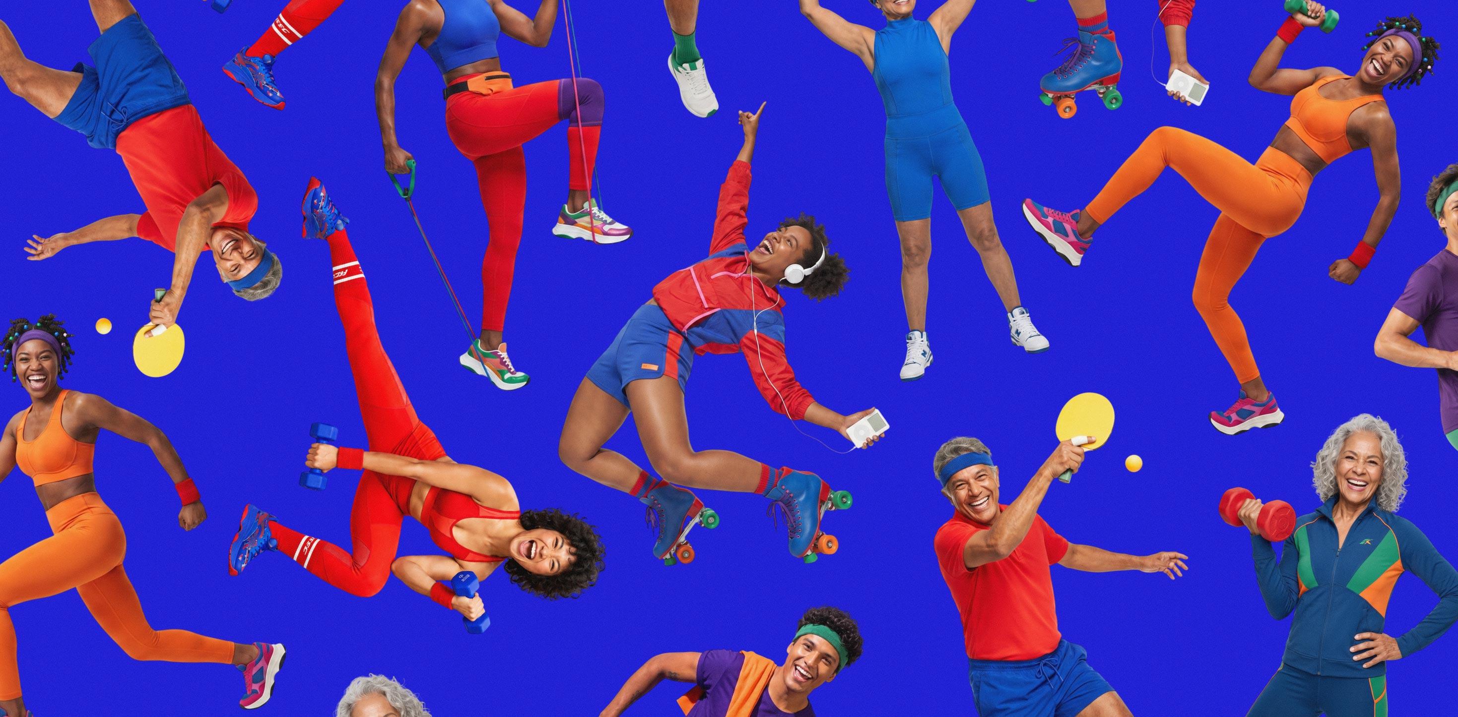
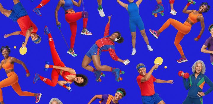
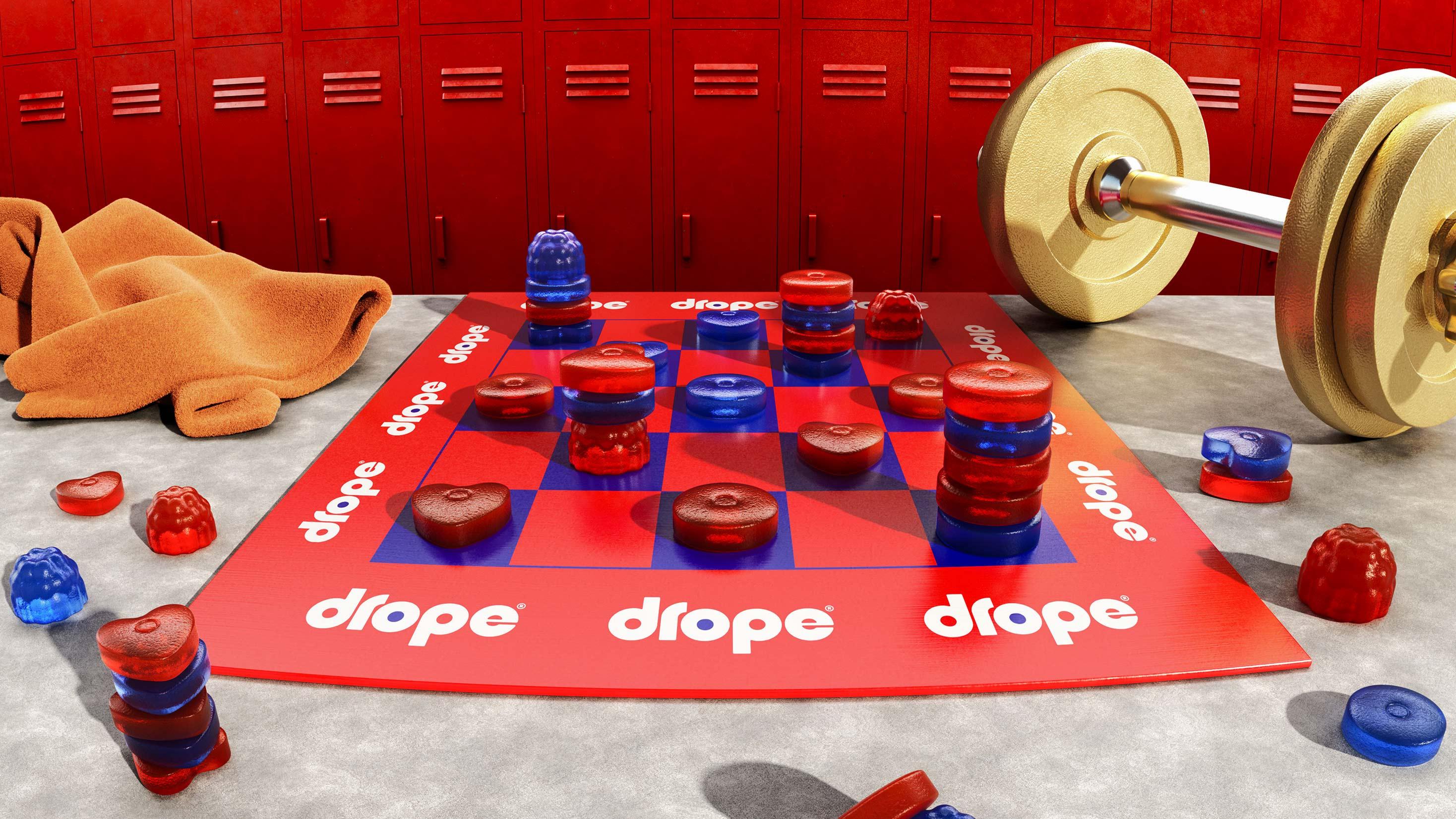
Stripes, patterns and photographic cut-outs inspired by vintage graphics complete the visual world. The illustrations reference pop art and old comic strips, showing different moments of consumption and making self-care feel lighter, more playful and less expected. A playground for grown-ups.
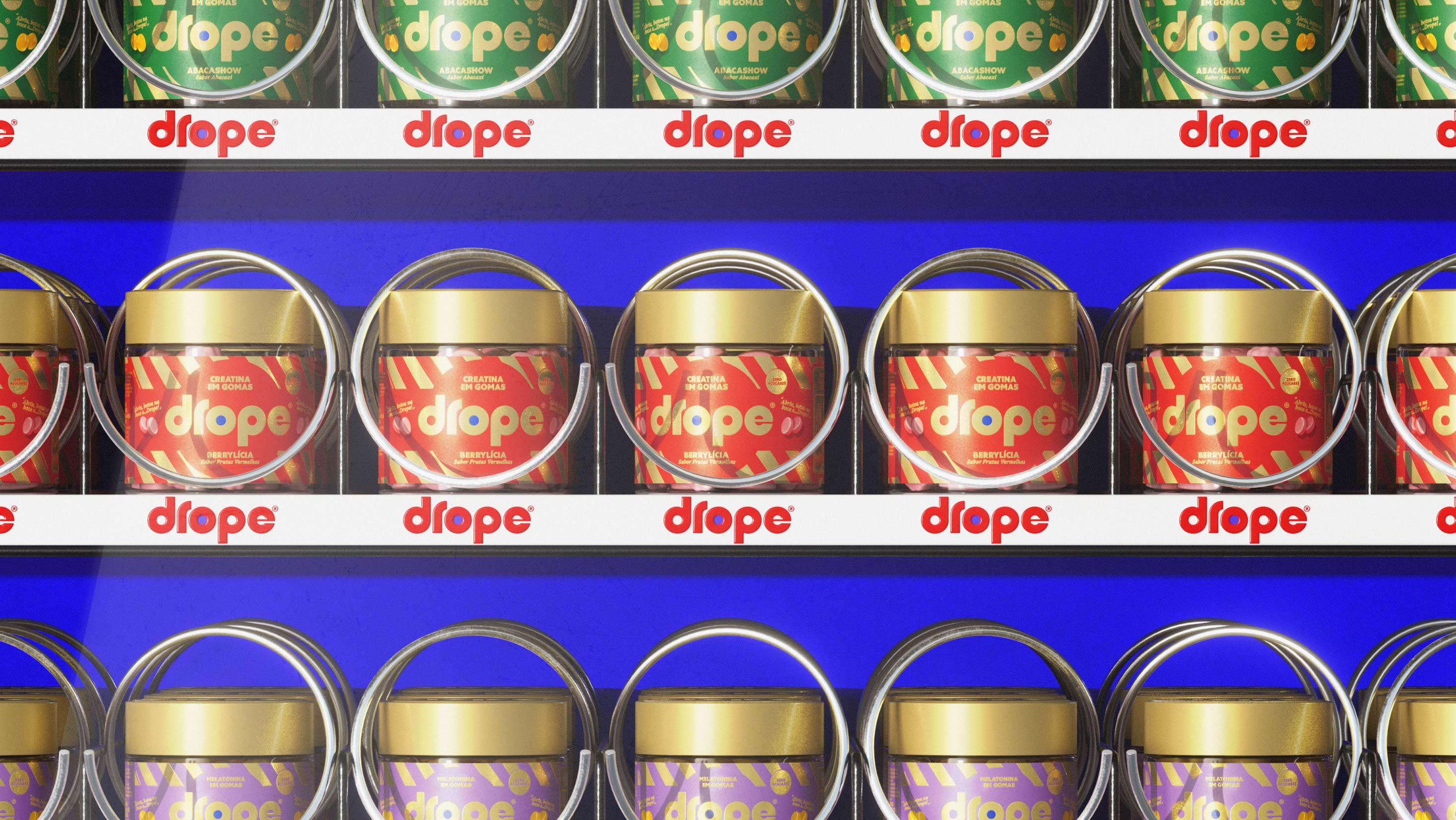
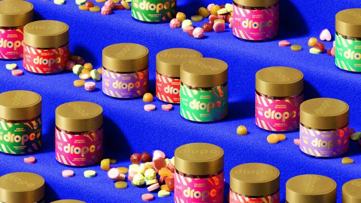
The packaging carries this idea through every detail. We created a system designed to grow with the brand while keeping consistency across gummies, caramels, chewing gum and future launches. Indulgent photography makes the products feel desirable, while a clear information hierarchy organises benefits, ingredients and functional details in a simple, accessible and highly appetising way.
The verbal identity pushes the same idea further by making the language of supplementation easier and more enjoyable. Expressions associated with childhood take on new meanings in an adult context, balancing humour, information and indulgence without ever feeling childish. It gives Drope its own way of showing that science and flavour can speak the same language, captured in the brand line: Wellbeing that tastes good.
The project was developed as one connected system, from strategy through to the launch campaign. Social media, influencers, trade and every other touchpoint were brought together around the same idea: bringing more flavour into supplementation.
Because taking care of yourself does not have to feel complicated. And wellbeing can taste good.