Tia Sônia consolidated itself in the Brazilian market by arousing the pleasure of eating health and nutritious food. From the homemade granola prepared for her son Marcos,
Sônia now runs a production that nurtures people in several places in Brazil. The brand conquered the care and admiration of the Brazilians by combining natural ingredients
and family recipes in all its products. After all, caring for others through food is the purpose driving Tia Sônia.
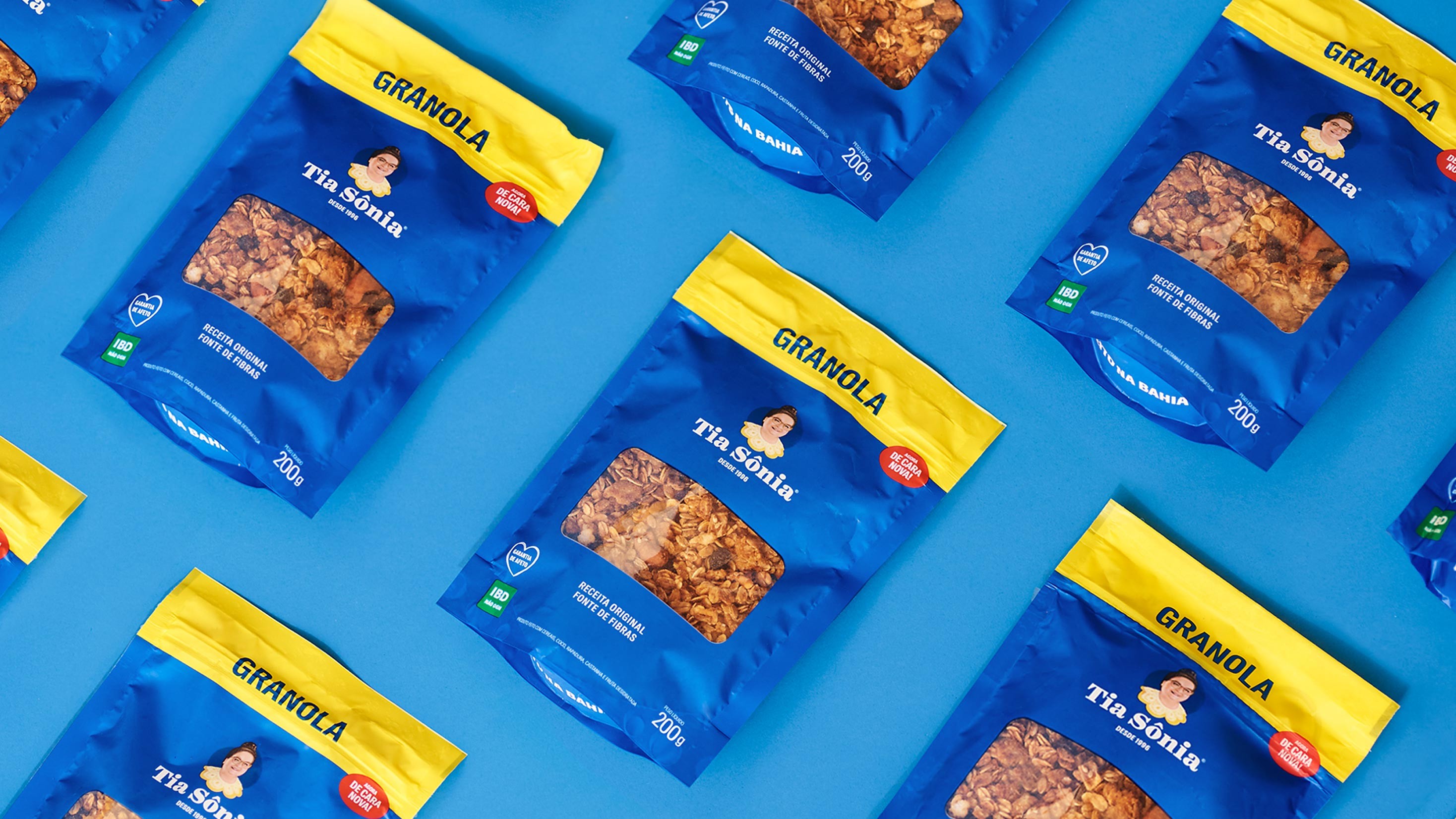
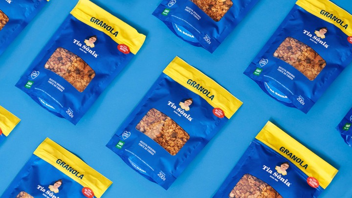
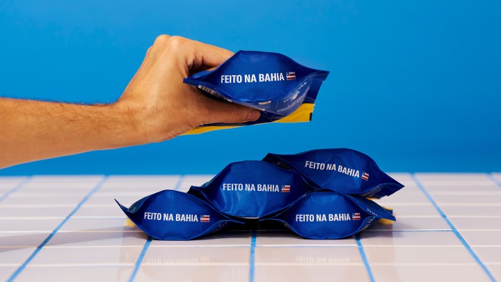
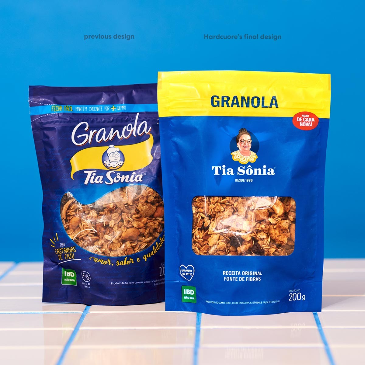
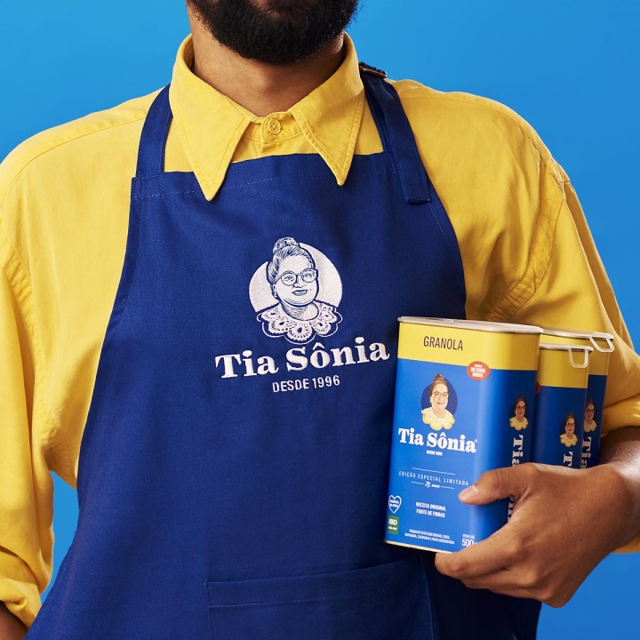
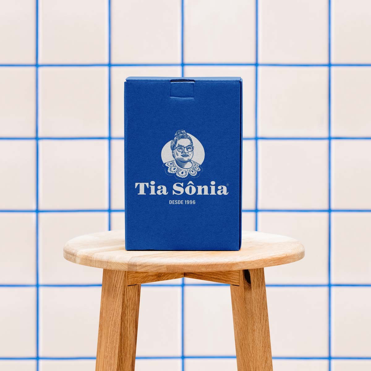
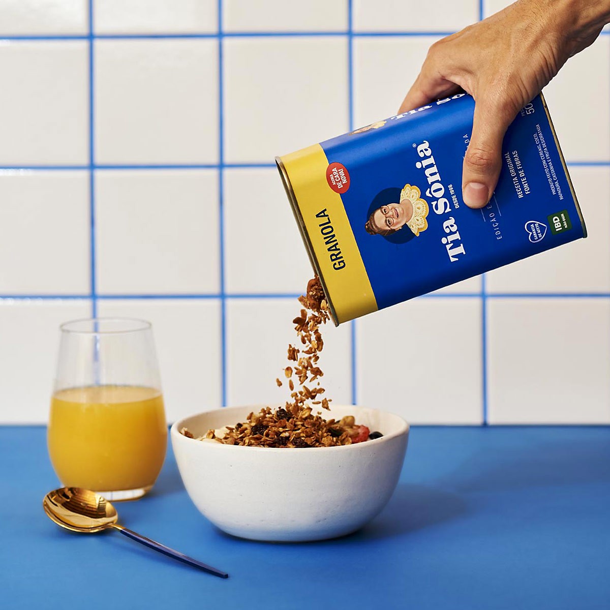
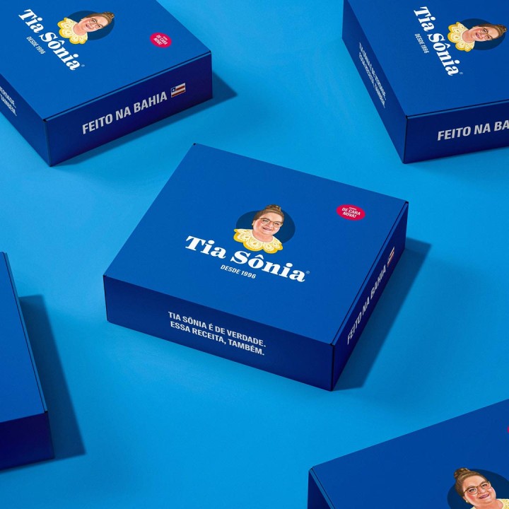
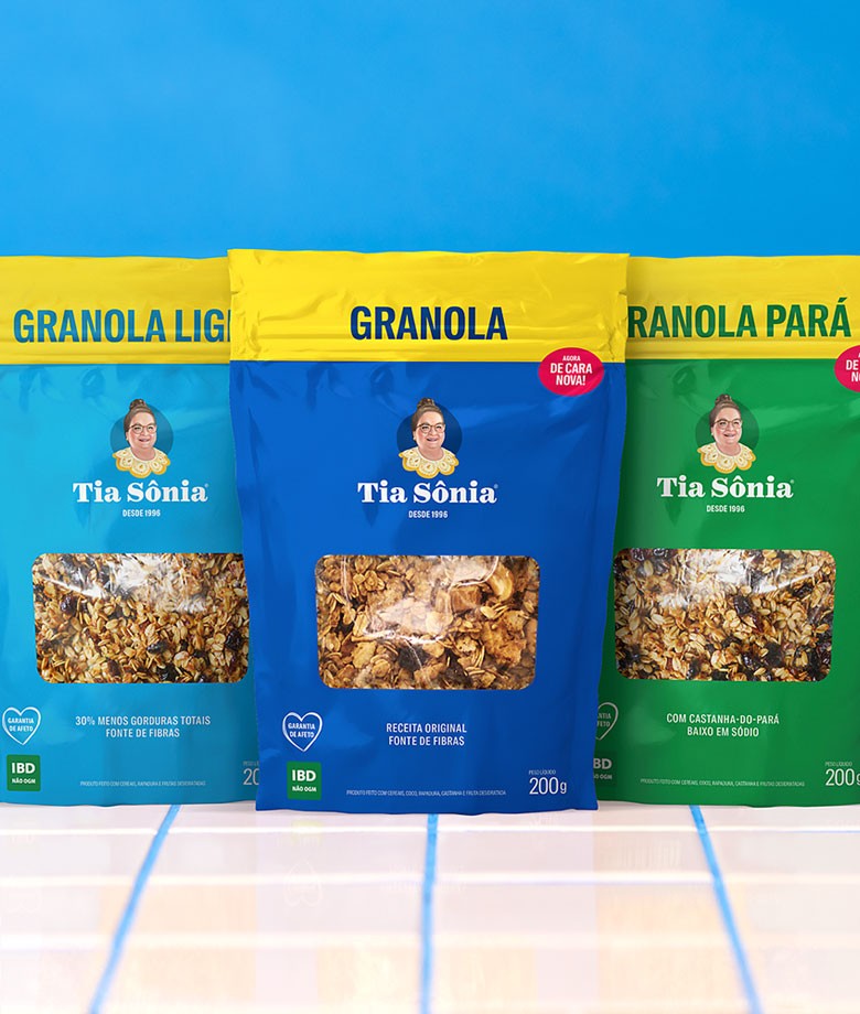
Hardcuore took on the challenge of redesigning this brand that has a special place in the life and imagination of so many people. To translate its essence into the design, we rescued all its tradition, pointing out a consistent and long-lasting path into the future. We have also created a new and special packaging in the form of a can to celebrate the 25 years of history of the brand, presenting its new visual identity to the public.
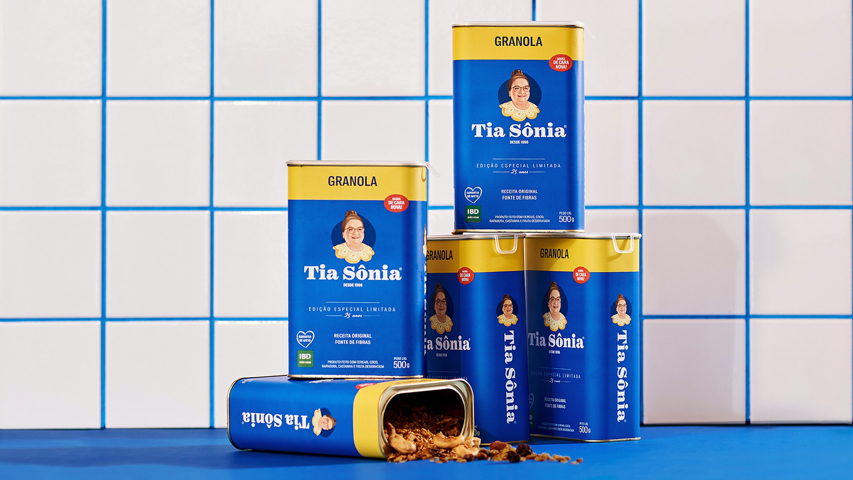
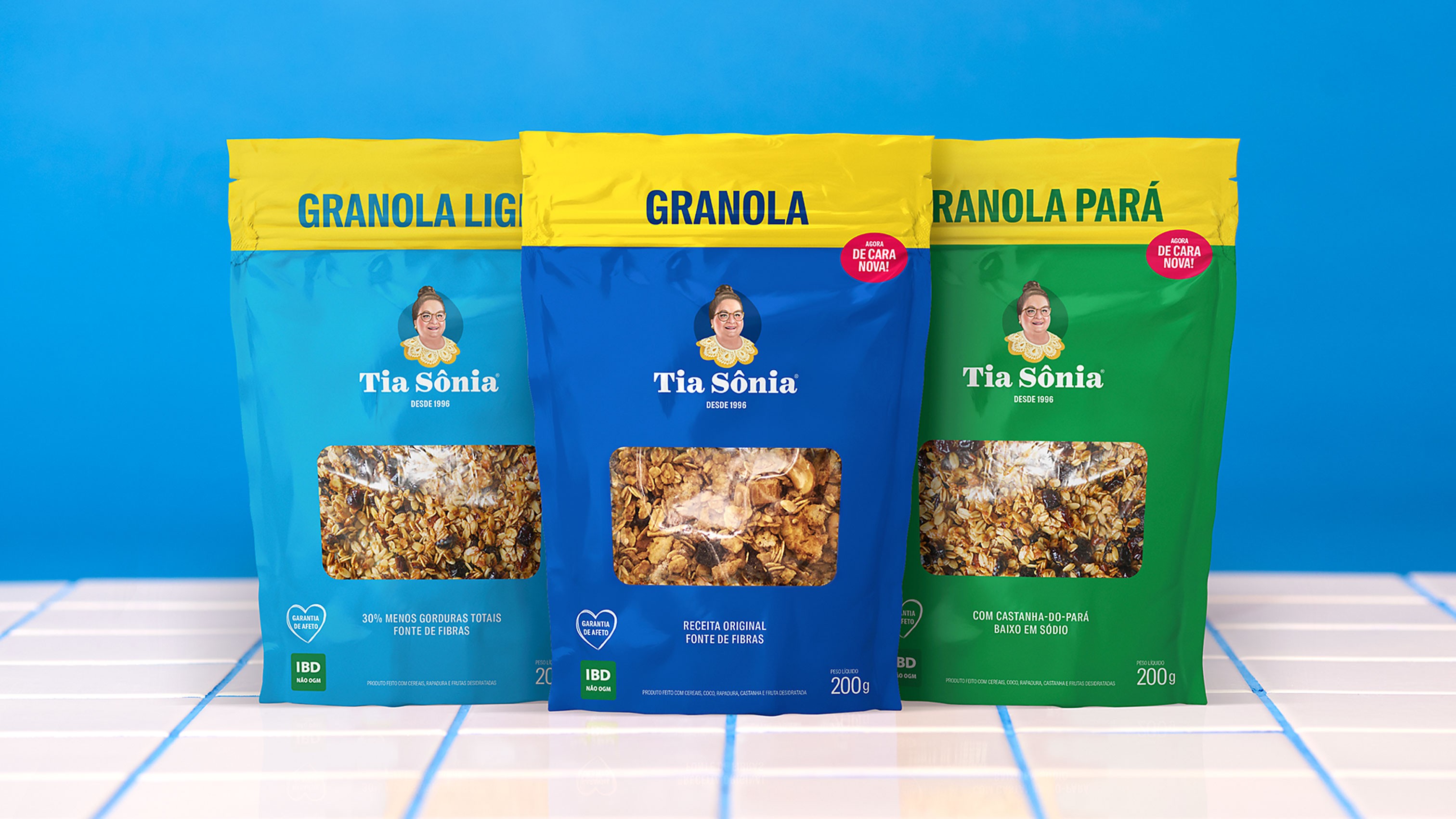
With a brand-new image, Tia Sônia changed, but continues being recognized by its most remarkable characteristics. Therefore, we preserved its colors, updating them to more
vibrant shades, and kept some elements from the original packaging, adding more details to it.
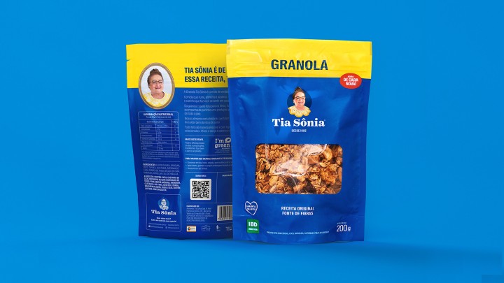
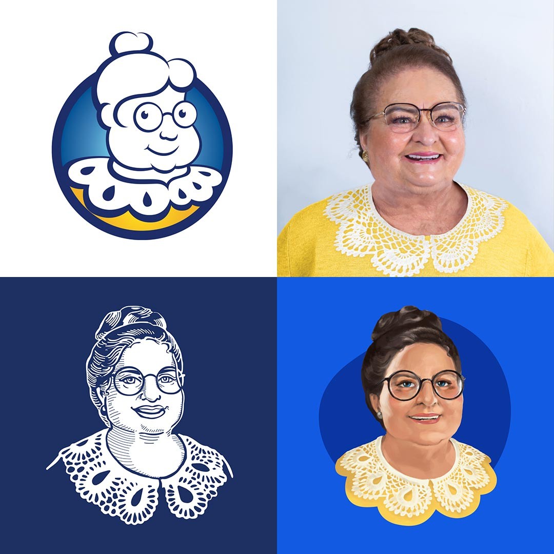
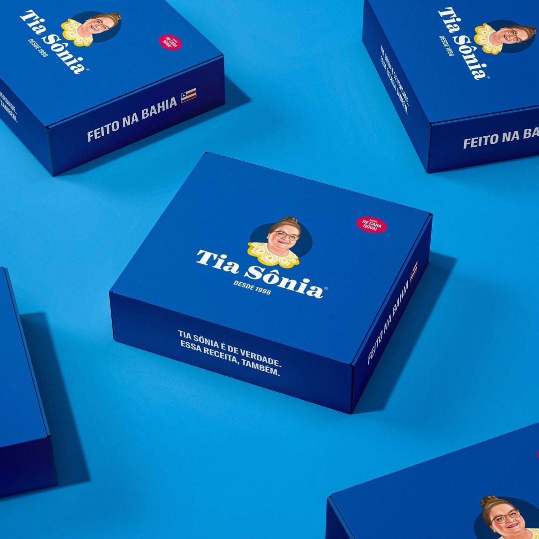
The lace collar from Bahia, for instance, with all its regional and cultural meaning, remained. Other essential details, such as the bust frame, the head slightly to the right,
and the pair of round glasses on Sônia also continued highlighting its originality.
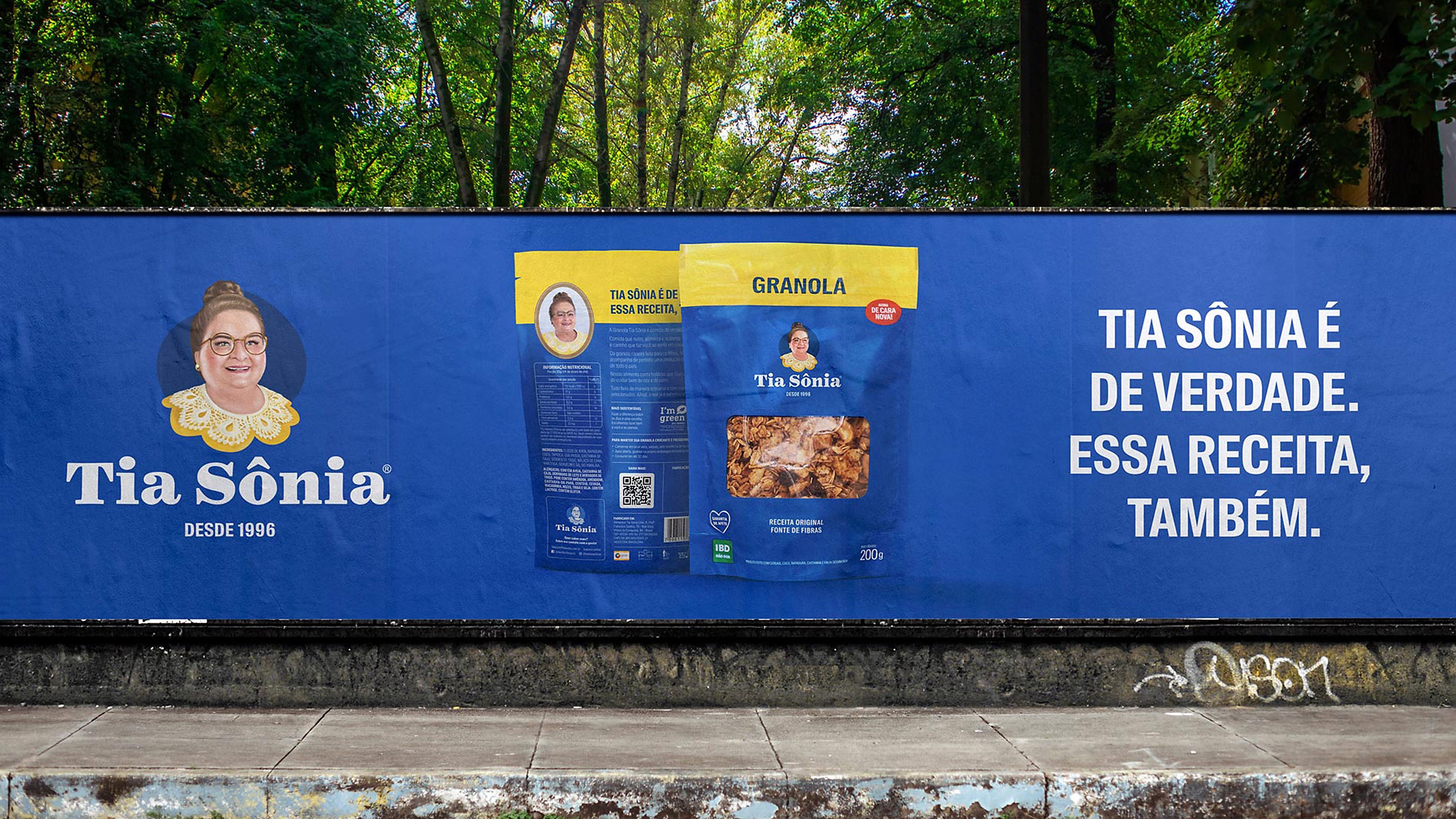
To generate an even better perception of the brand, its handcraft style, and the quality of its product, we opted for a realistic visual language. Sônia, the company founder, is not a character, but an actual Brazilian, an authentic daughter of Bahia, who is proud of her origins. The product is also real, natural, without any artificial dye or preservatives. The concept reinforces the truthfulness and naturalness of the brand and its founder.
The creation process included the production of a photograph taken of Sônia, which reminds us of the first packages of the brand, an oil painting, and also a thorough sketching. In addition, we chose a stronger and more classical typography, which reflects the personality of this historical brand, which is part of the life of so many Brazilians.
Tia Sônia, the new classic. For those who enjoy real granola.