True
What is the flavor of movement? We redesigned True’s identity to translate the truth of its flavor and nutrition through design.
Purpose and design connected through movement. True is reborn with a vibrant identity that inspires authenticity in everyday life.


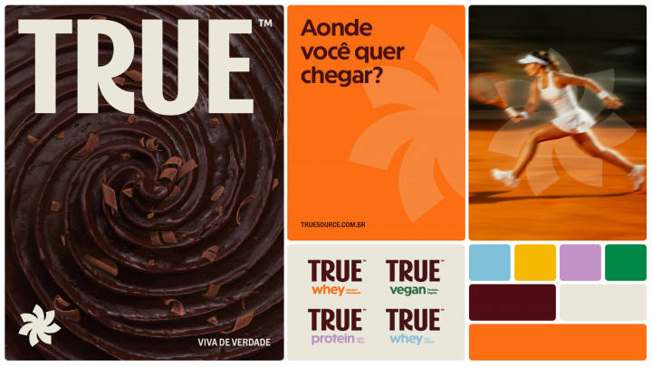



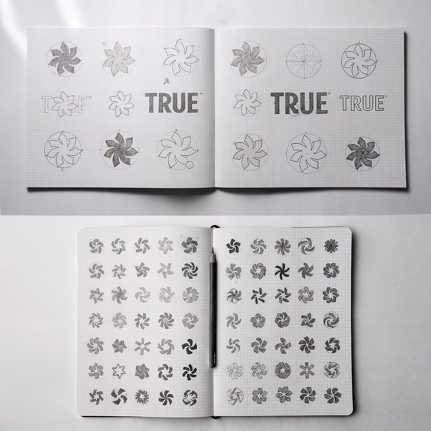

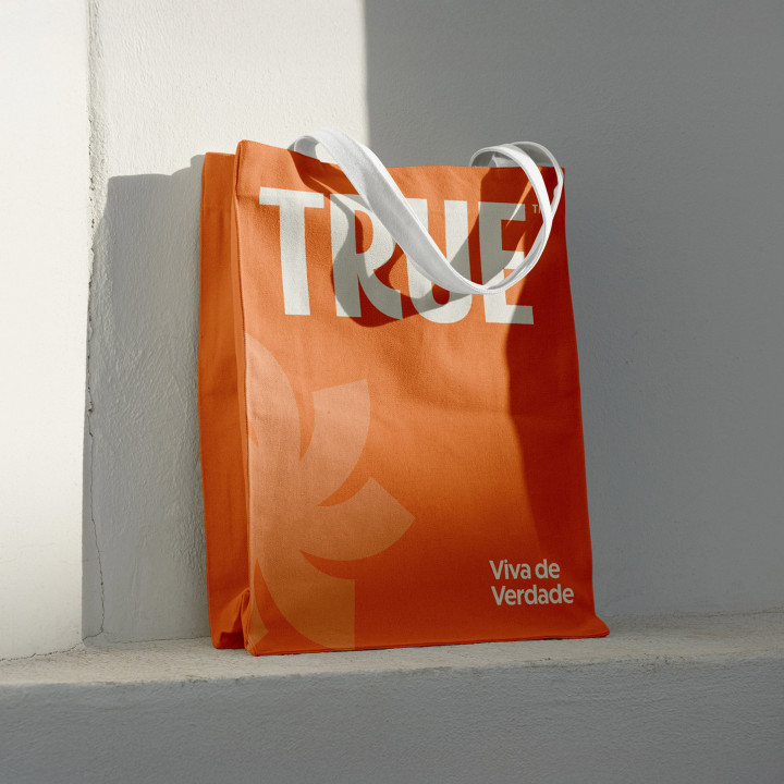
Movement connects both to the active daily life of the brand’s consumers and to literal references: the spin of a mixer, the rotation of a bicycle, the sun that illuminates and nourishes. All of these reinforce the vital energy that drives True and keeps pace with its community.















See our works
-
Film -
Design -
Communication
Hello stranger
Do you have the right project for us? Get in touch and we will get back to you soon.
contato@hardcuore.com +55 21 3178 0787Subscribe to our newsletter.
Get the latest on new cases, projects, and more.
Flavor in Motion
We were invited to redesign True, a well-established supplement brand, to capture a new chapter for the company: more direct, sophisticated, and aligned with the wellness universe.
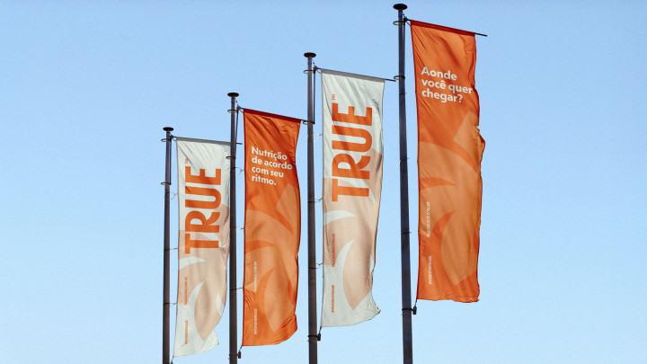
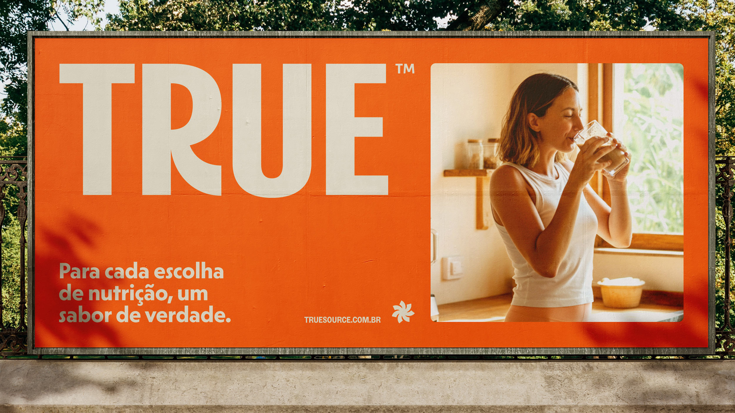
Formerly known as True Source, the brand is now simply TRUE, reinforcing authenticity and purpose with the signature “Live True”, a statement about clarity, quality, and the sum of the elements that truly matter for a balanced life.
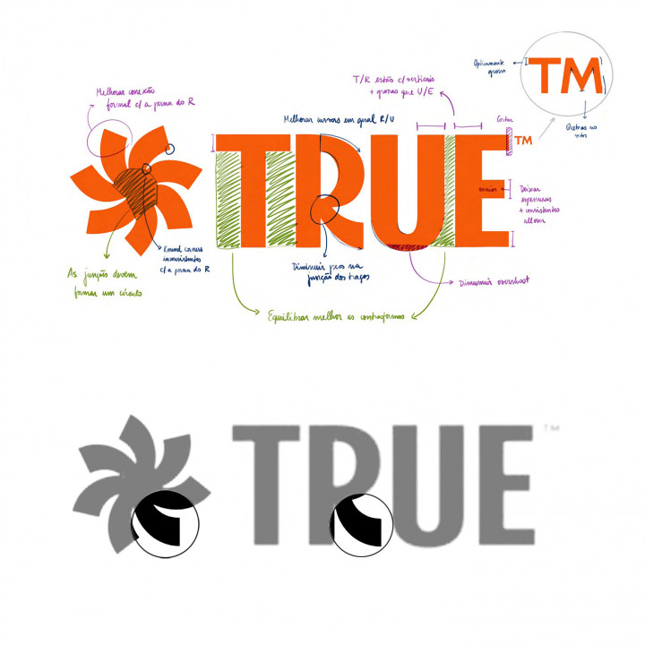
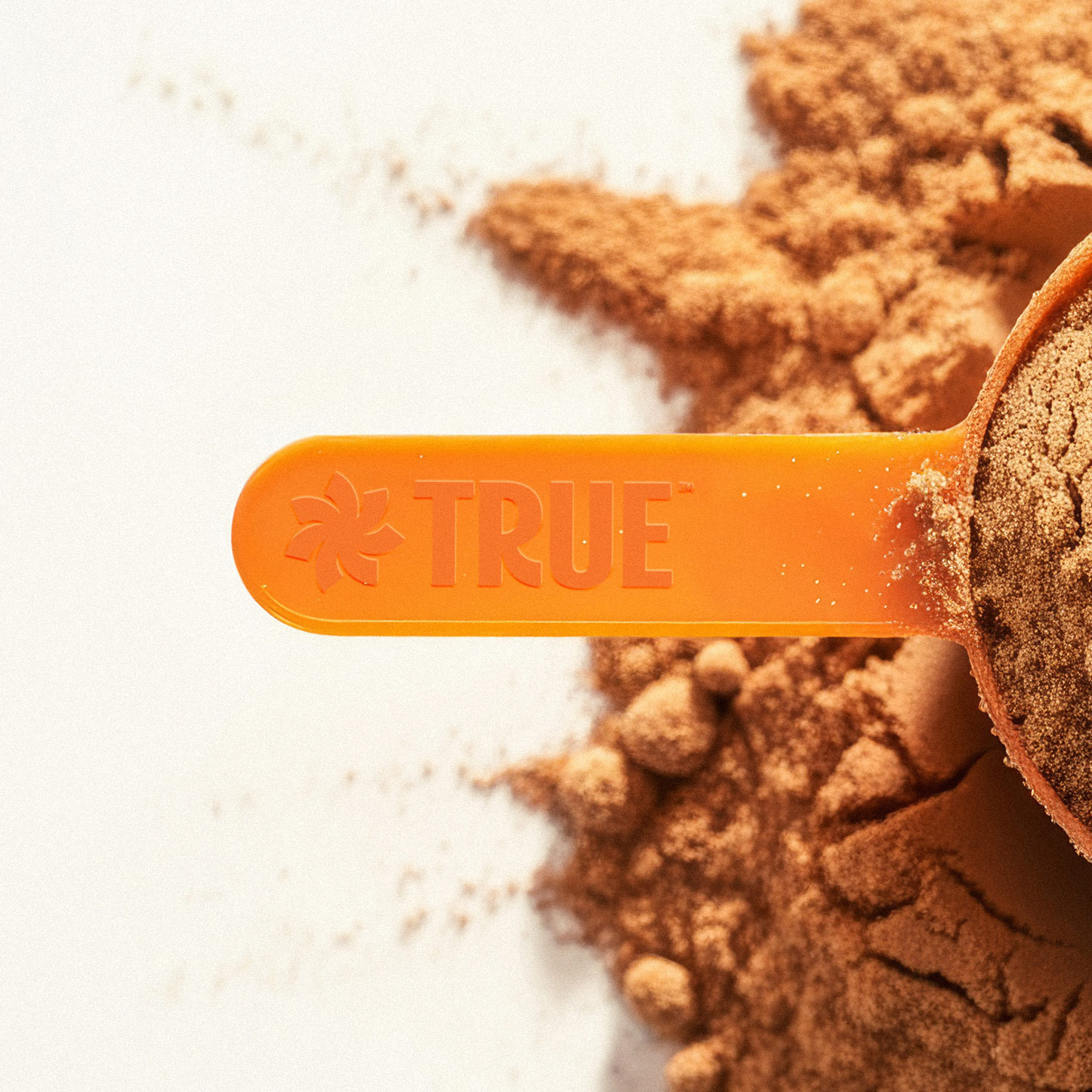
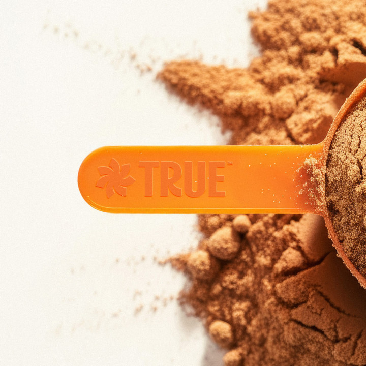
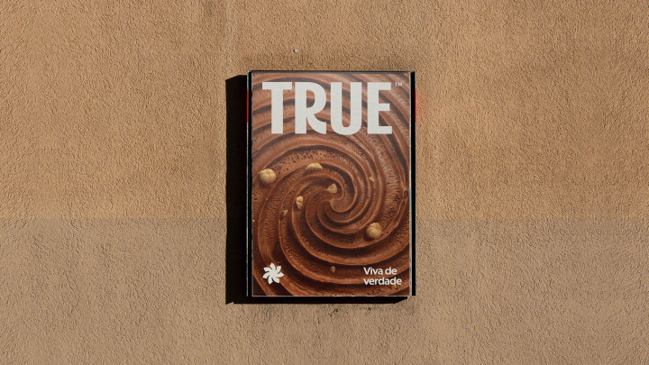
Our challenge was to build a proprietary identity that conveyed truth in flavor, nutritional value, and lifestyle. To achieve this, we developed a logo and symbol born from the idea of movement, a concept that runs through the entire identity, from the visual language to the appetite appeal of the products.
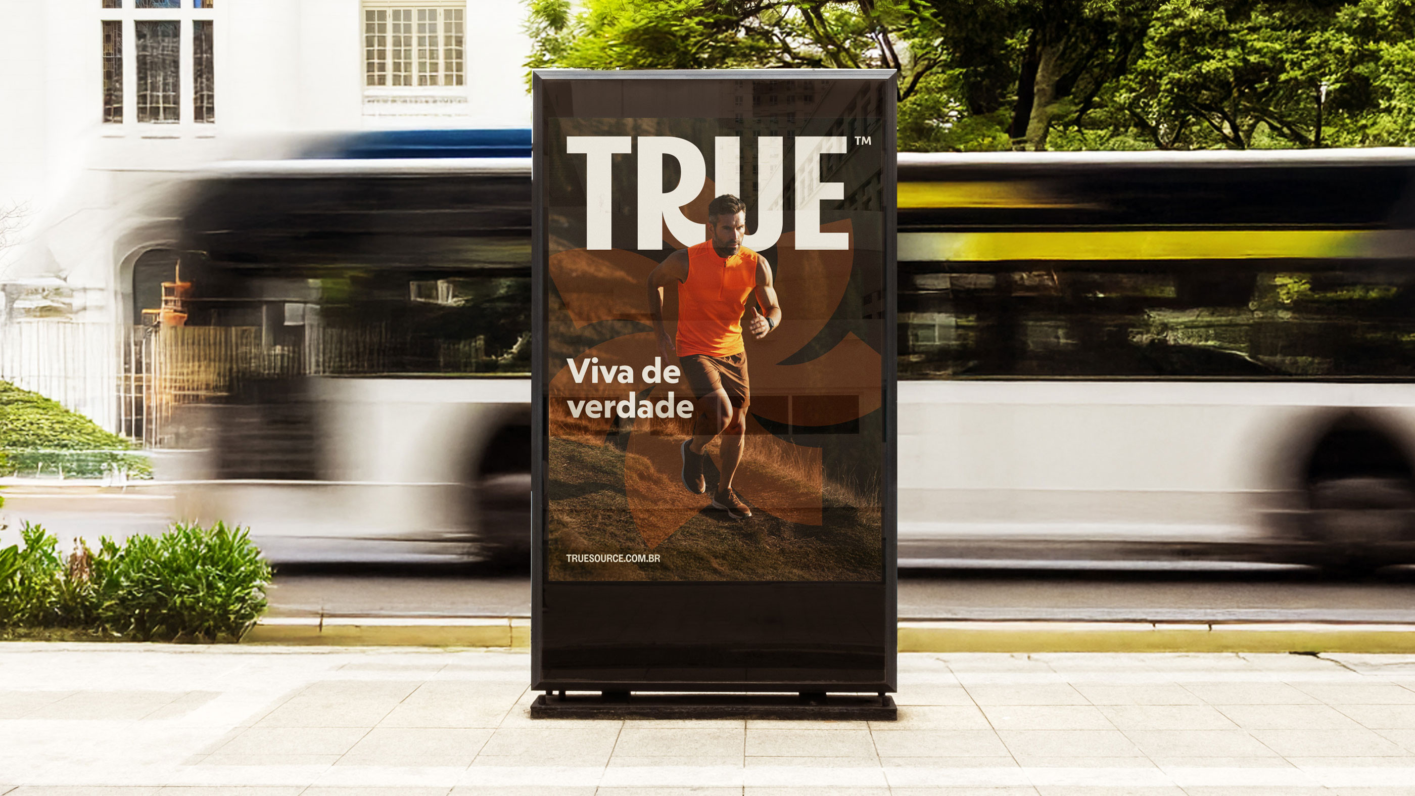
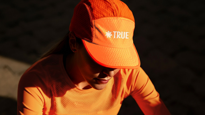
Movement connects both to the active daily life of the brand’s consumers and to literal references: the spin of a mixer, the rotation of a bicycle, the sun that illuminates and nourishes. All of these reinforce the vital energy that drives True and keeps pace with its community. The new identity reflects authenticity and sophistication, with a sunlit art direction, warm photography, and scenes that communicate pleasure, health, and well-being.
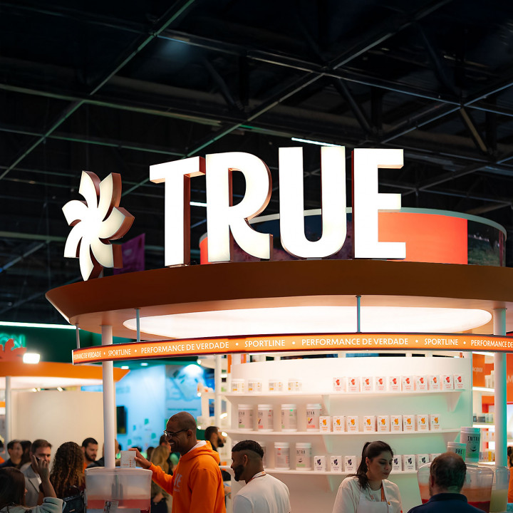
We designed a clear architecture for the sub-brands, ensuring consistency while highlighting each product line. The design expresses the strength of a premium brand that goes beyond performance, it is about living well, with balance and flavor.
True is reborn as a living and impactful system, a vibrant, proprietary brand in constant movement, just like the people it inspires.
Credits
-
Agency
-
HardCuore®
-
Creative Direction
-
Breno Pineschi + Rafael Cazes
-
HardCuore Team
-
Priscila Czuka, Luiza Pfeifer, Fernanda Rodrigues, Gabriela Barbosa, Felipe Teobaldo, Clarisse Svaiter, Alex Rezende, Lucca Pineschi, Vinícius Cambruzzi, Marina Ferreira, Pedro Lambuja e Vanessa Gomes.
-
Typographic Refinement of Logo
-
Cyla Costa


