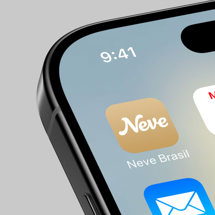
Neve
We created the new visual and verbal identity for the brand that has led brazilian bathrooms for the last 50 years.
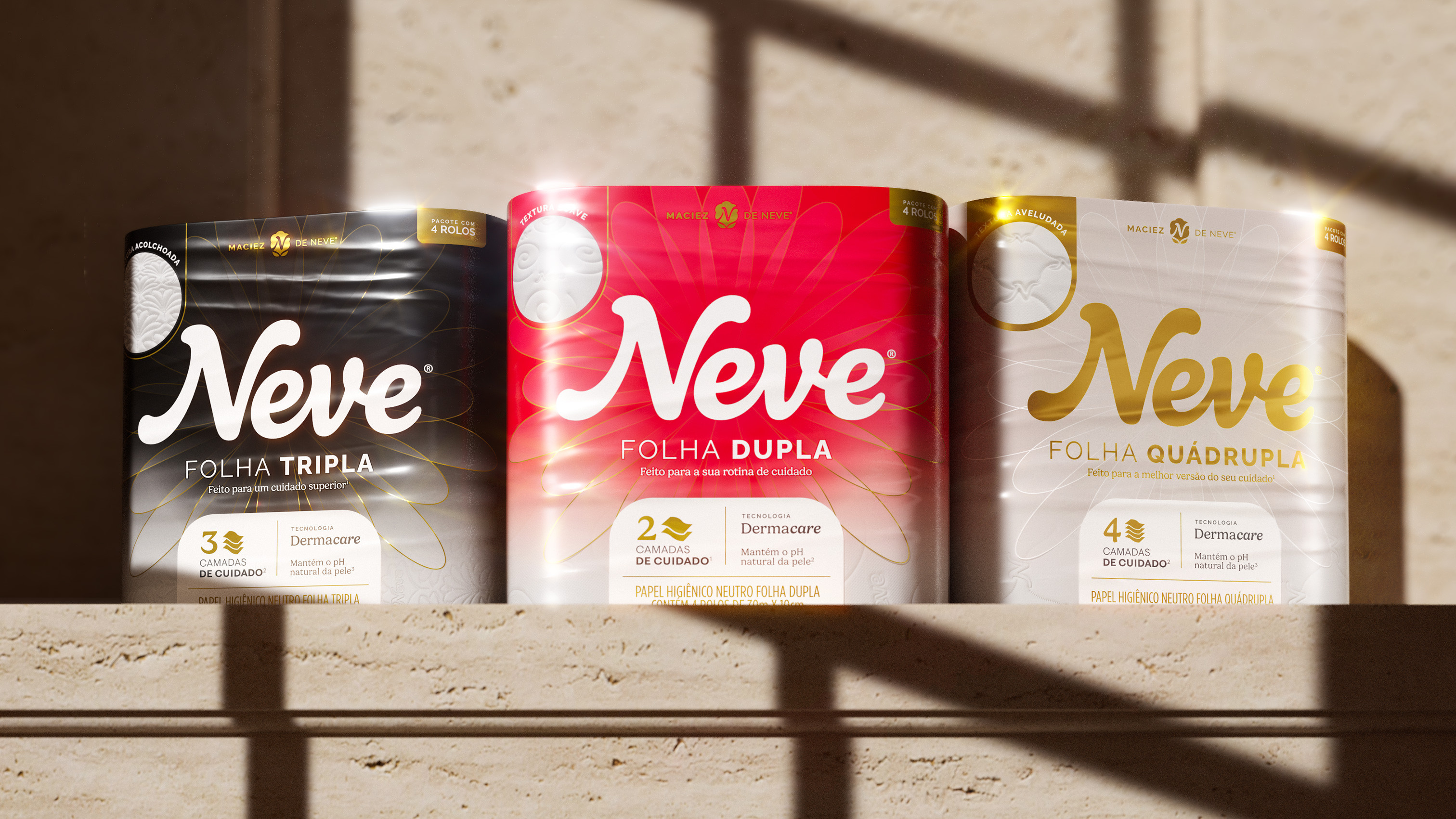

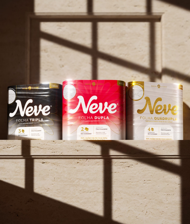

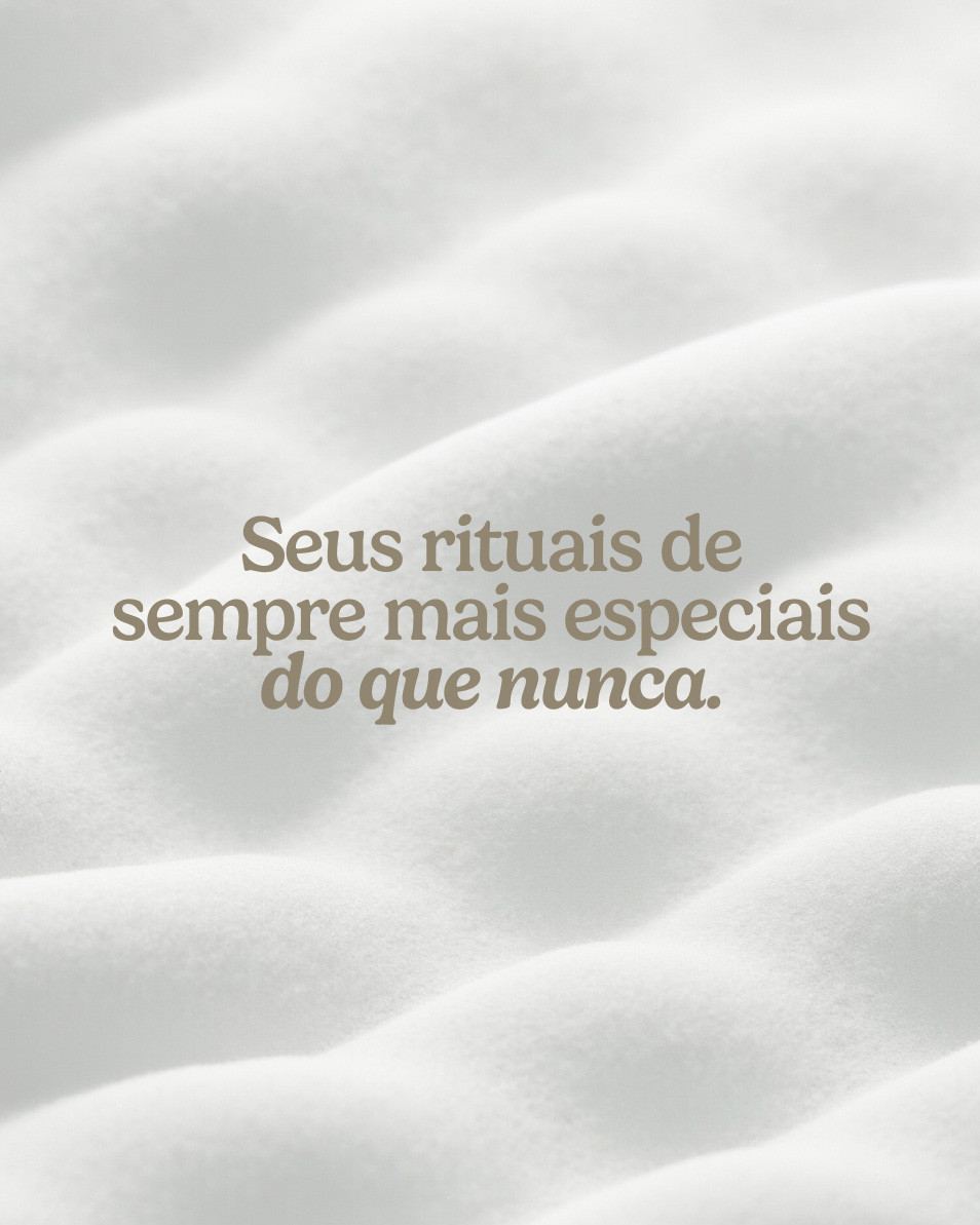
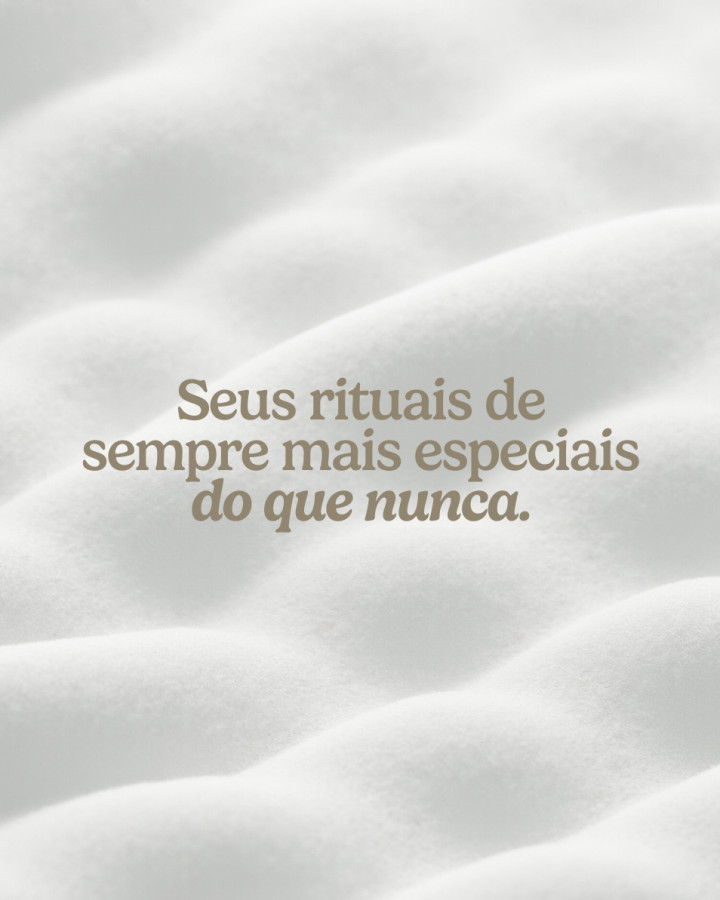
It’s the end of the bathroom you know and the beginning of the one you deserve.
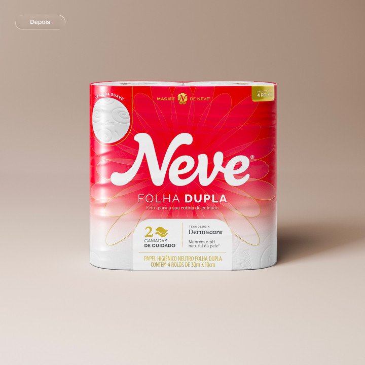
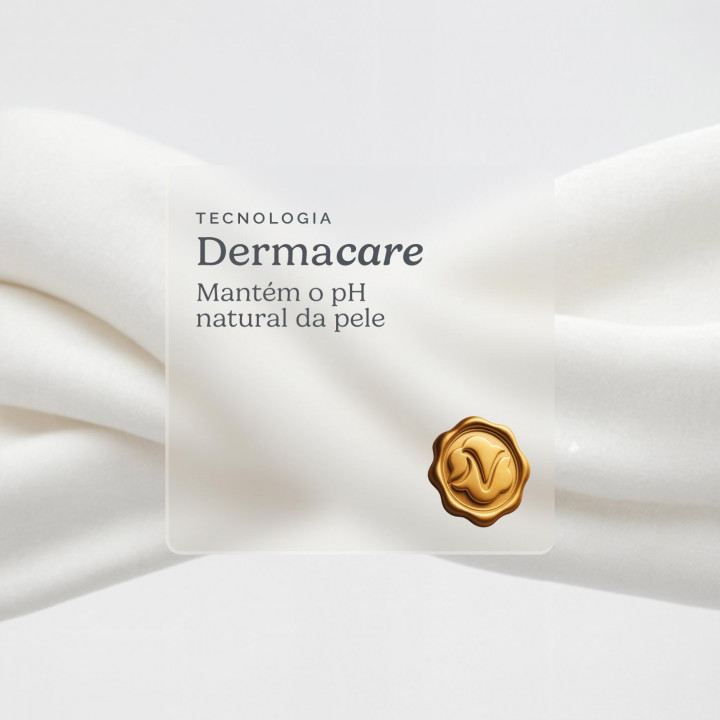
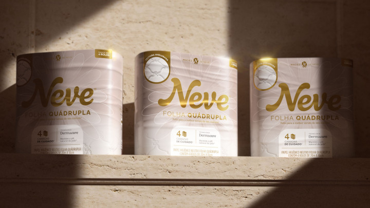
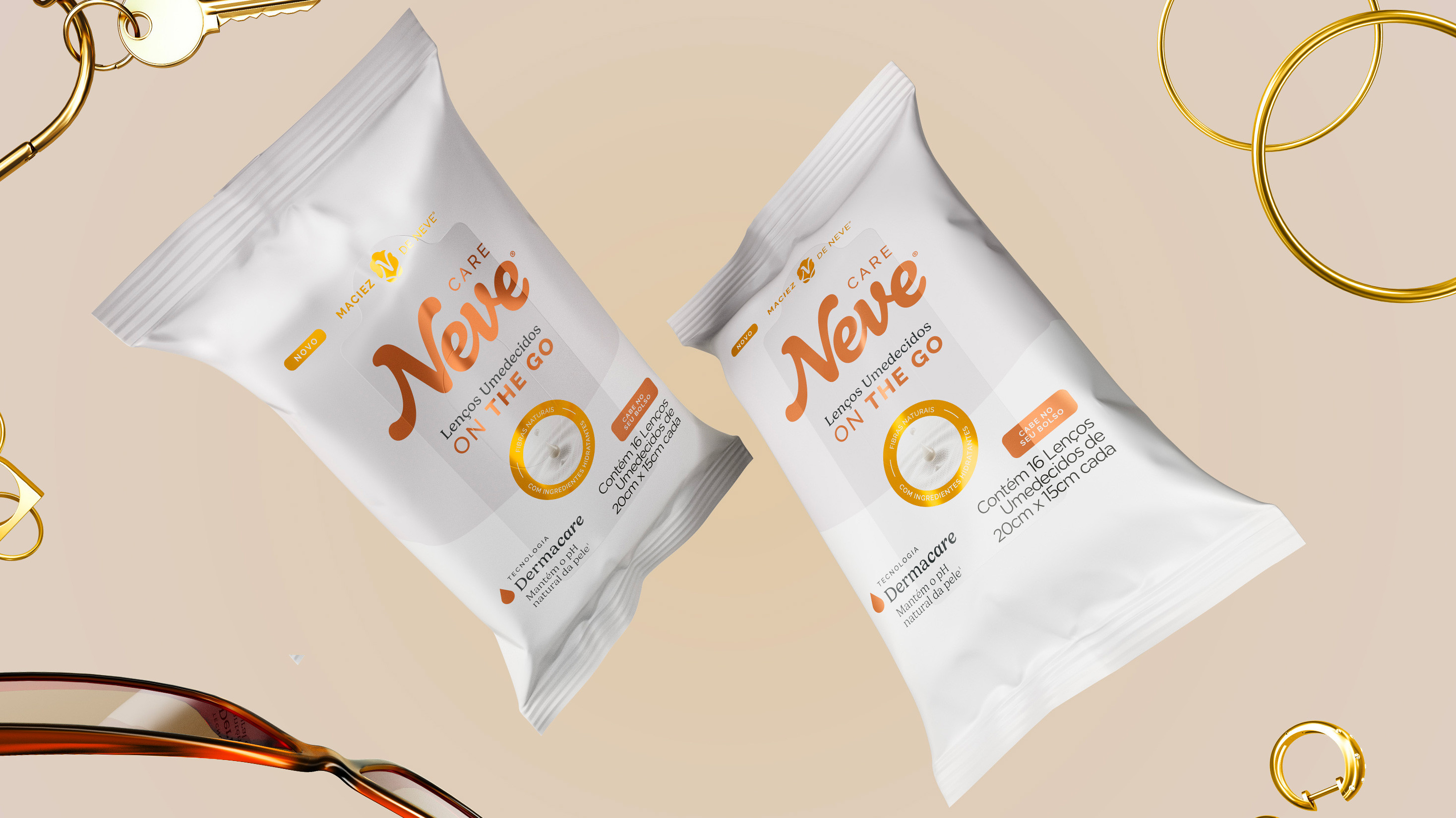
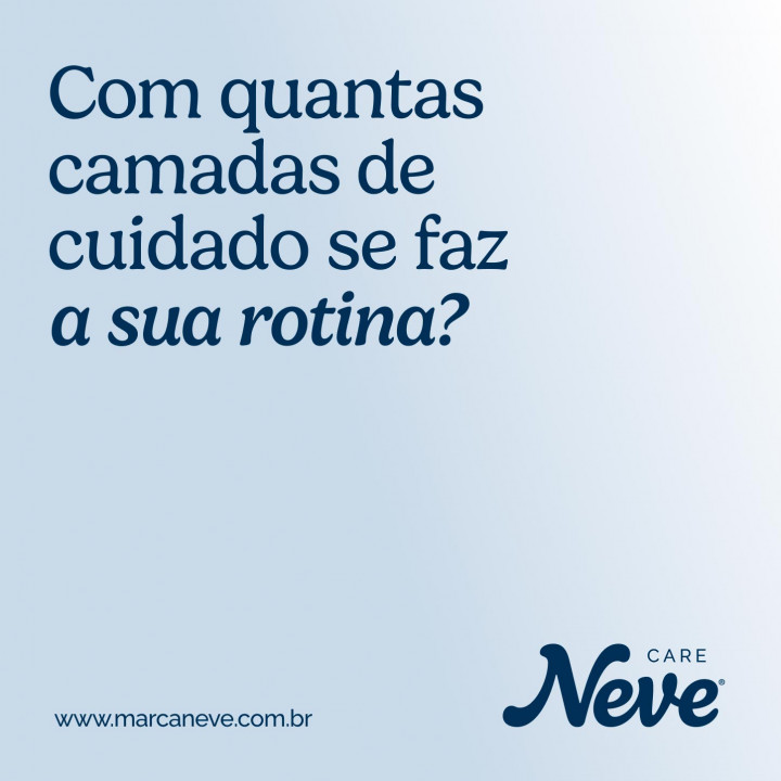
Neve’s new identity evolves the brand to show how many layers of care it takes to build a routine.
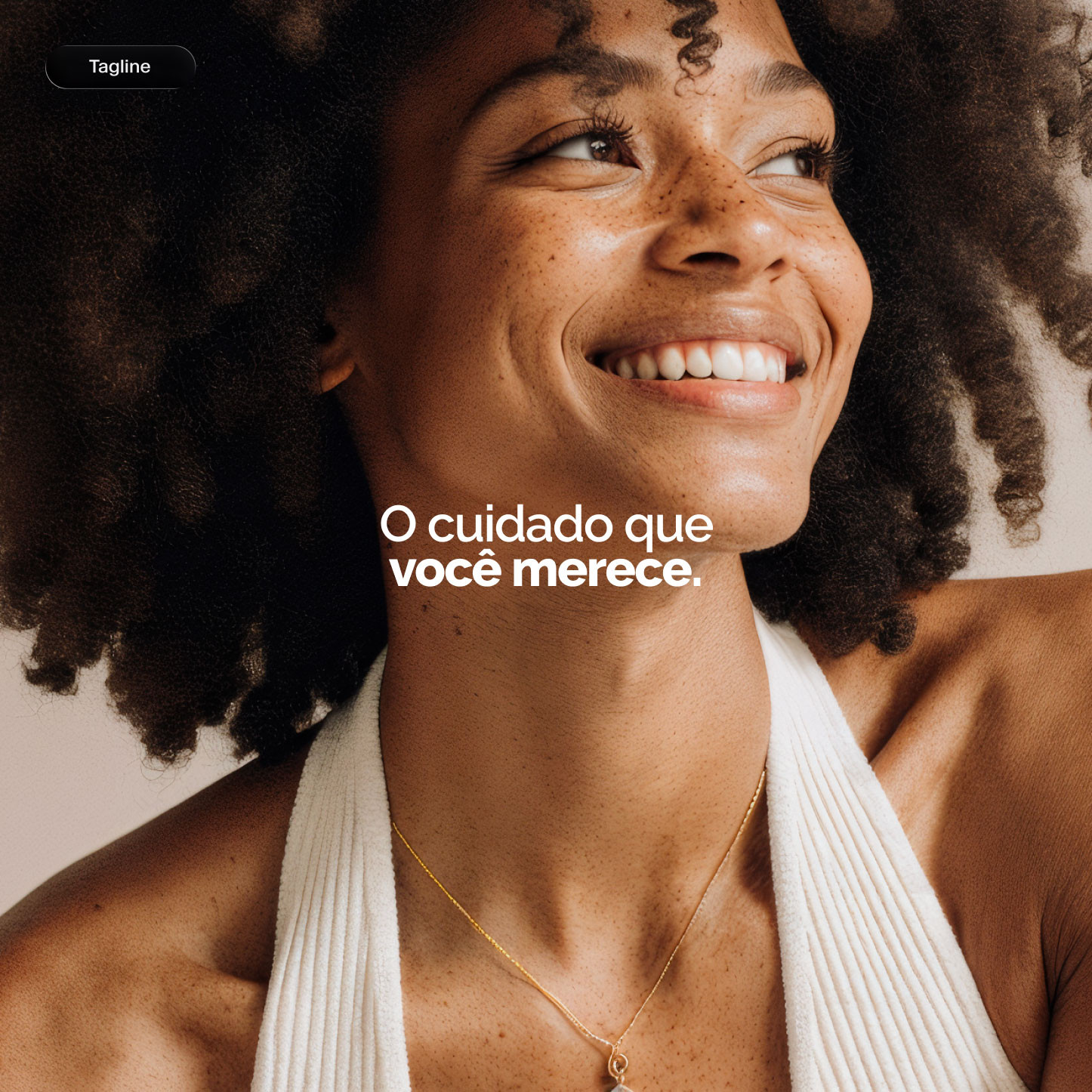


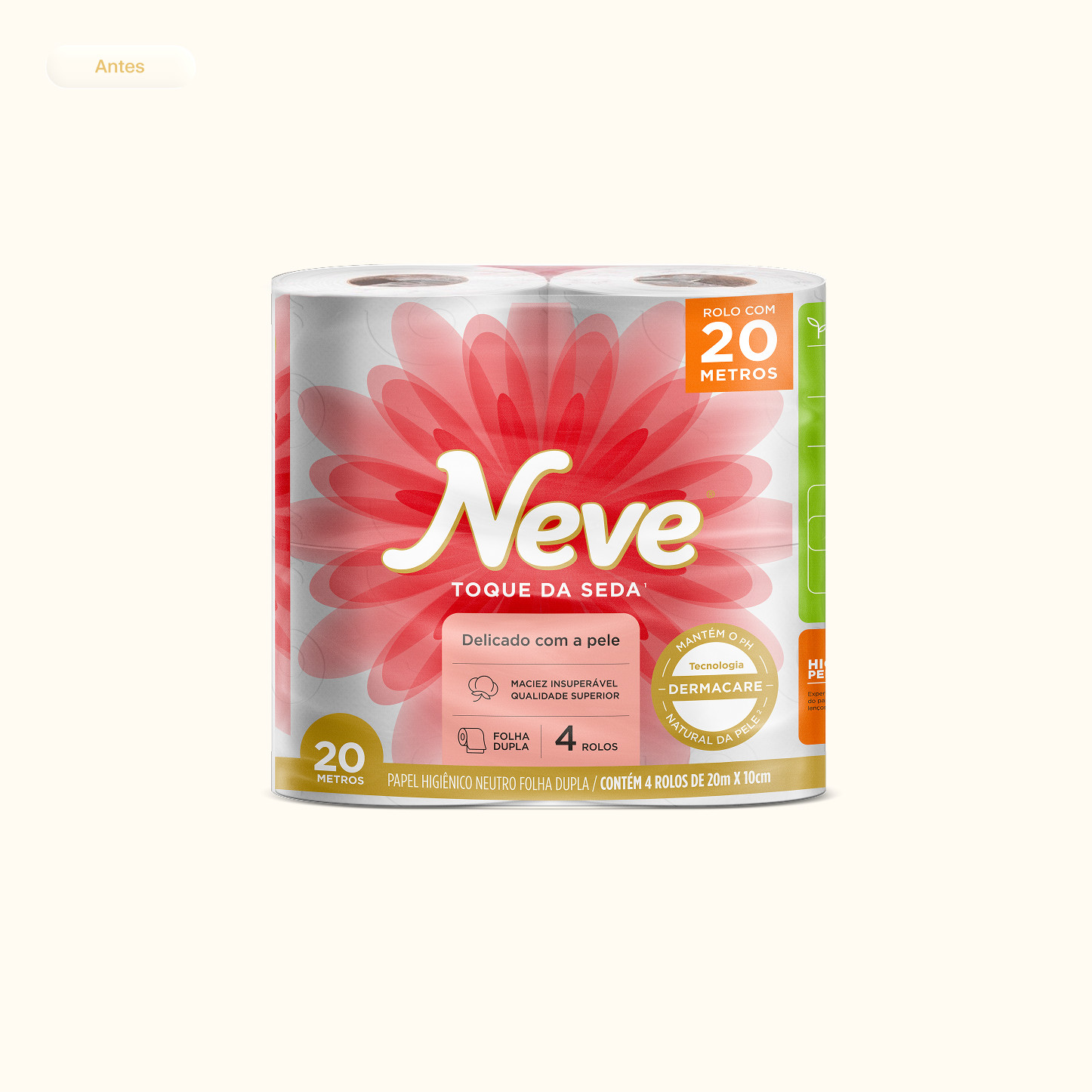
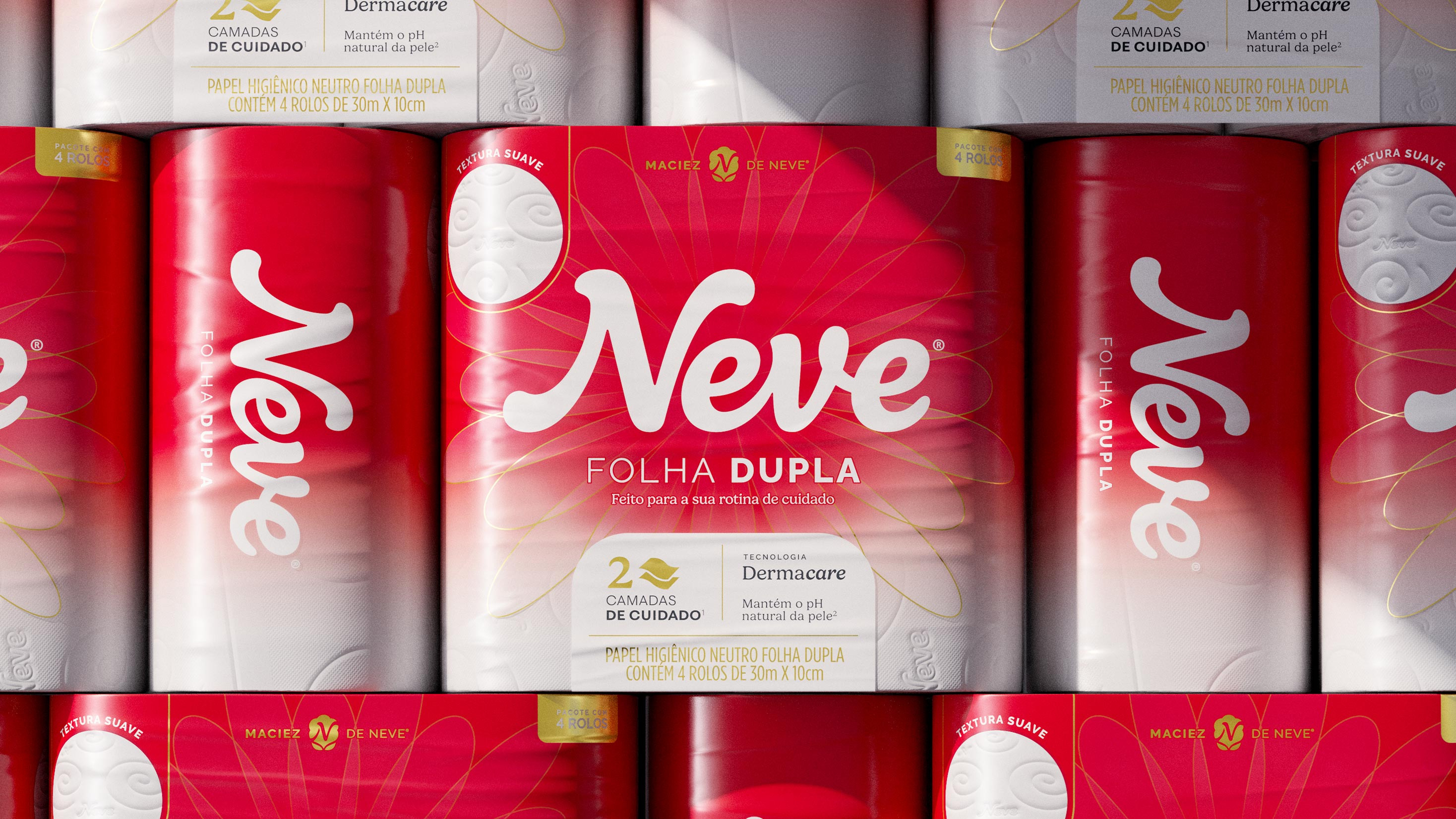
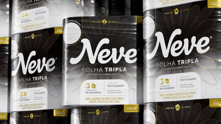
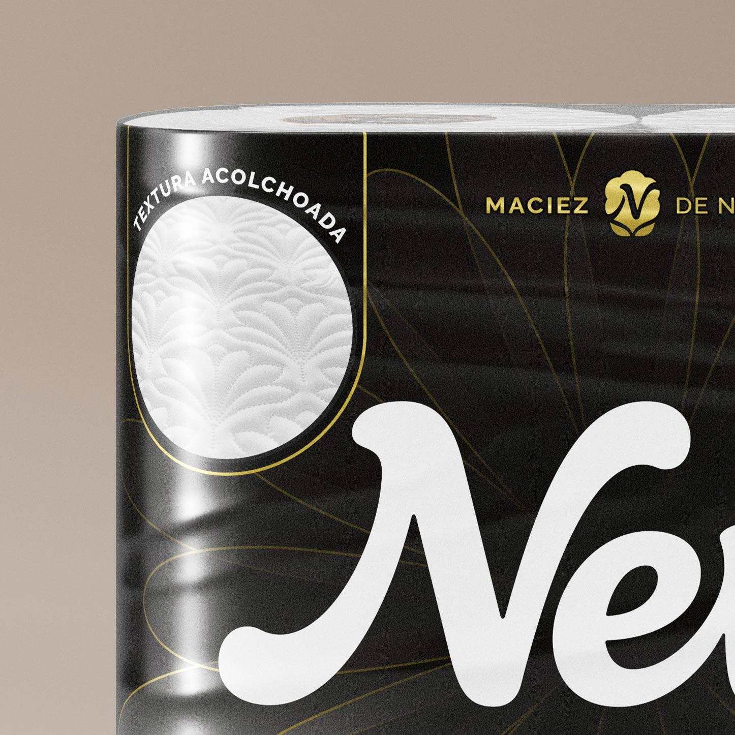
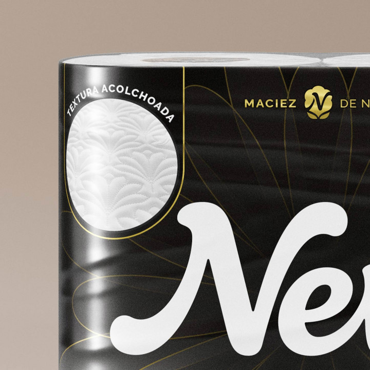
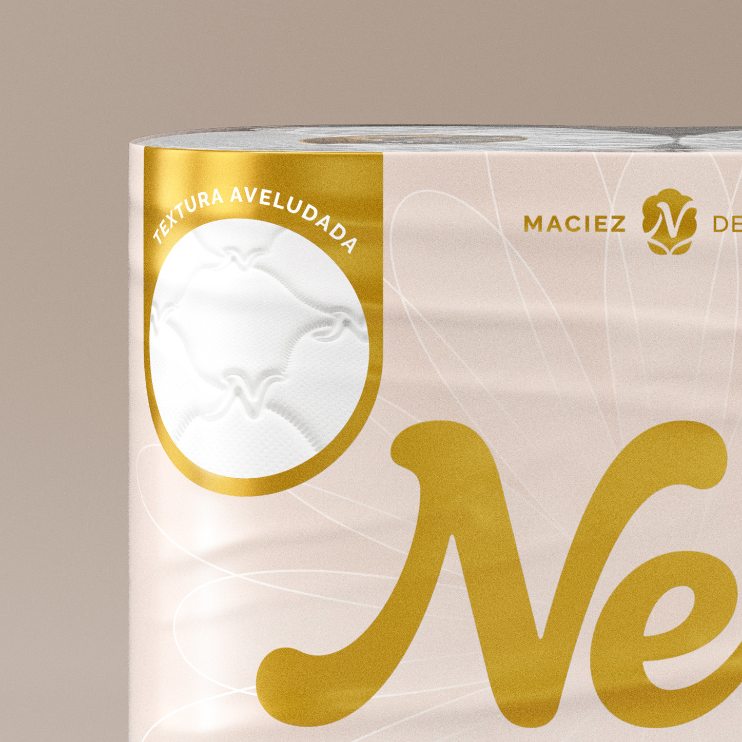
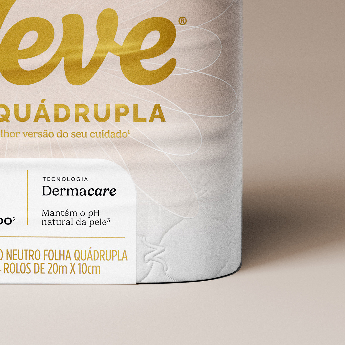
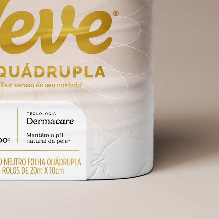
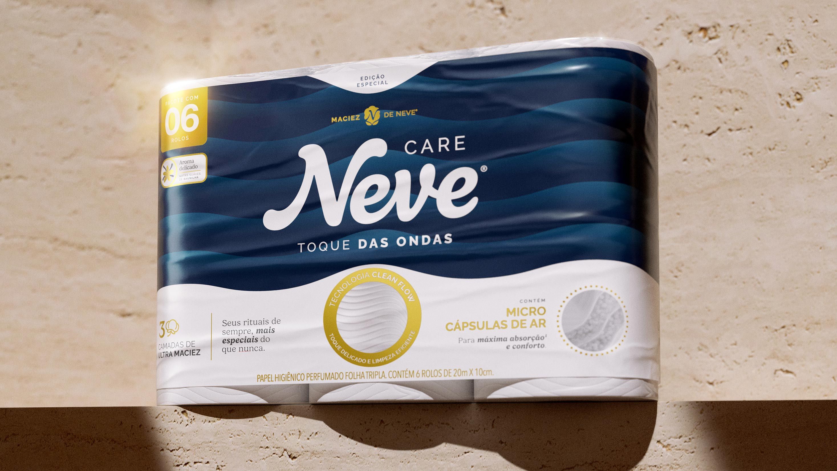
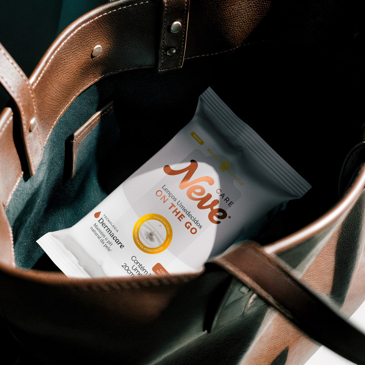
The new identity moves away from the category’s traditional codes and is grounded in a sensory territory. Organic shapes, textures, and light tones convey inspiration drawn from the world of well-being.
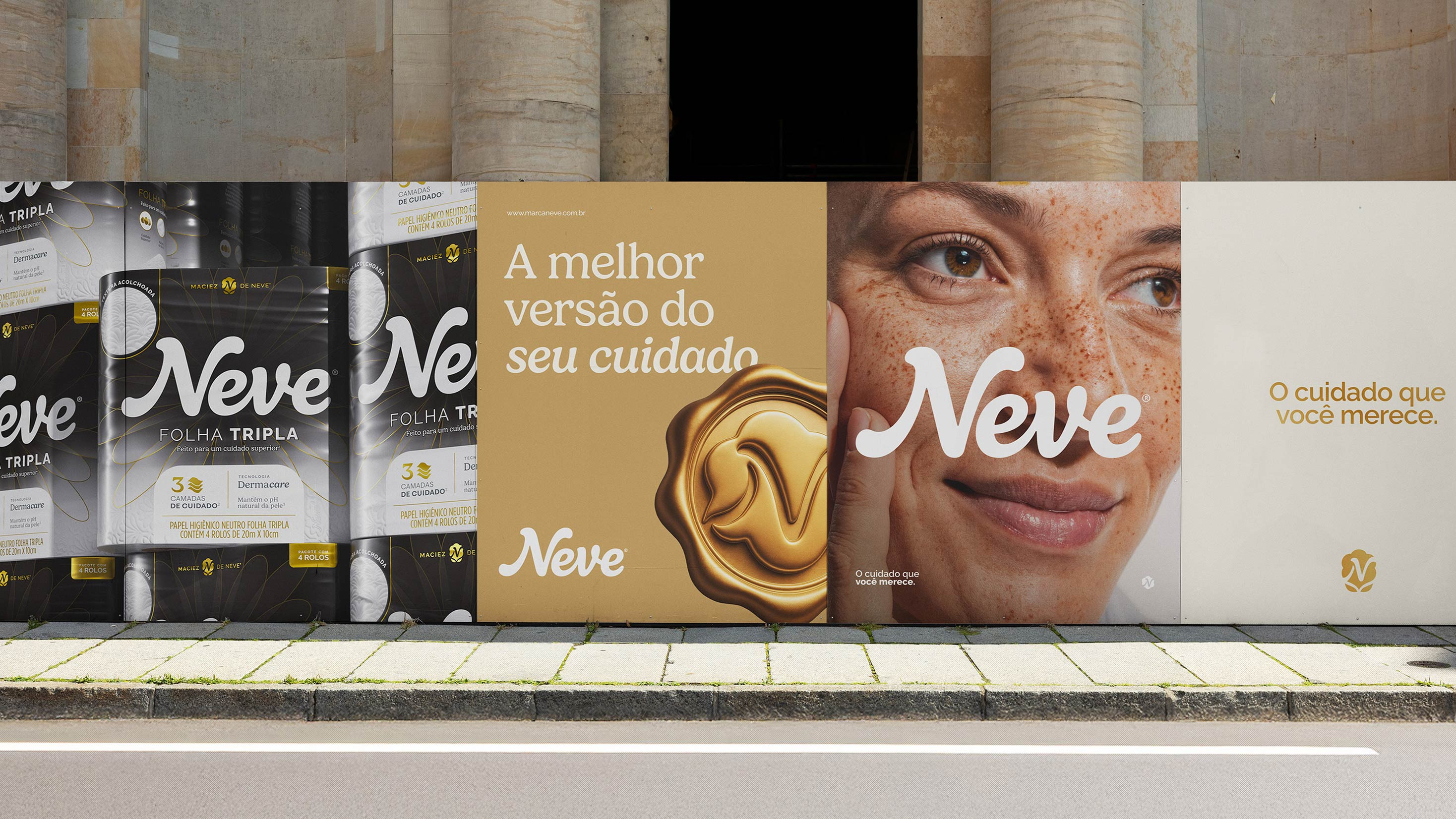


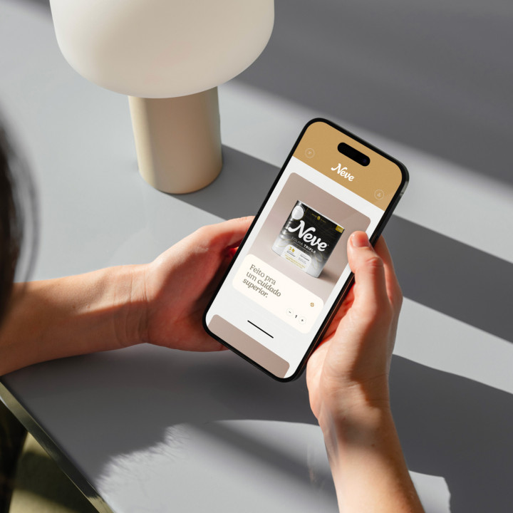

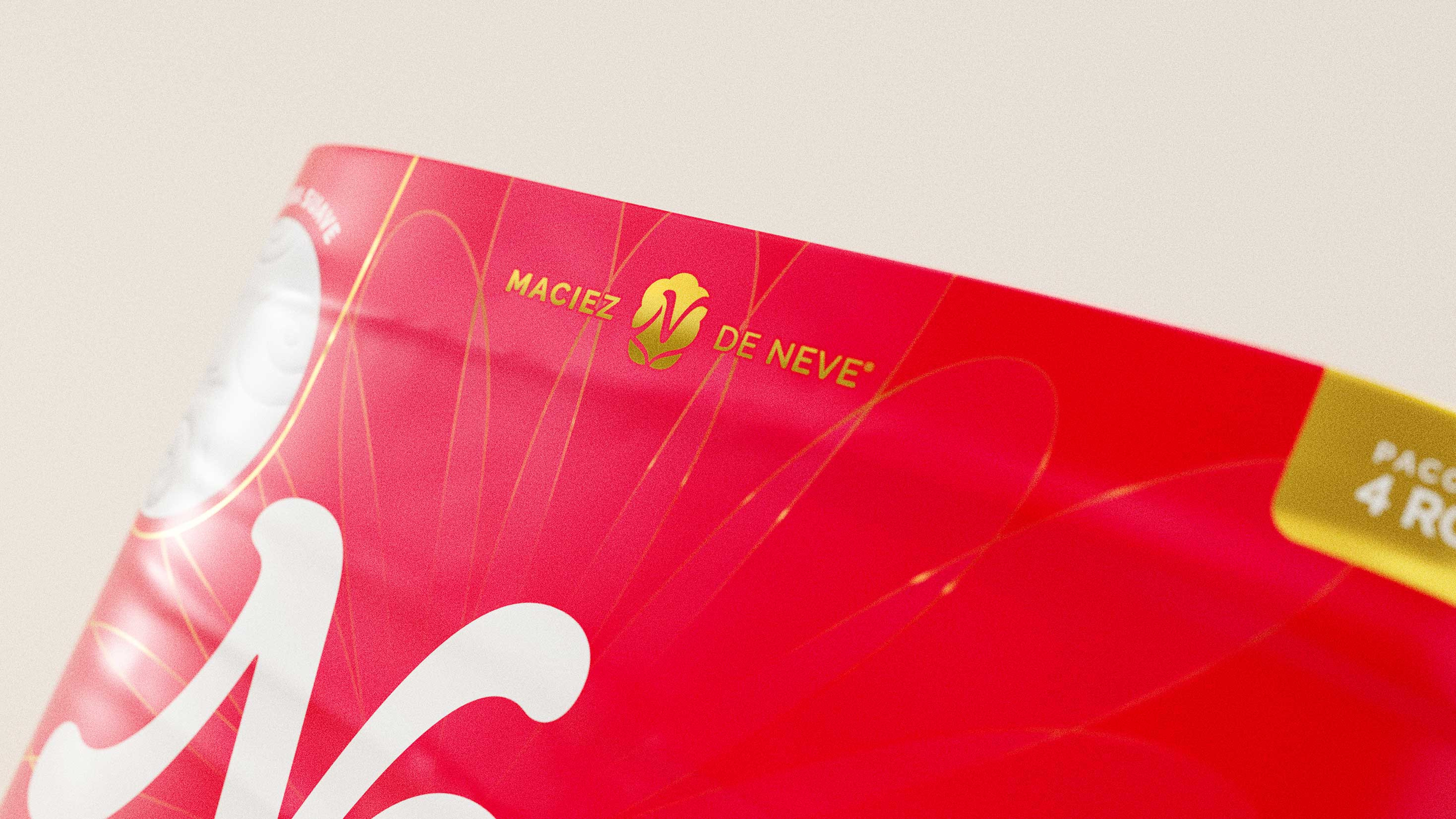
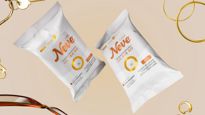
The packaging was redesigned to update its visual codes. Iconic elements, such as the Neve flower, were reimagined in a cleaner, more sophisticated, and minimalist way.


See our works
-
Film -
Design -
Communication