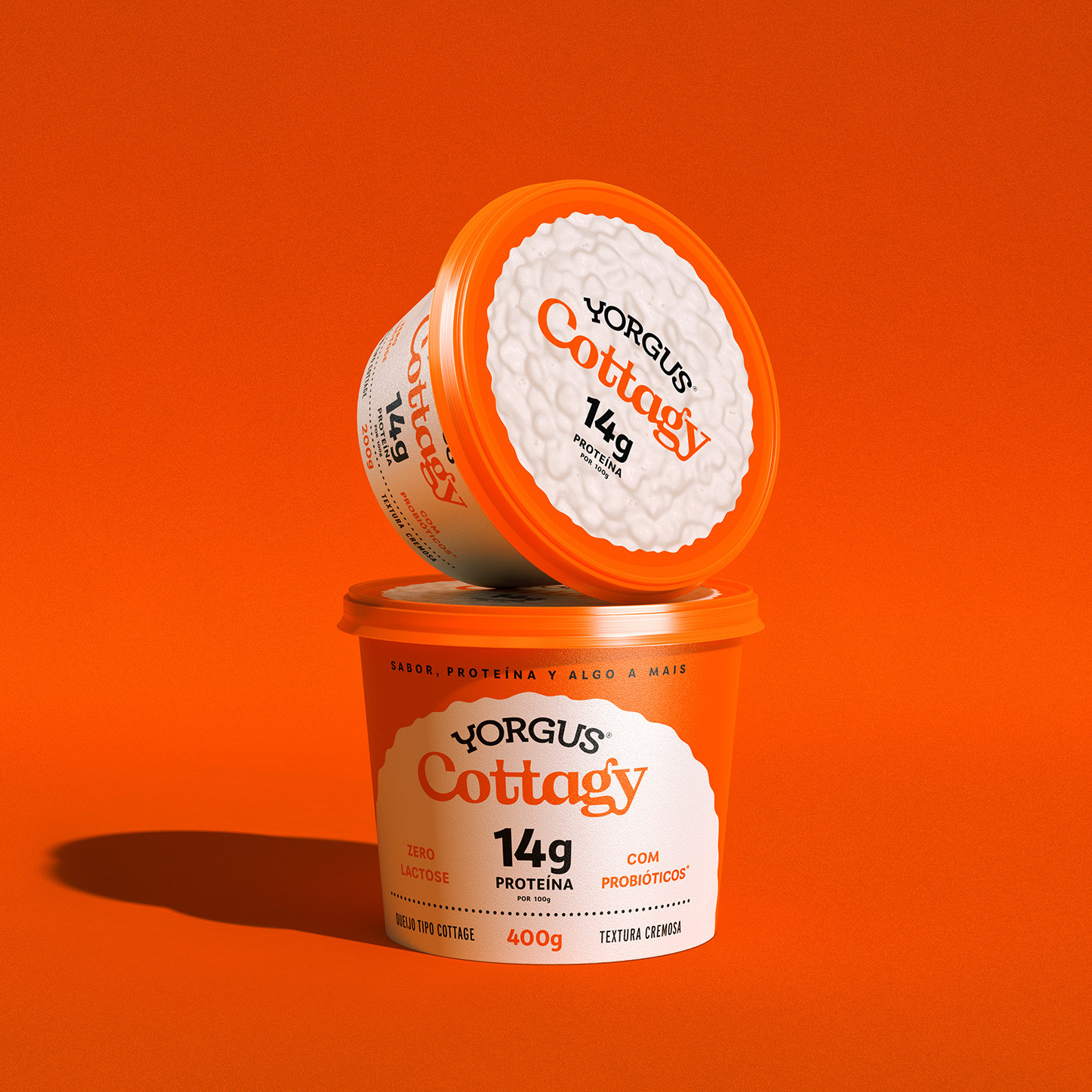
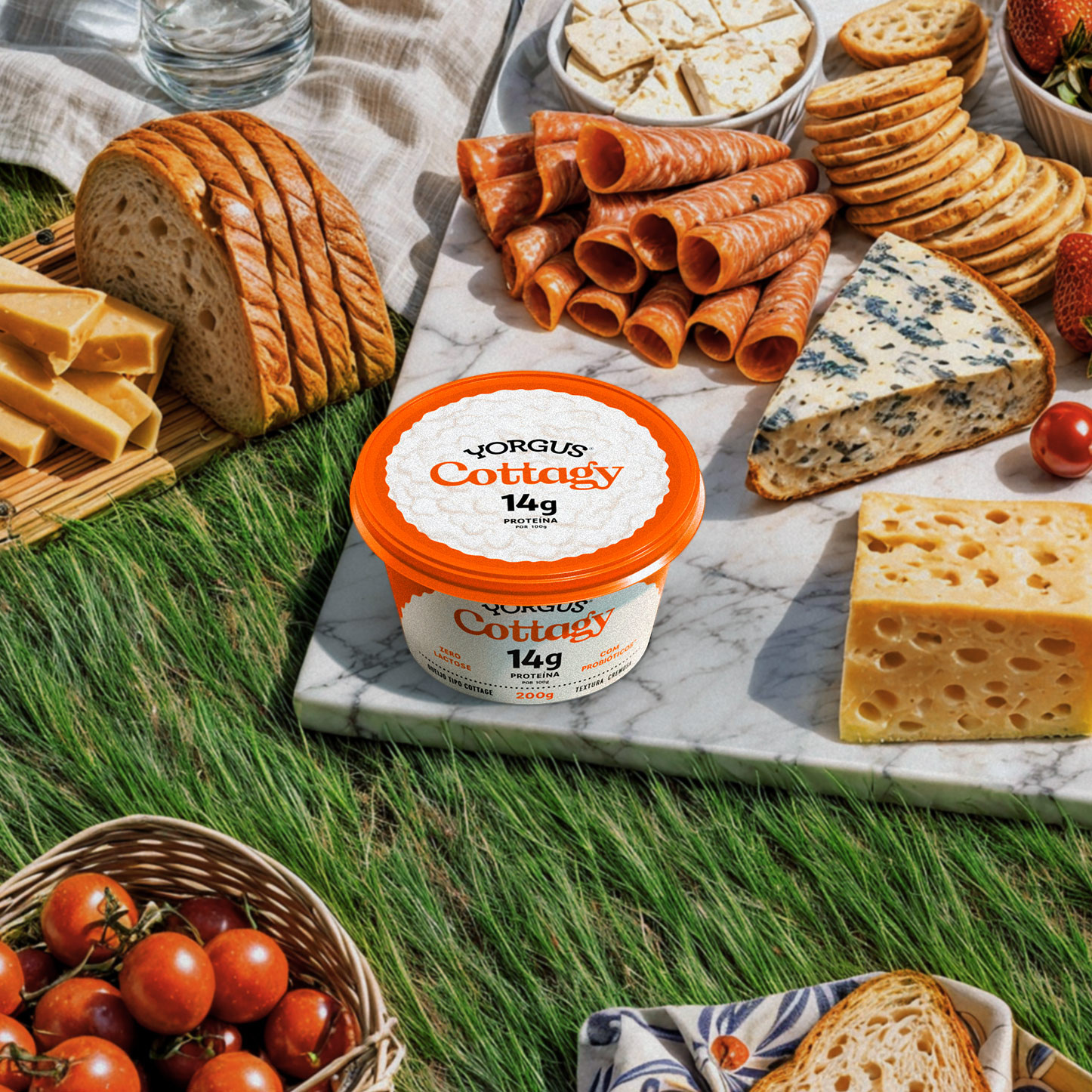
Yorgus Cottagy
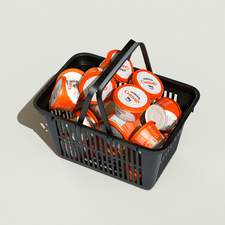
We created the identity and packaging for Yorgus' new cottage—or rather, "cottagy." A design full of flavor, protein, and a little something extra.
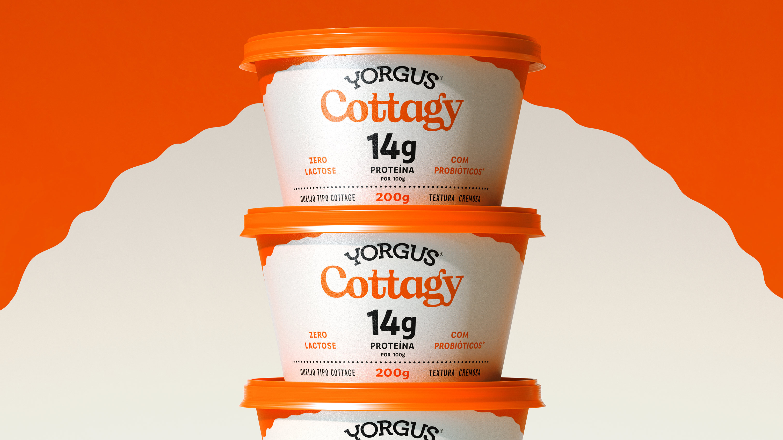

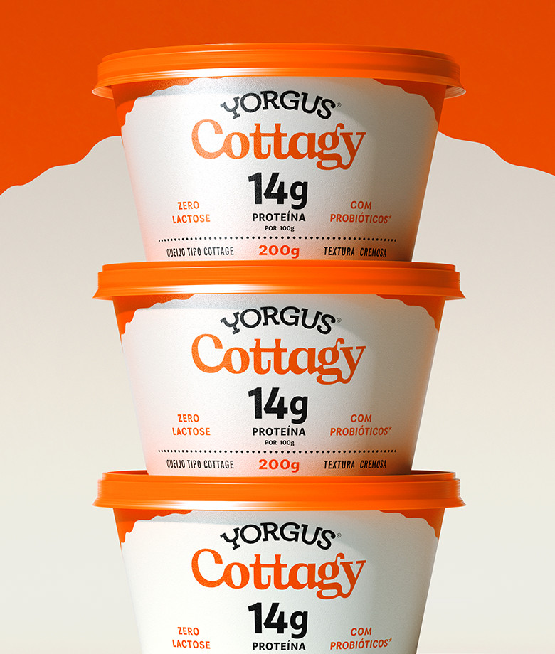

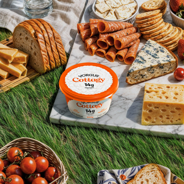
How do you create an identity and packaging that capture an innovative product combining flavor and health in one place? The new Yorgus Cottagy hits the market with a modern, playful, and delicious look.

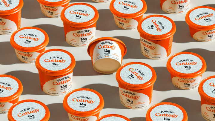


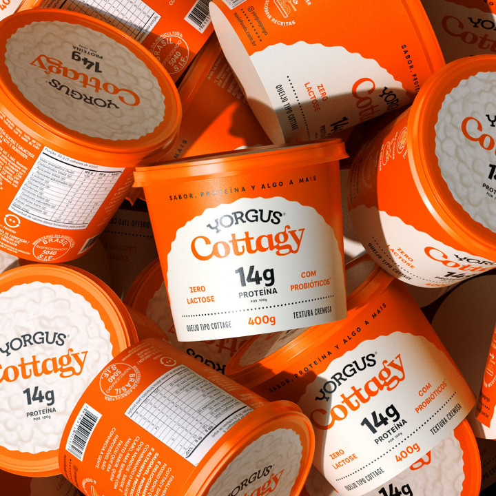

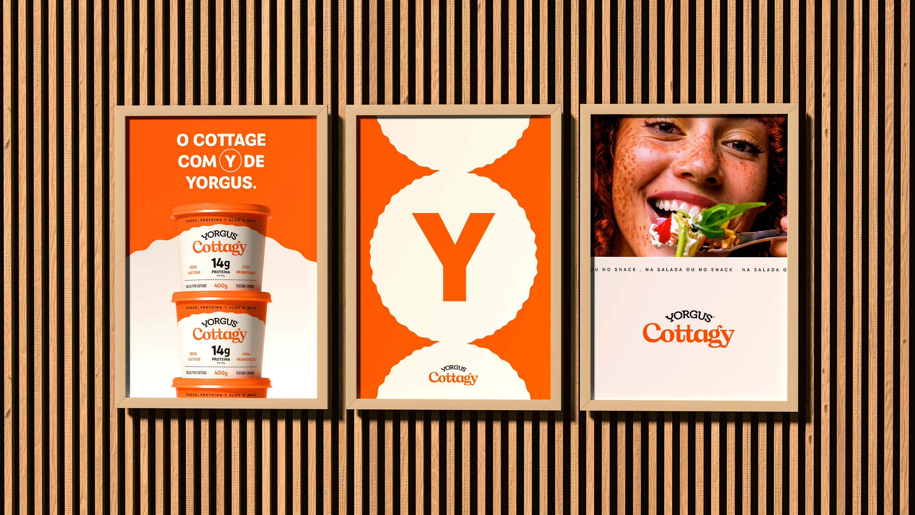


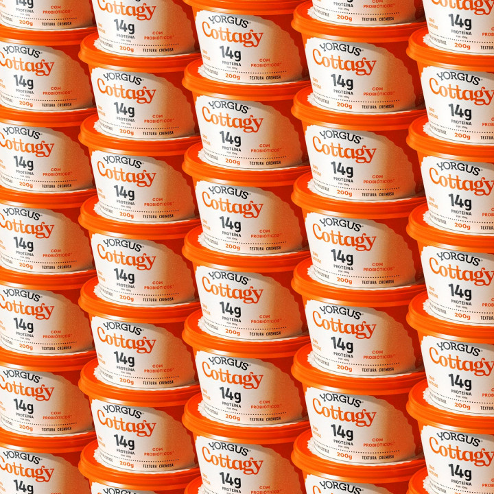

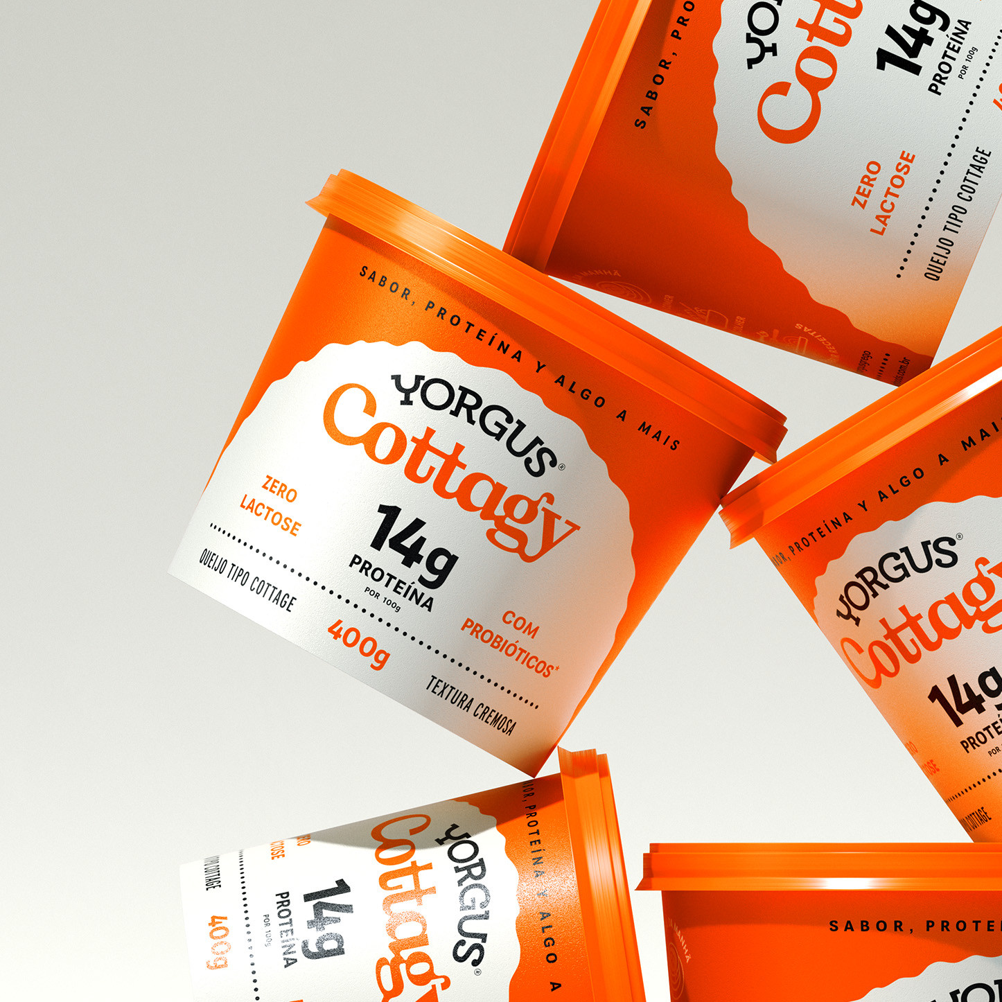


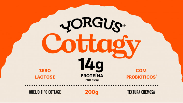

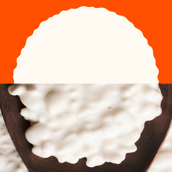
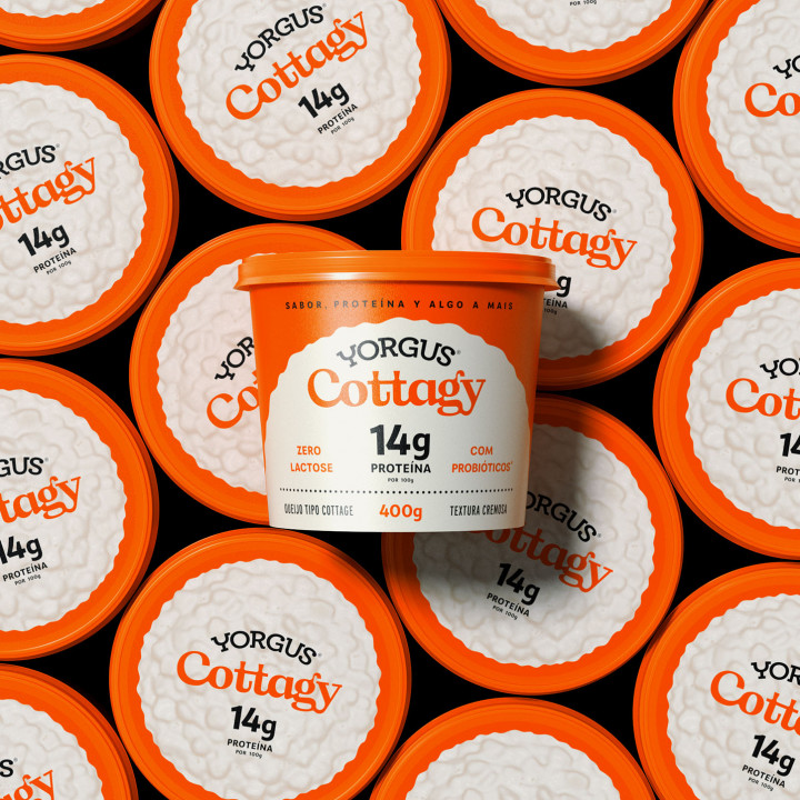
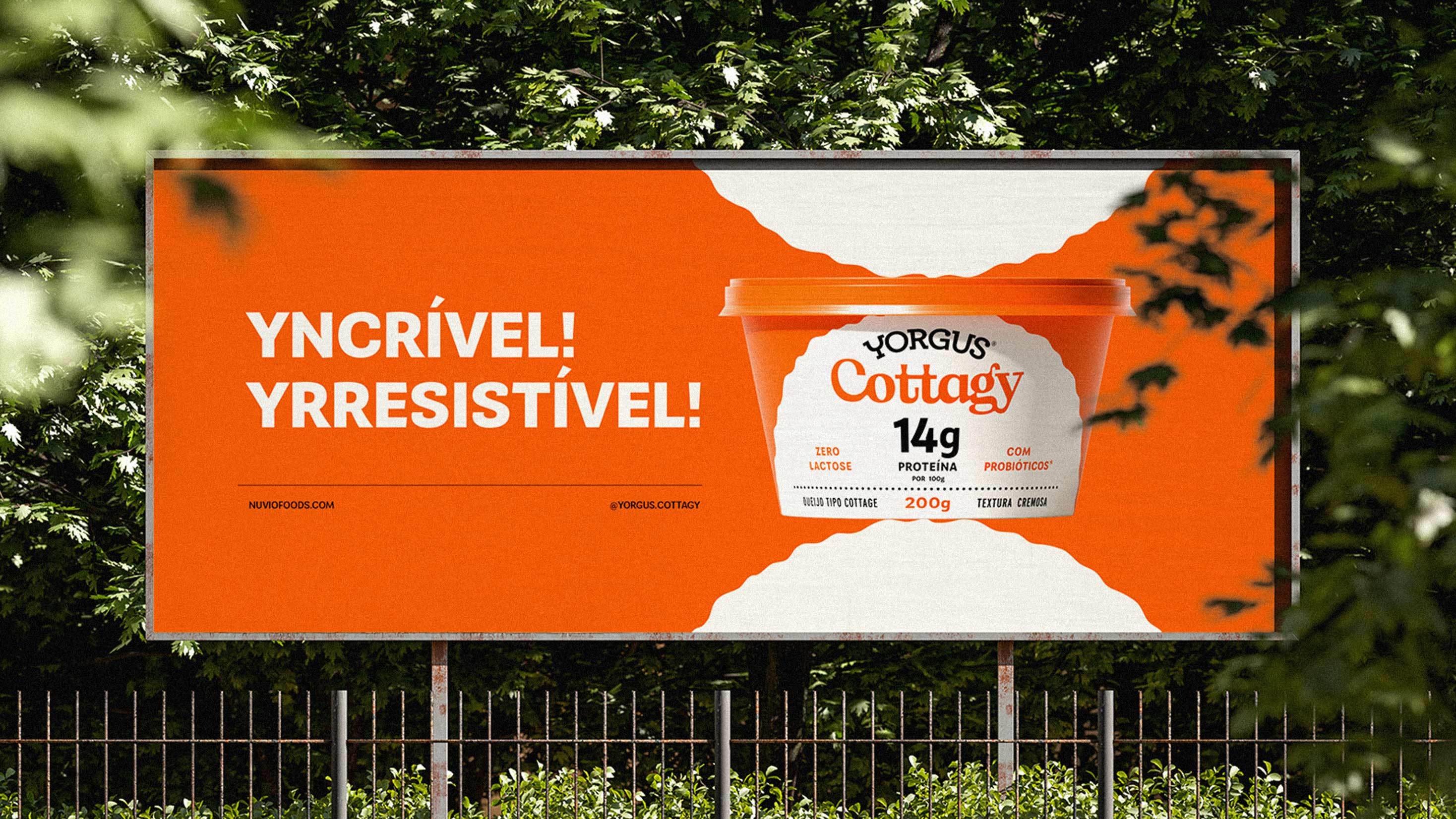
The brand’s main graphic element replicates a spoonful of fresh cottage cheese, helping to convey the idea of texture and enhance the product’s appetite appeal across the packaging and visual identity.


See our works
-
Film -
Design -
Communication