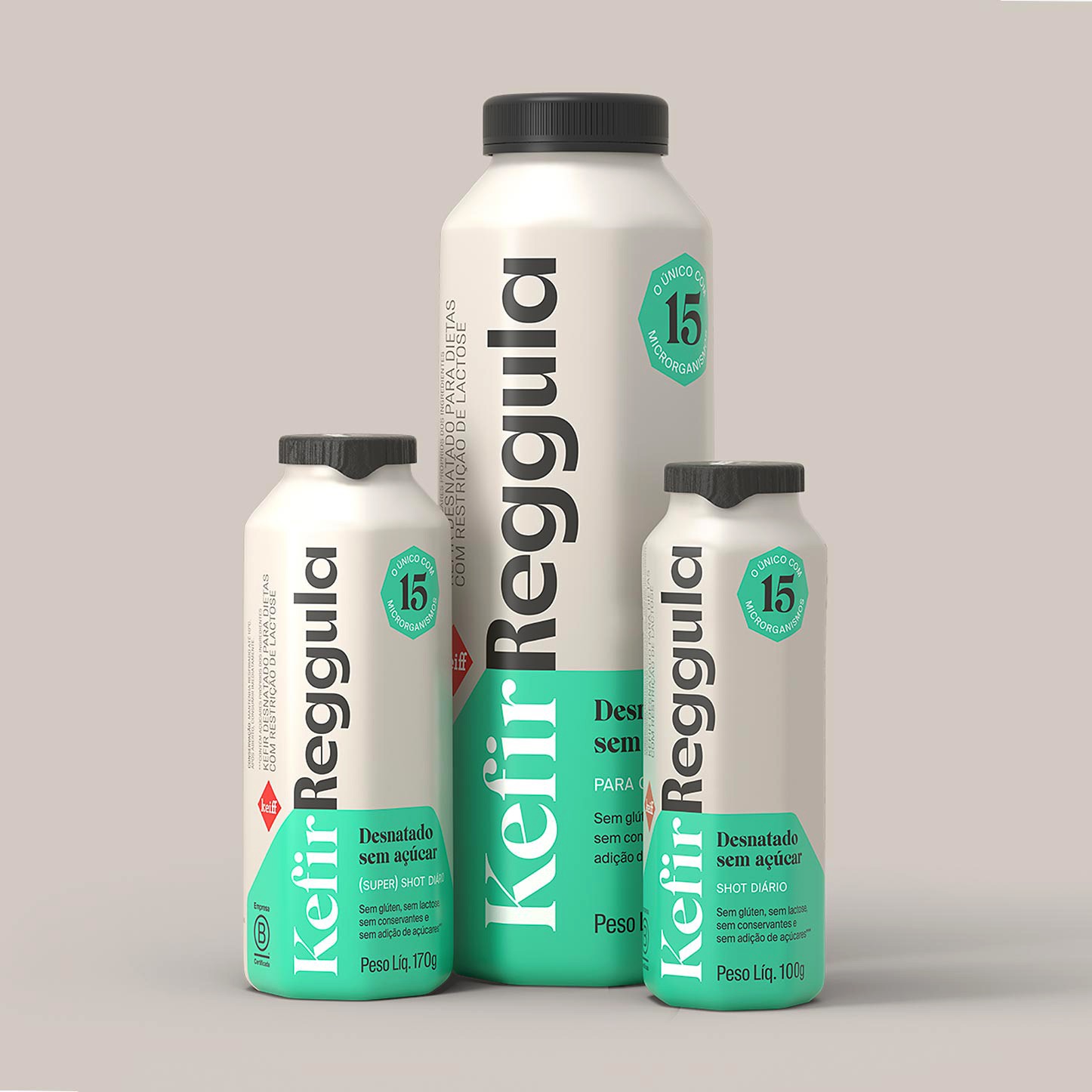
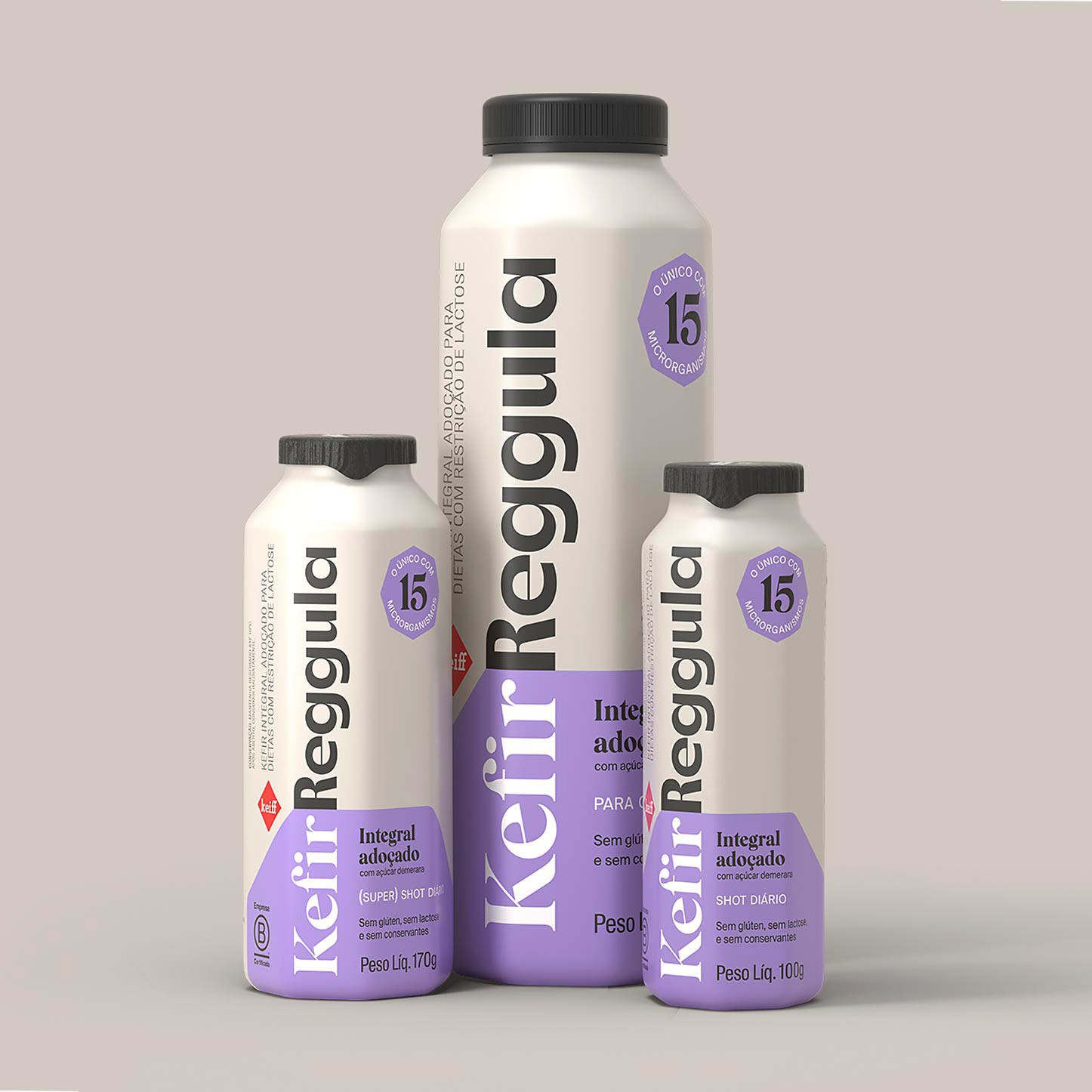
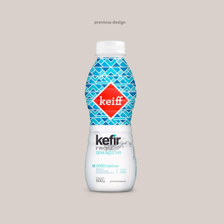
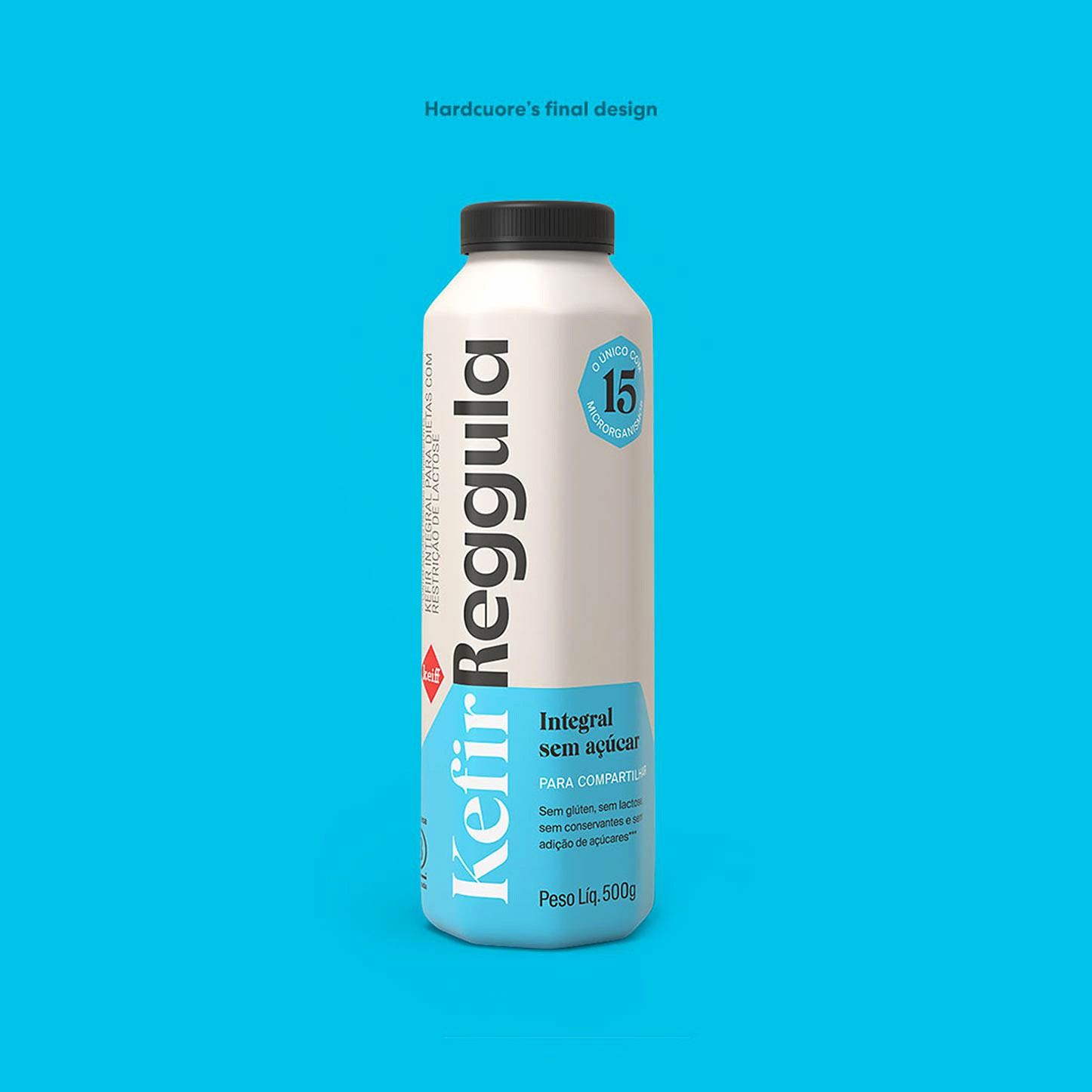
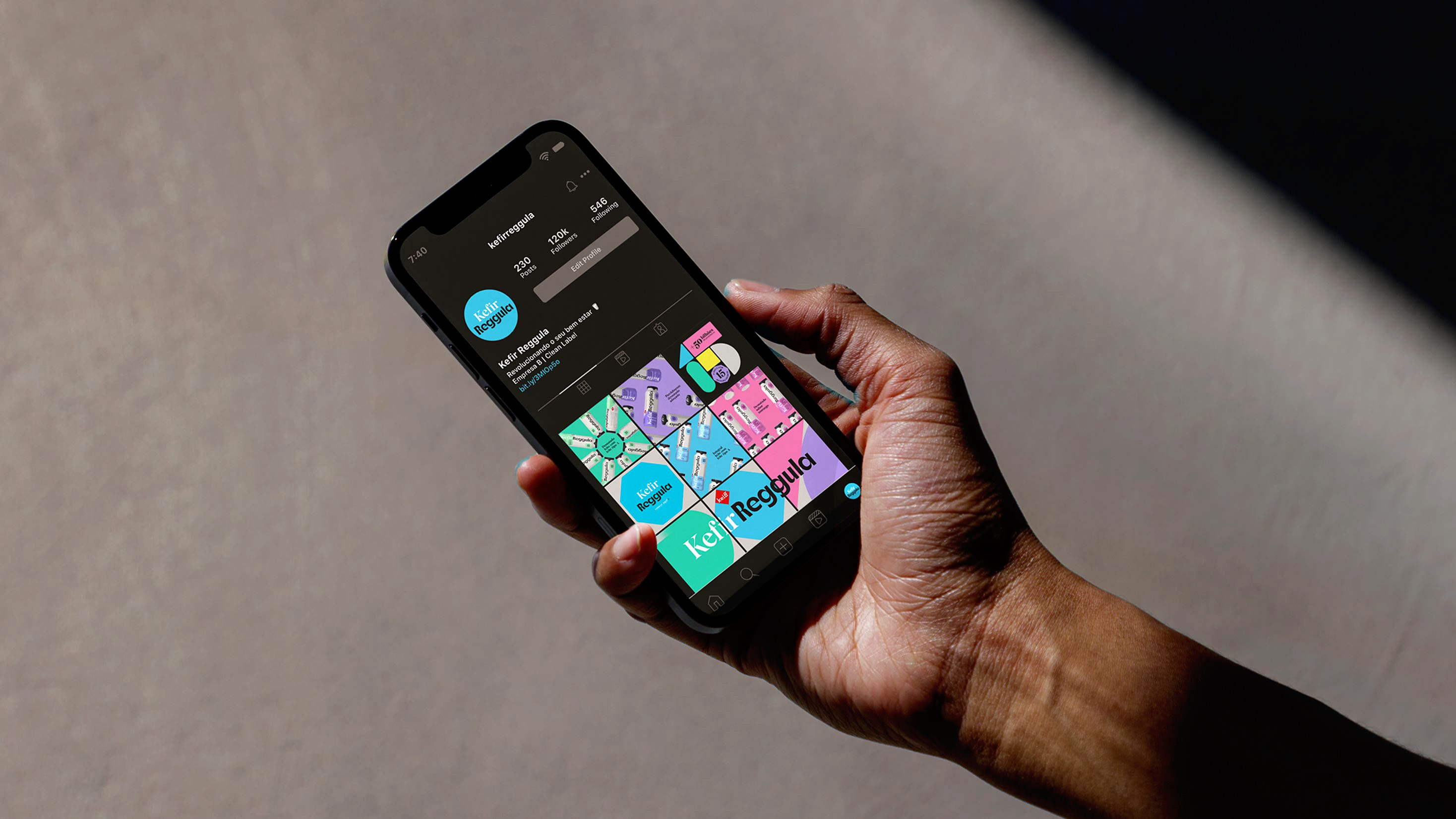
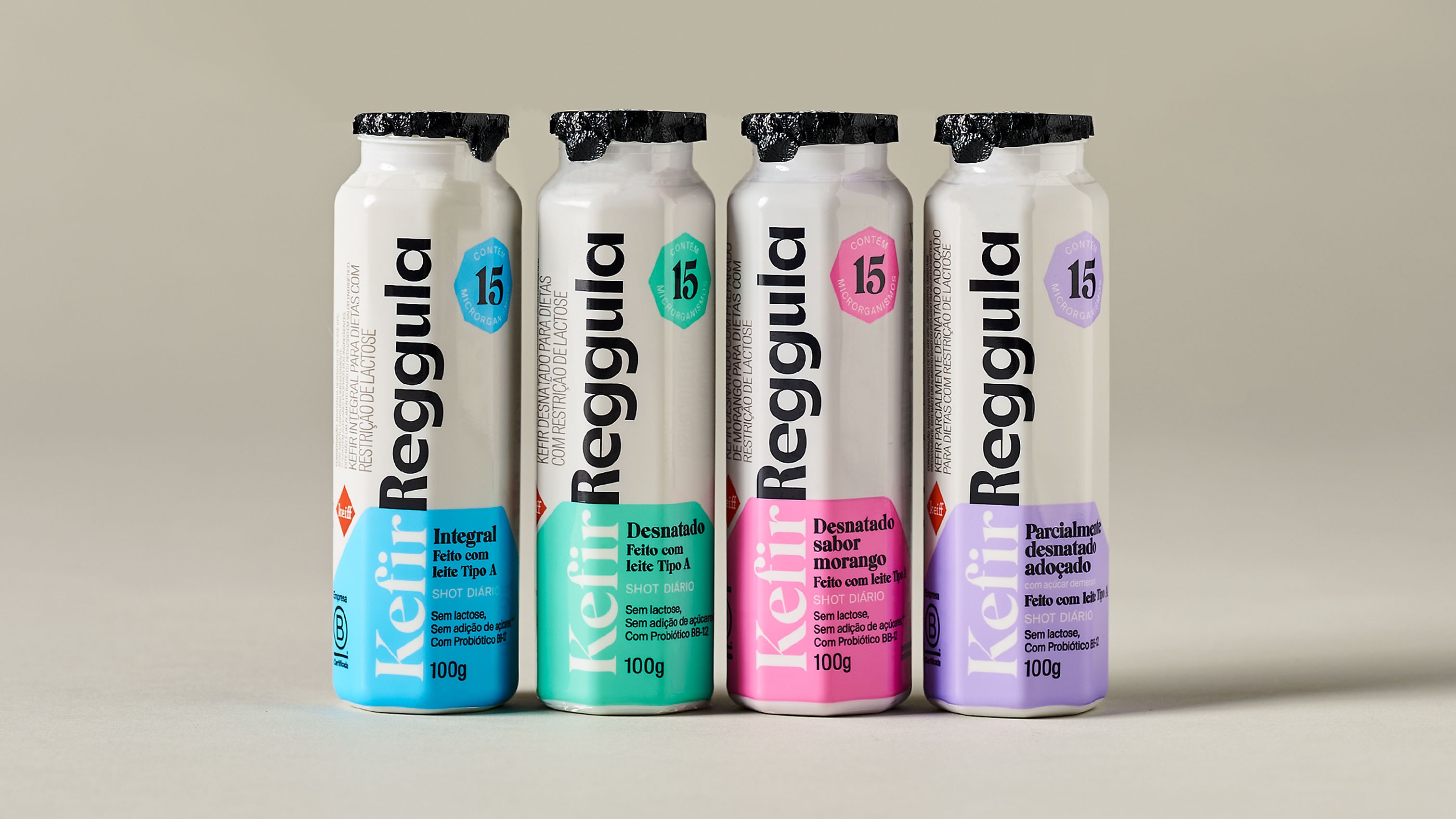
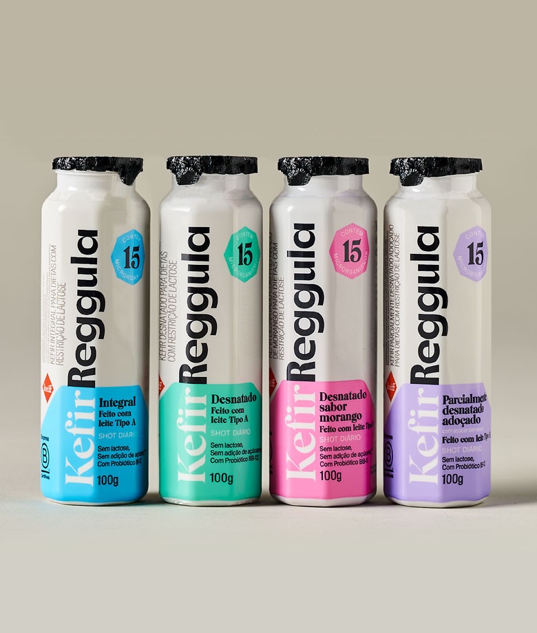
Kefir Reggula was created with the purpose of expanding the access to kefir, bringing health and well-being for everyone. Hardcuore received the mission of conducting the rebranding, also redesigning the brand's packaging as well as creating a new name and positioning for it.
Keiff Kefir was renamed as Kefir Reggula to help explain directly how the product works in Brazil, where people still neither have the habit of consuming kefir nor understand its health benefits.
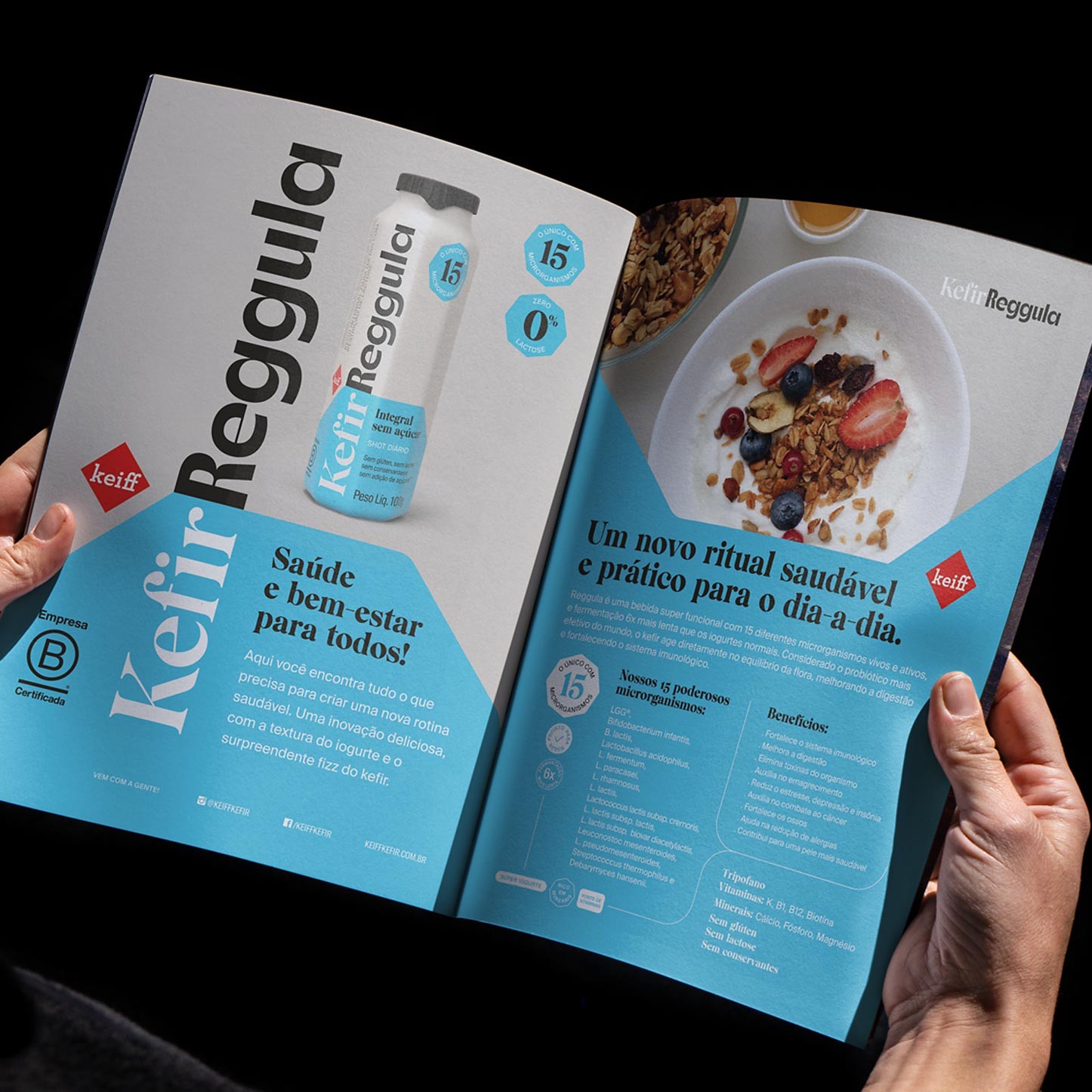
The healthy, practical ritual with Kefir Reggula involves a routine with flavor, few ingredients, and plenty of consistency. The brand wants to transform people’s lives through self-care. It is the only kefir in the Brazilian market with 15 different microorganisms and top quality, Grade A milk. This product improves digestion and strengthens the immune system. It is a super functional beverage that regulates the intestinal flora balance.
The reasoning for creating the brand’s visual identity went through this intrinsic logic to the functional delivery of this probiotic product. The brand’s visual expression and new packaging should reflect its main attributes and features, without stepping away from the dairy category codes.
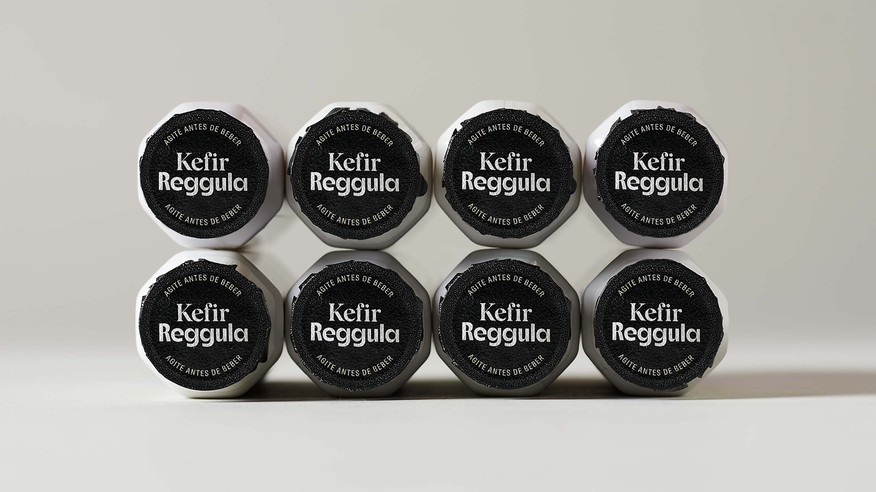
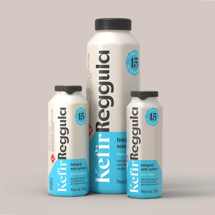
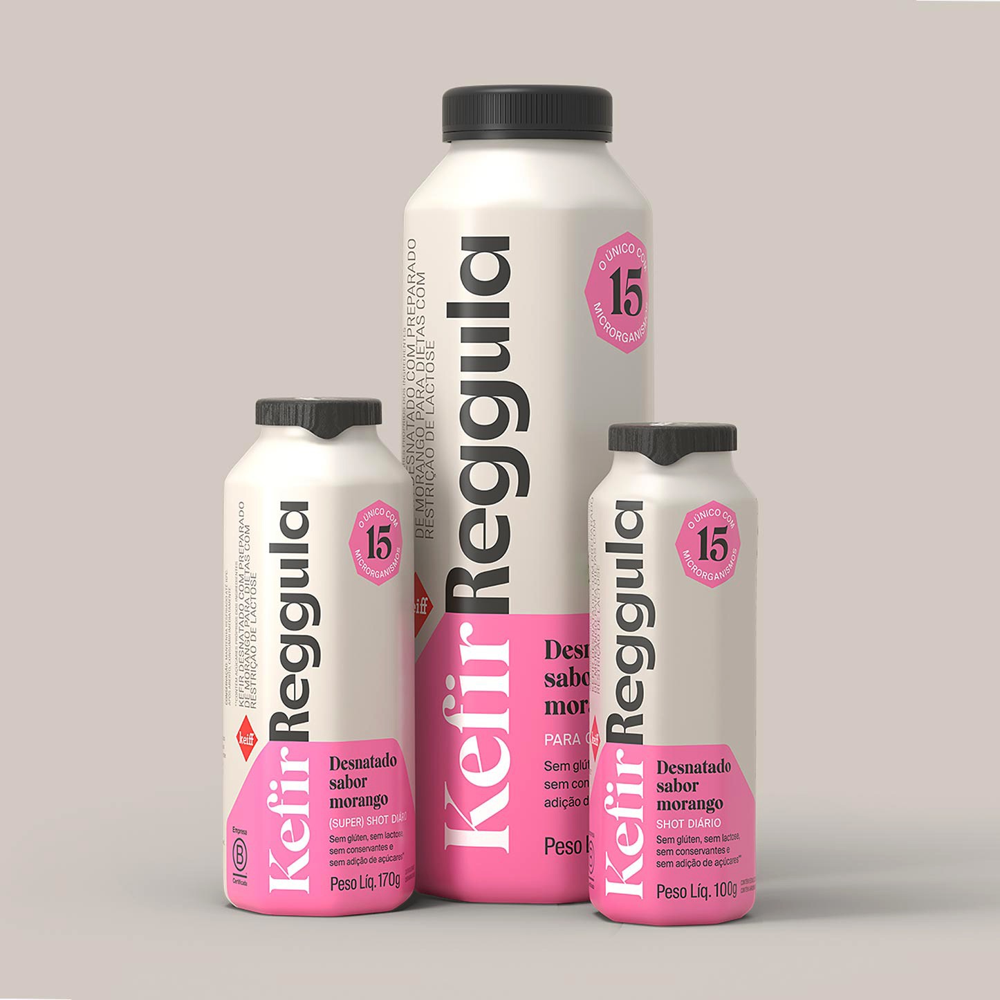
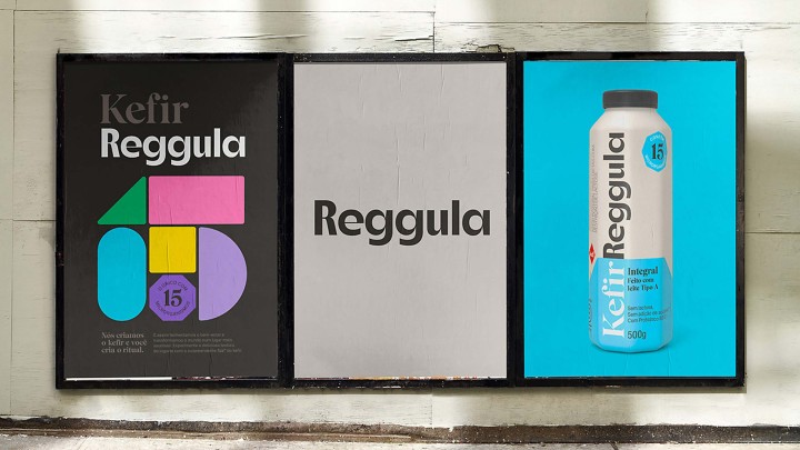
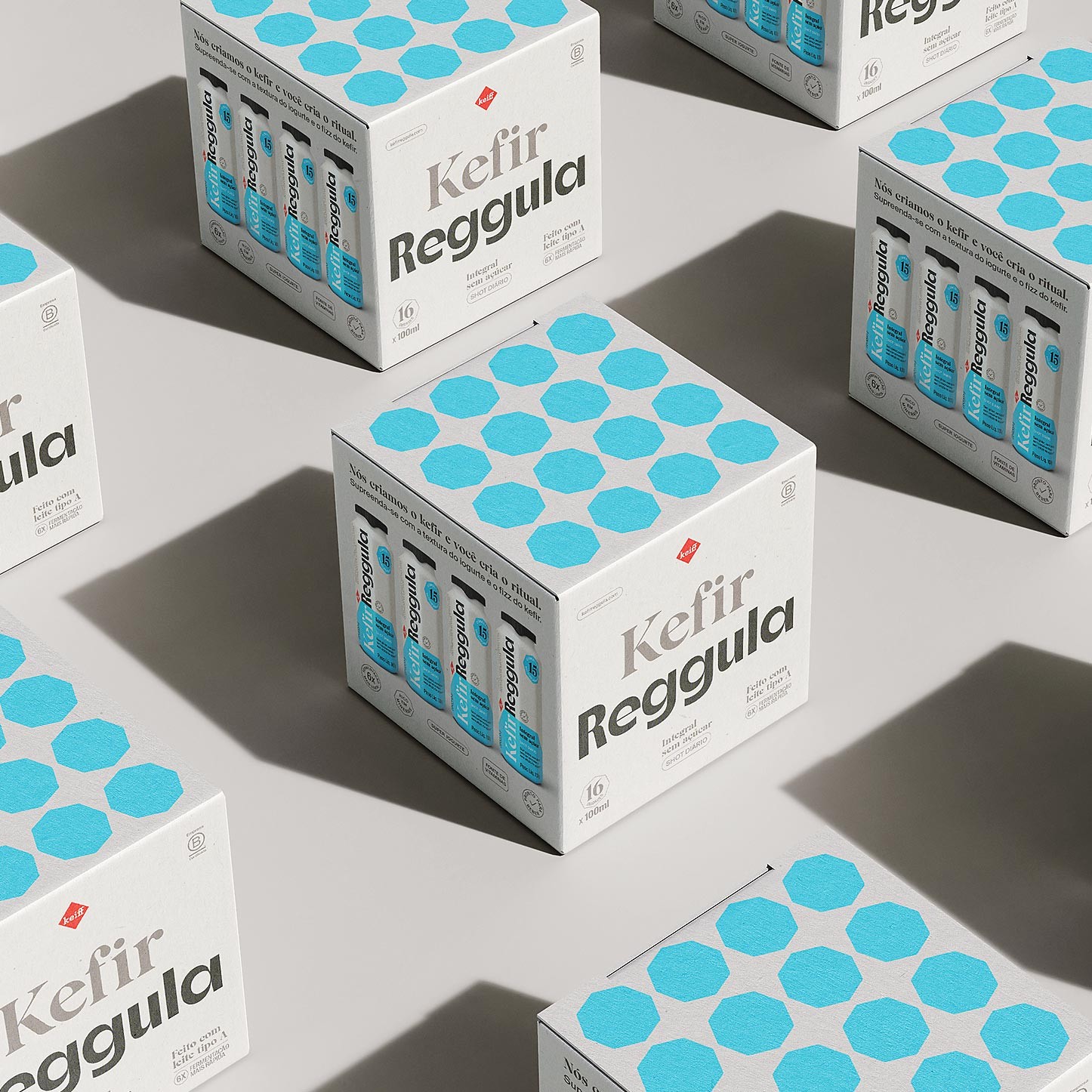
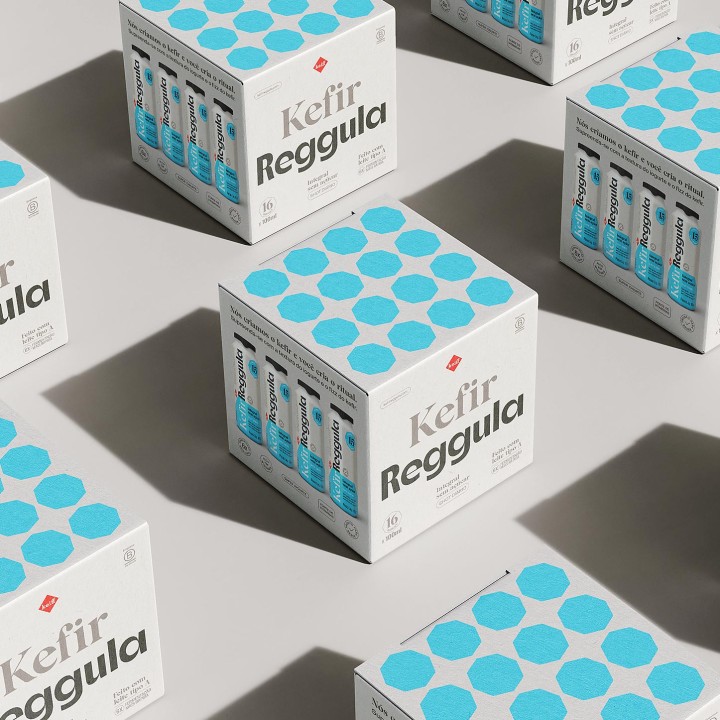
Kefir Reggula's new visual identity matches the human need for putting things in order, just like its product does with the body functioning. Since it promotes change from inside out, we were inspired by geometrical shapes that reinforce the concept of mechanism, gearing and organization. The brand no longer has a conventional generic package. Now it has gained its own eight-side shaping that reinforces the product’s main attribute: to regulate the body. With an impactful, disruptive package design, Kefir Reggula now also reverberates innovation and confidence.
To promote tasting, we have expanded the brand’s packaging family, creating a 100ml option for the product, which was previously sold only in 500ml bottles. With 100% recyclable packages, Kefir Reggula is B Corp Certified, which means that, in addition to producing, profiting and moving the economy forward, offer social and environmental benefits.
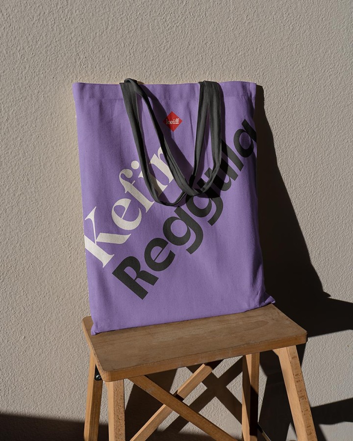
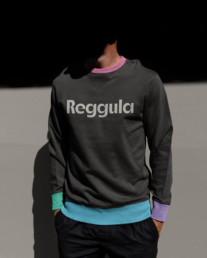
To convey the brand’s friendly, intimate and value-adding personality, we have opted for a simple and clear visual language, with elegant, large font to enable better reading. Kefir Reggula is natural and clean label; for this reason, we were careful to reflect this lightness in the selection of colors, typography, and in the harmony of graphic icons that are part of the brand’s visual system.
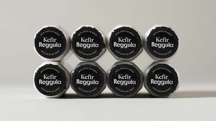
The cream hue is predominant on the package, also contributing to generate more appetite appeal. With complementary colors, we managed to rejuvenate the brand and at the same time highlight the four variations of kefir available to consumers. In all packages, the black cap stands out, bringing premium perception and more differentiation in supermarket shelves.