Ultra B was created to expand Tia Sônia’s performance portfolio. An evolution of the former Ultrabar, it transforms a product line into a more mature, compact and scalable brand.
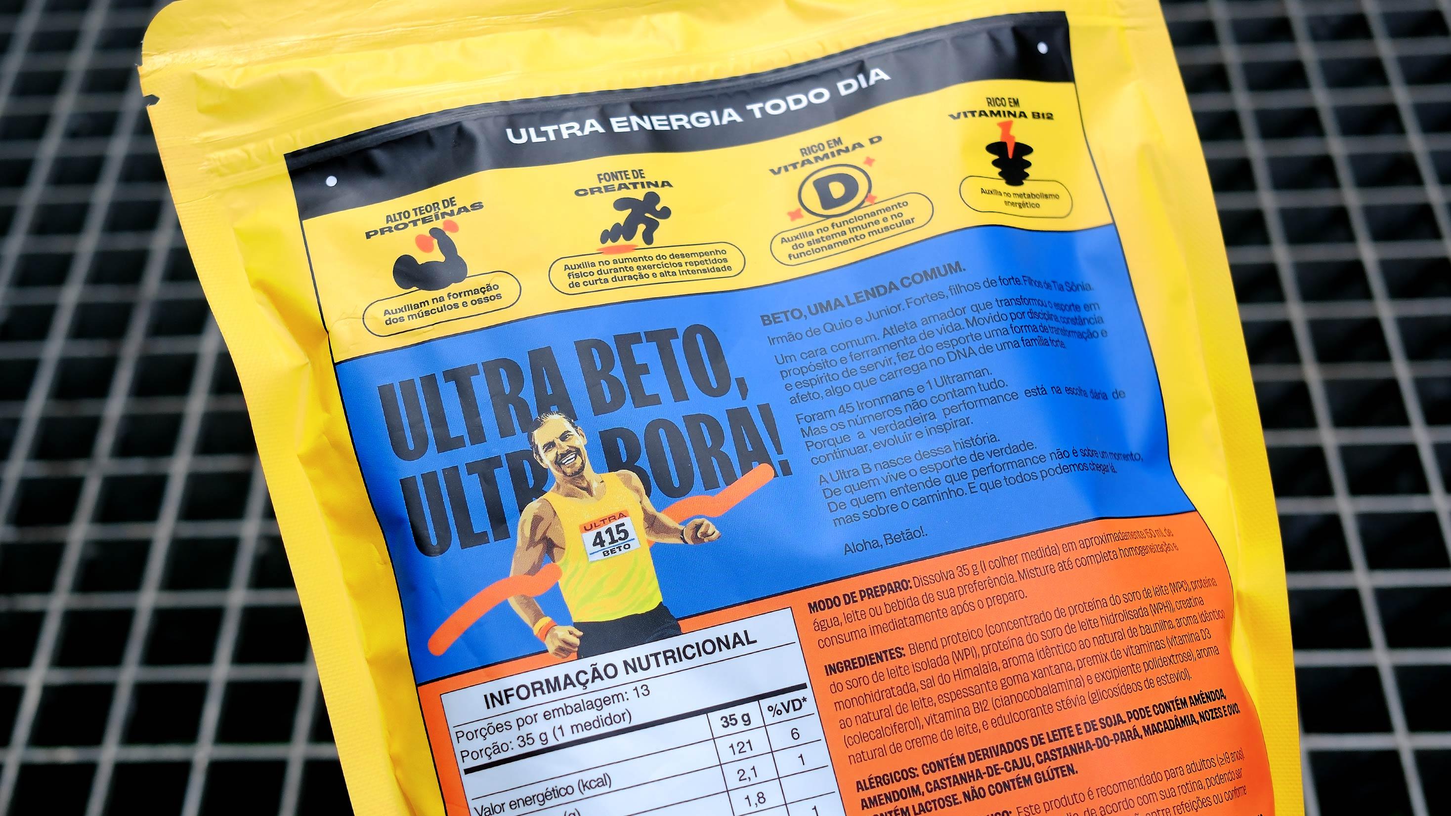
More than a name change, the project is built around a simple idea: performance is about going beyond. Ultra comes from the ability to turn a superlative into a brand. A concept inspired by both the world of ultramarathons and the journey of Beto, a legendary triathlete from Bahia who built his story through resilience, discipline and his contribution to sport and the people around him.
While Ultra represents power, evolution and movement, the B expands the brand’s possibilities. It stands for Better. Best. Boost. Bahia. And Beto. A single letter that reflects the unconventional perspective of a B-side while subtly connecting the brand to its Bahian roots, bringing authenticity and cultural relevance to the identity system.
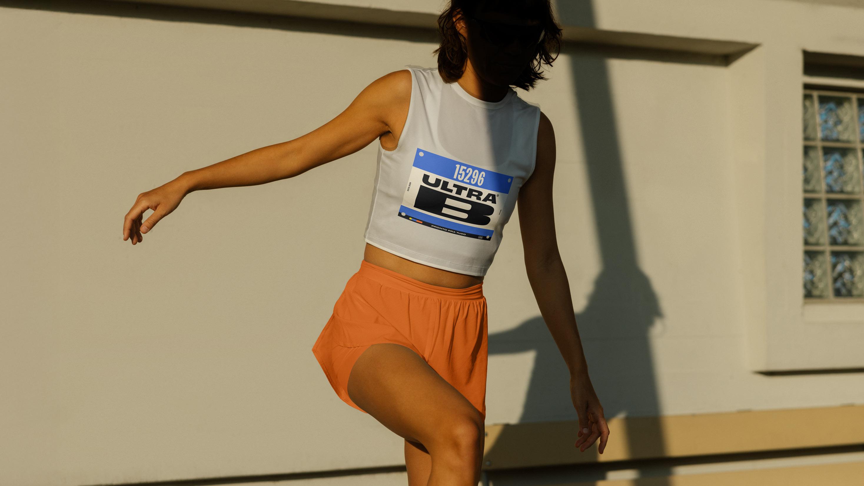
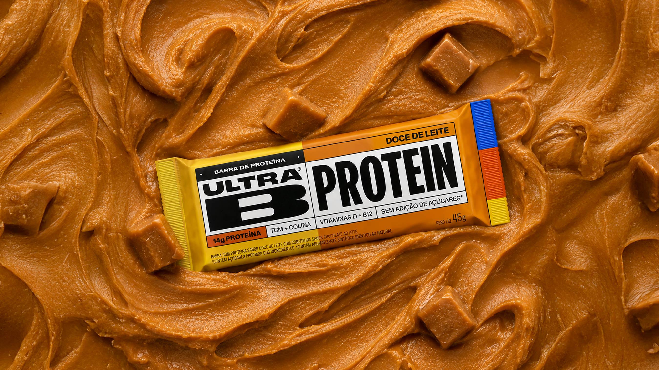
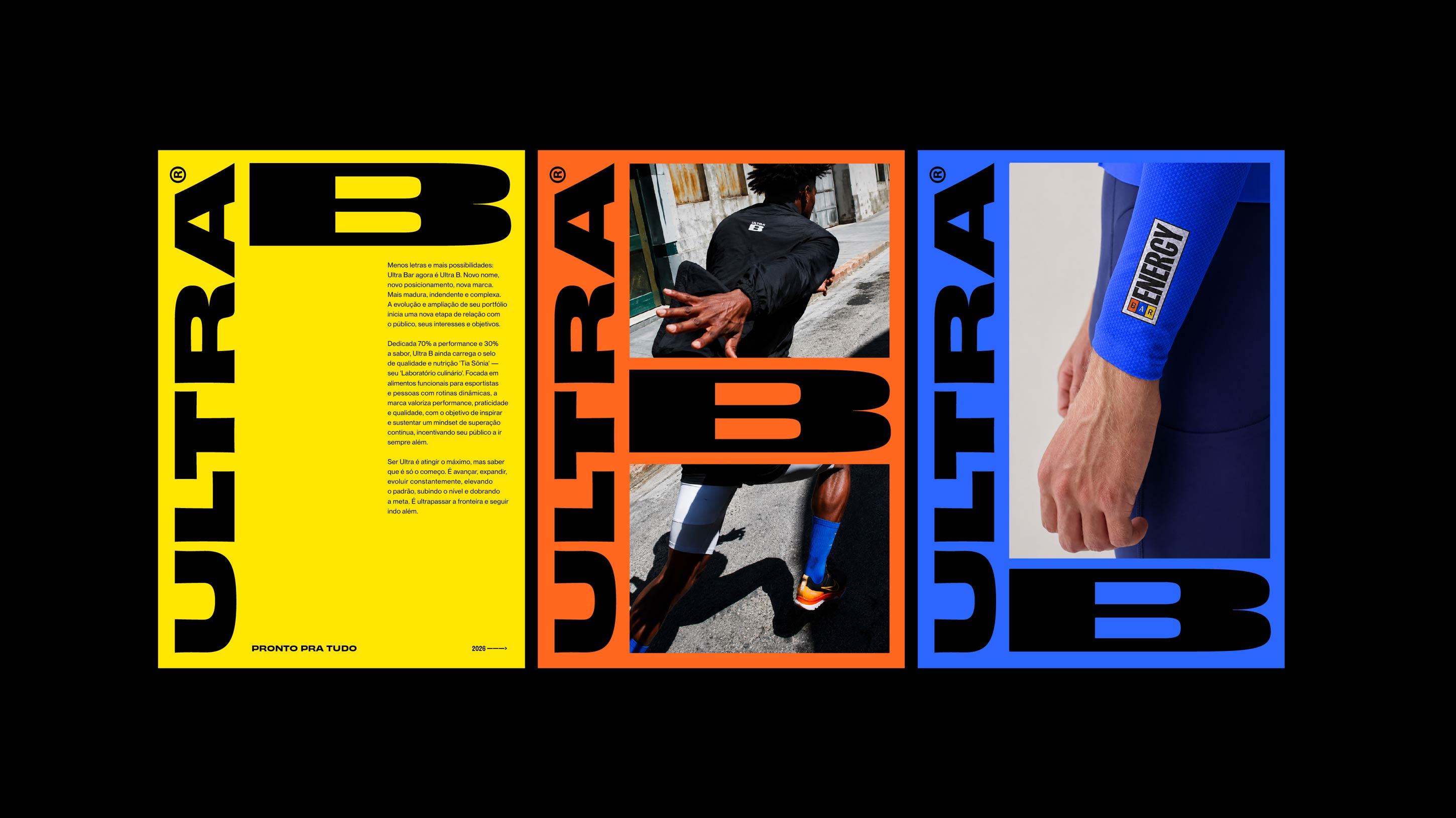
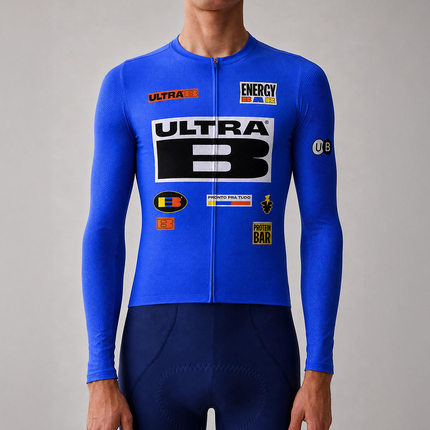
The entire visual identity was built around one of the most iconic elements of running competitions: bib numbers. The race bibs worn by athletes became the foundation for a distinctive visual universe, evolving into graphic elements, typography, packaging and the overall brand architecture.
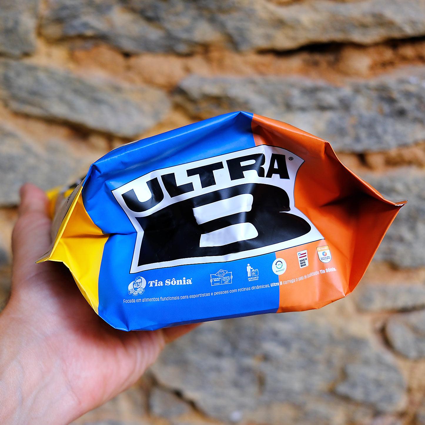
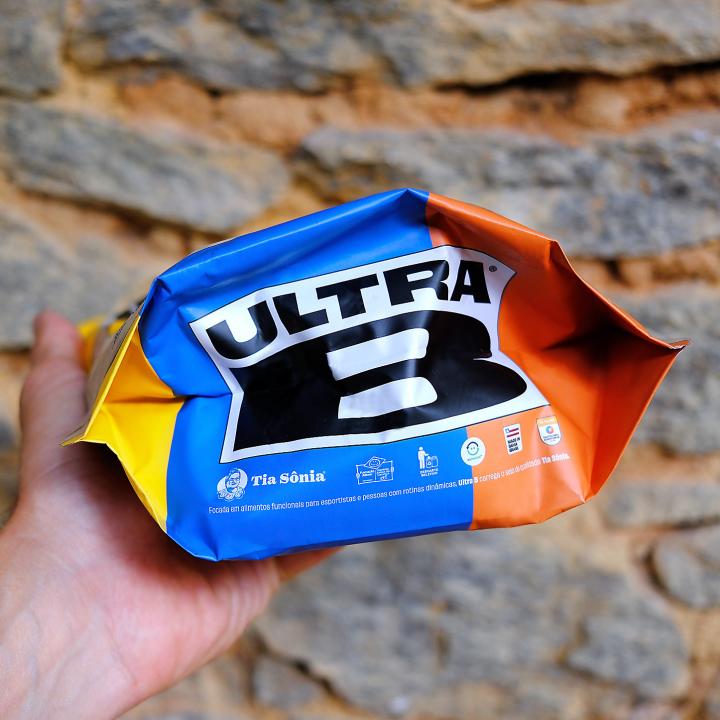
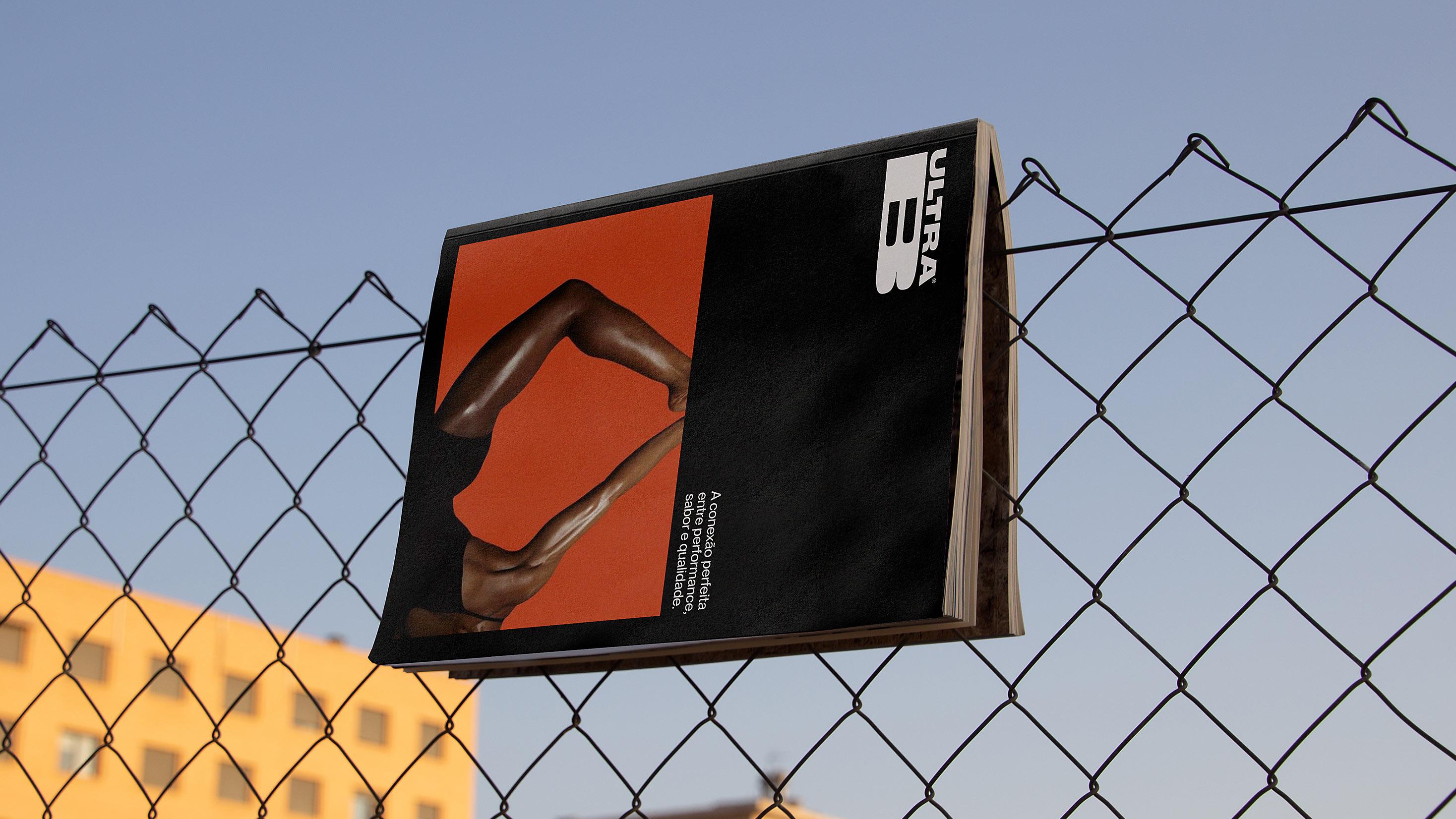
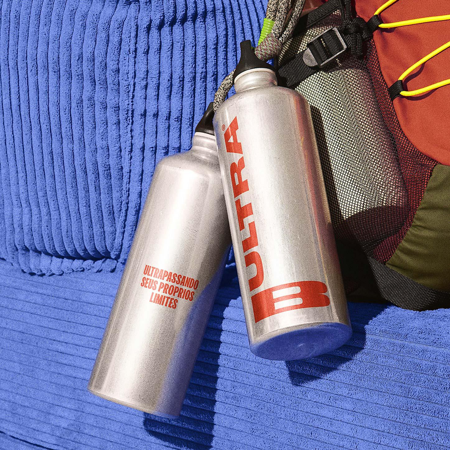
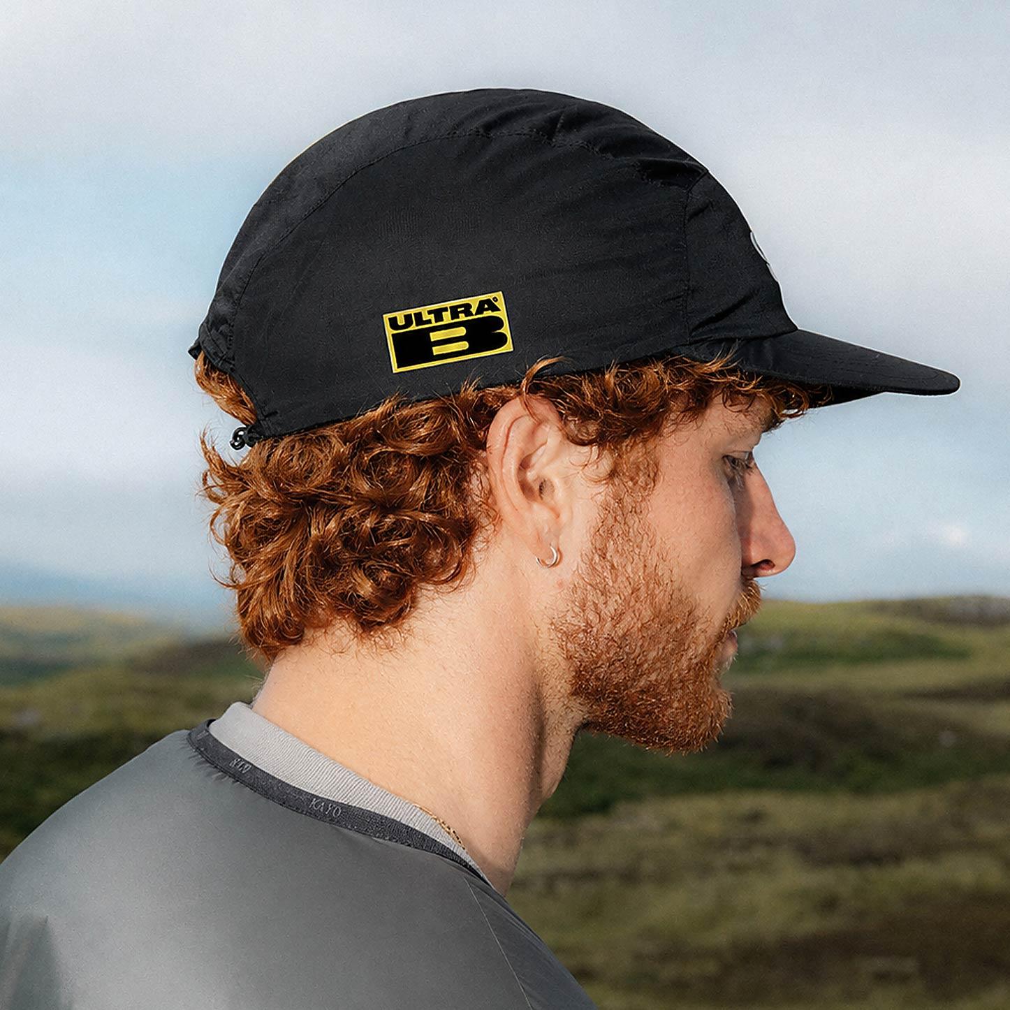
The logo translates this inspiration through a high-performance typographic construction. The expanded design of the word Ultra reinforces speed, power and movement, while the B takes center stage through proportions and spacing inspired by the visual codes of the sports world. The result is a simple, memorable and attitude-driven brand.
The typographic system combines ultra-condensed and ultra-expanded typefaces to create contrast, dynamism and visual impact. A language inspired by sports communication, competitions and performance environments.
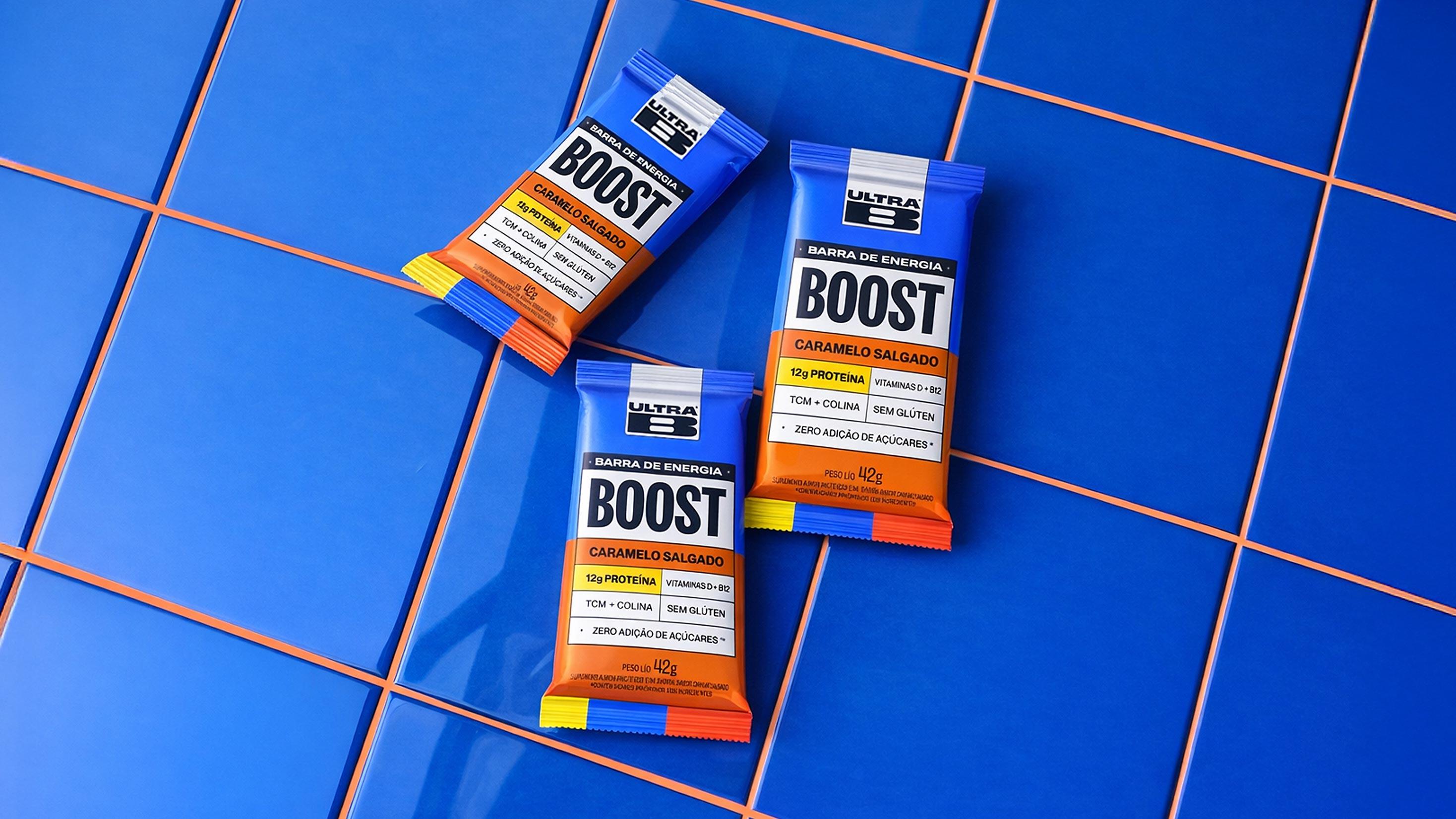
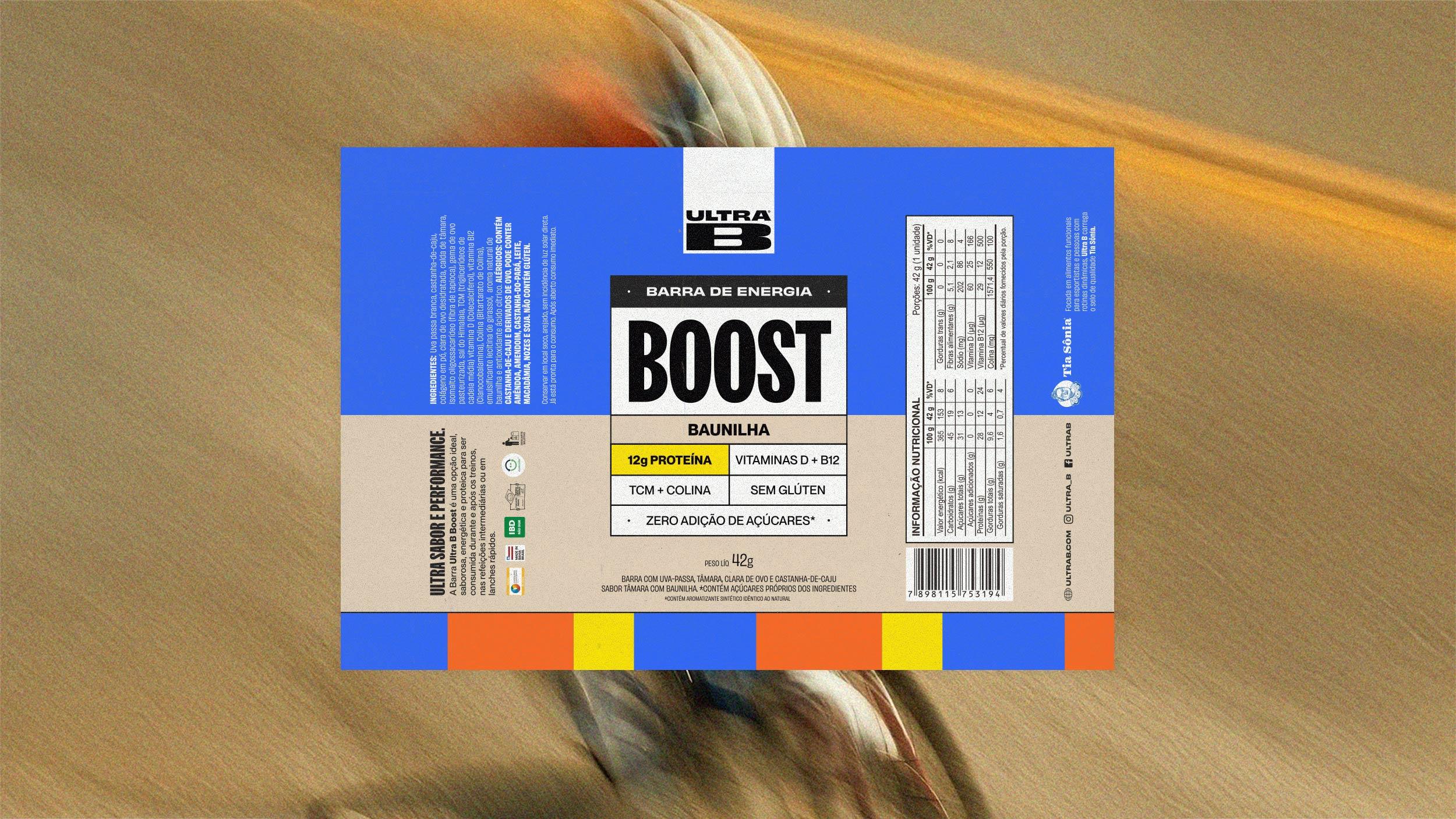
The color palette preserves the brand’s recognizable blue and orange while introducing yellow as a symbol of energy and strength. Together, these colors represent the balance between quality, flavor and performance, the pillars that define Ultra B.
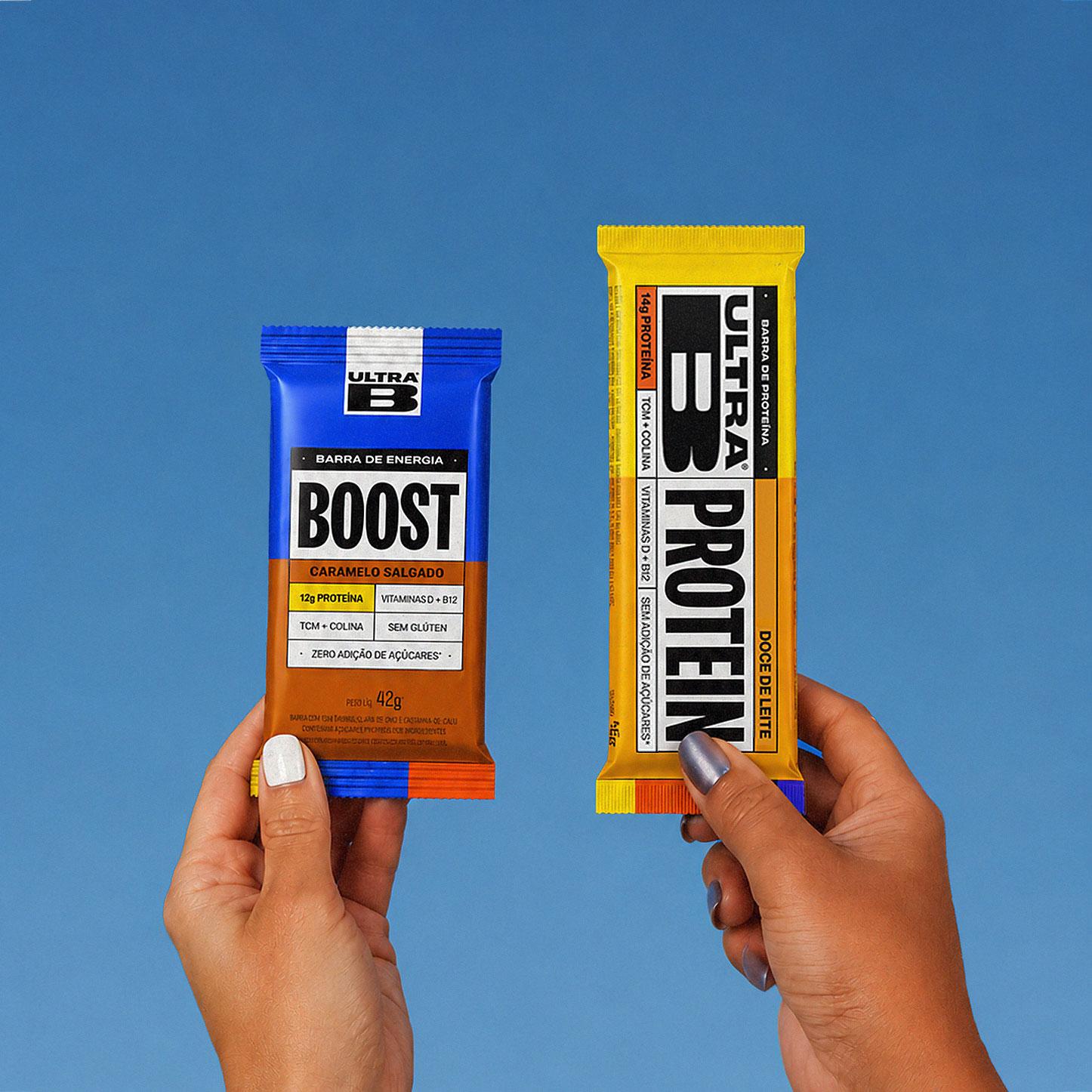
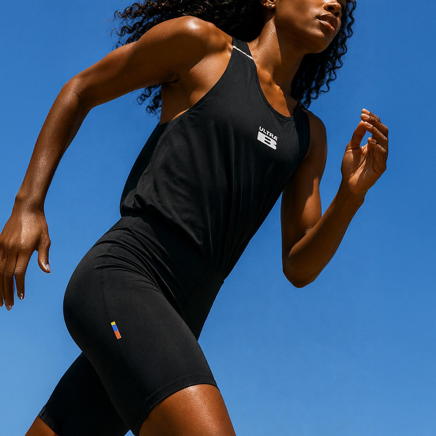
The stripes emerge as one of the identity’s strongest assets. Inspired by speed sports such as running and cycling, they serve as a visual signature across every brand touchpoint. A simple, versatile and instantly recognizable element that connects the entire brand experience.
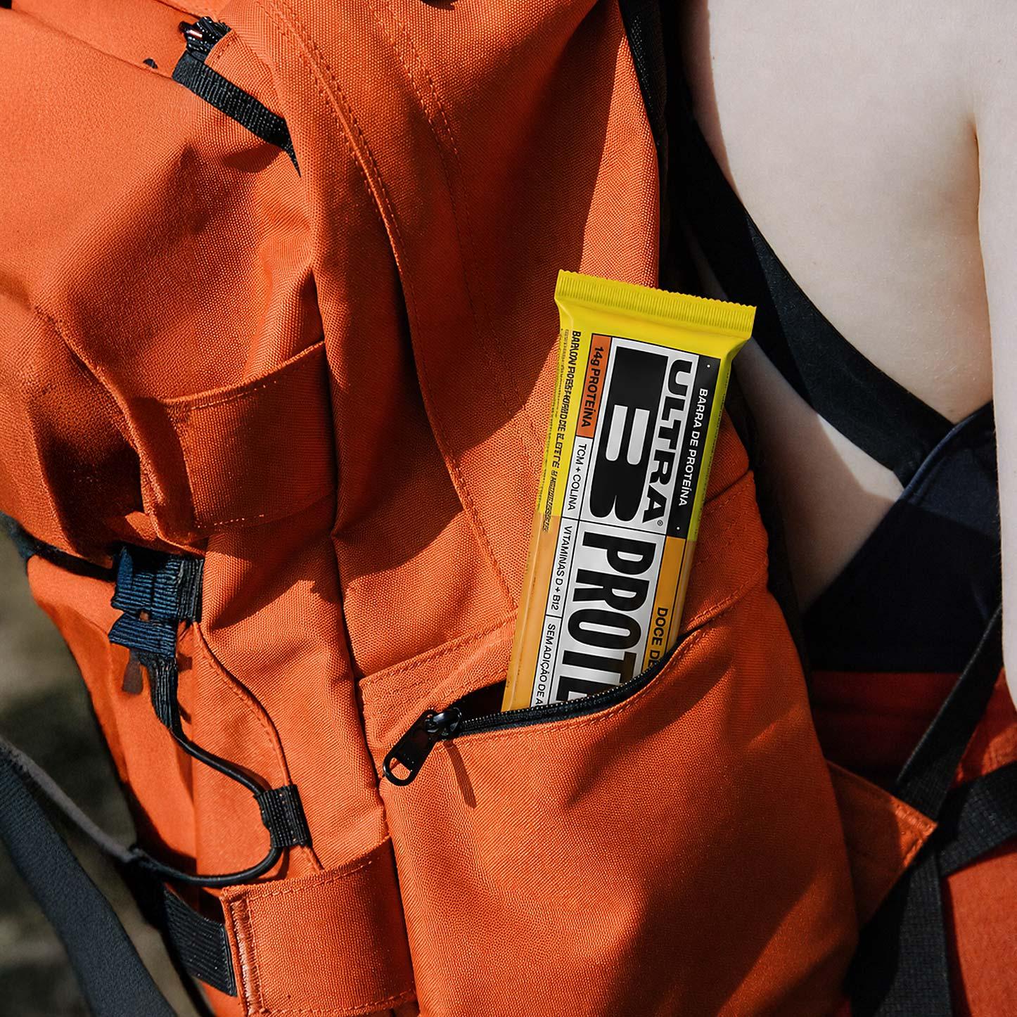
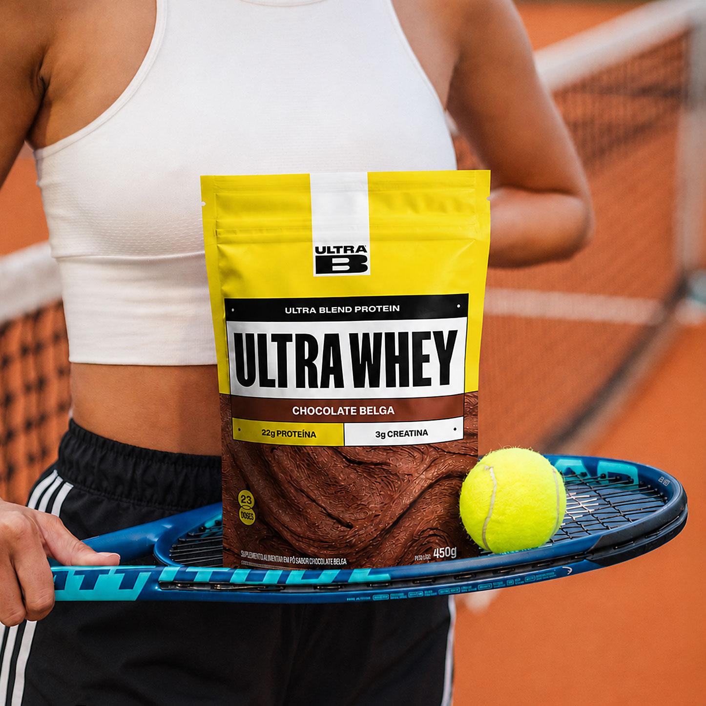
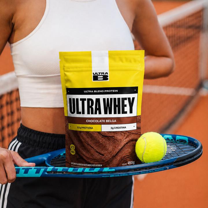
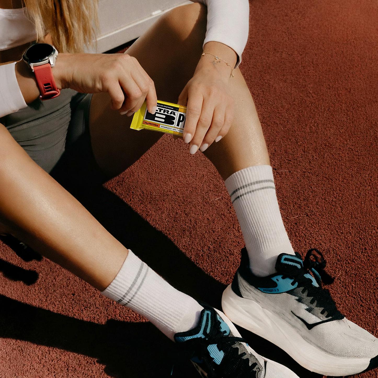
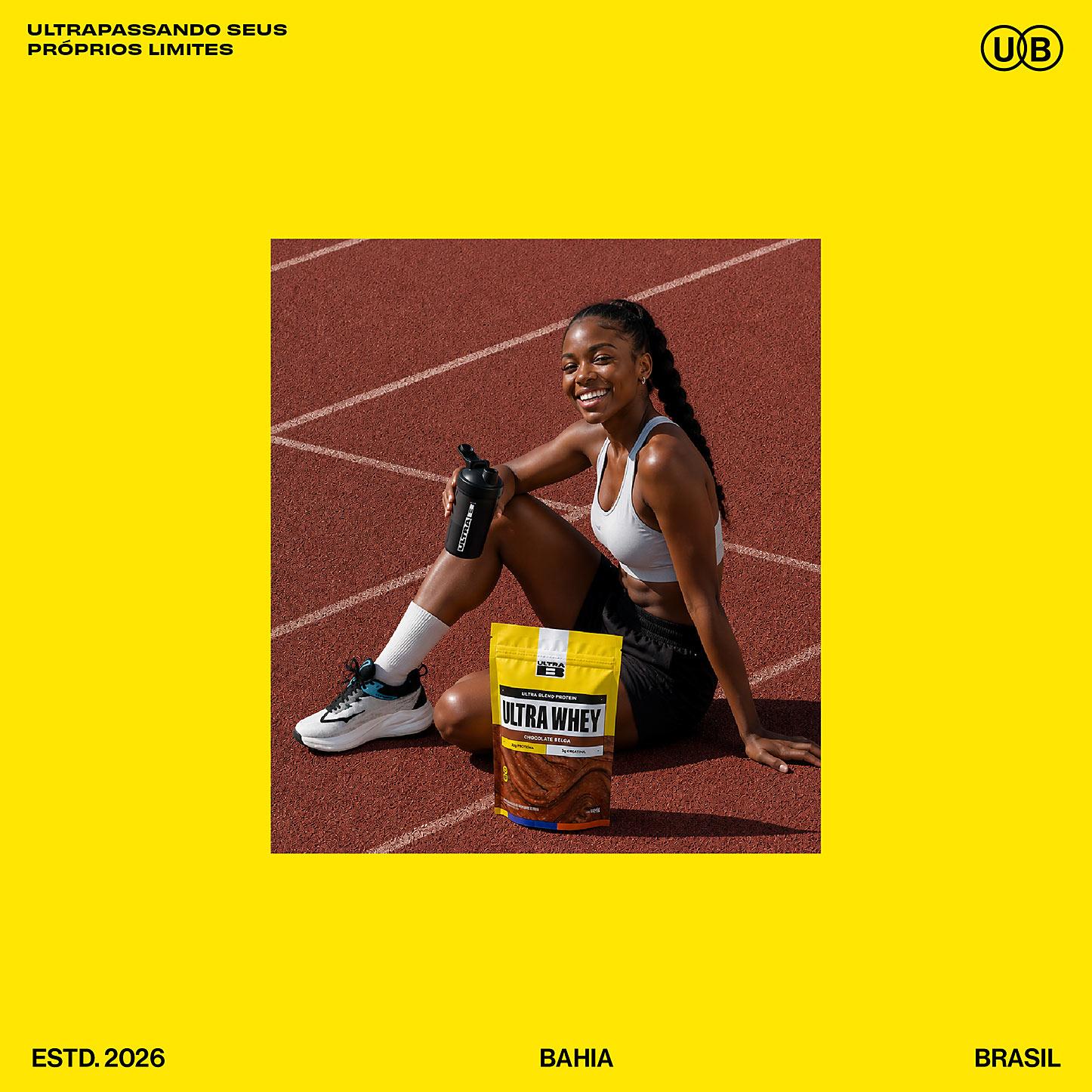
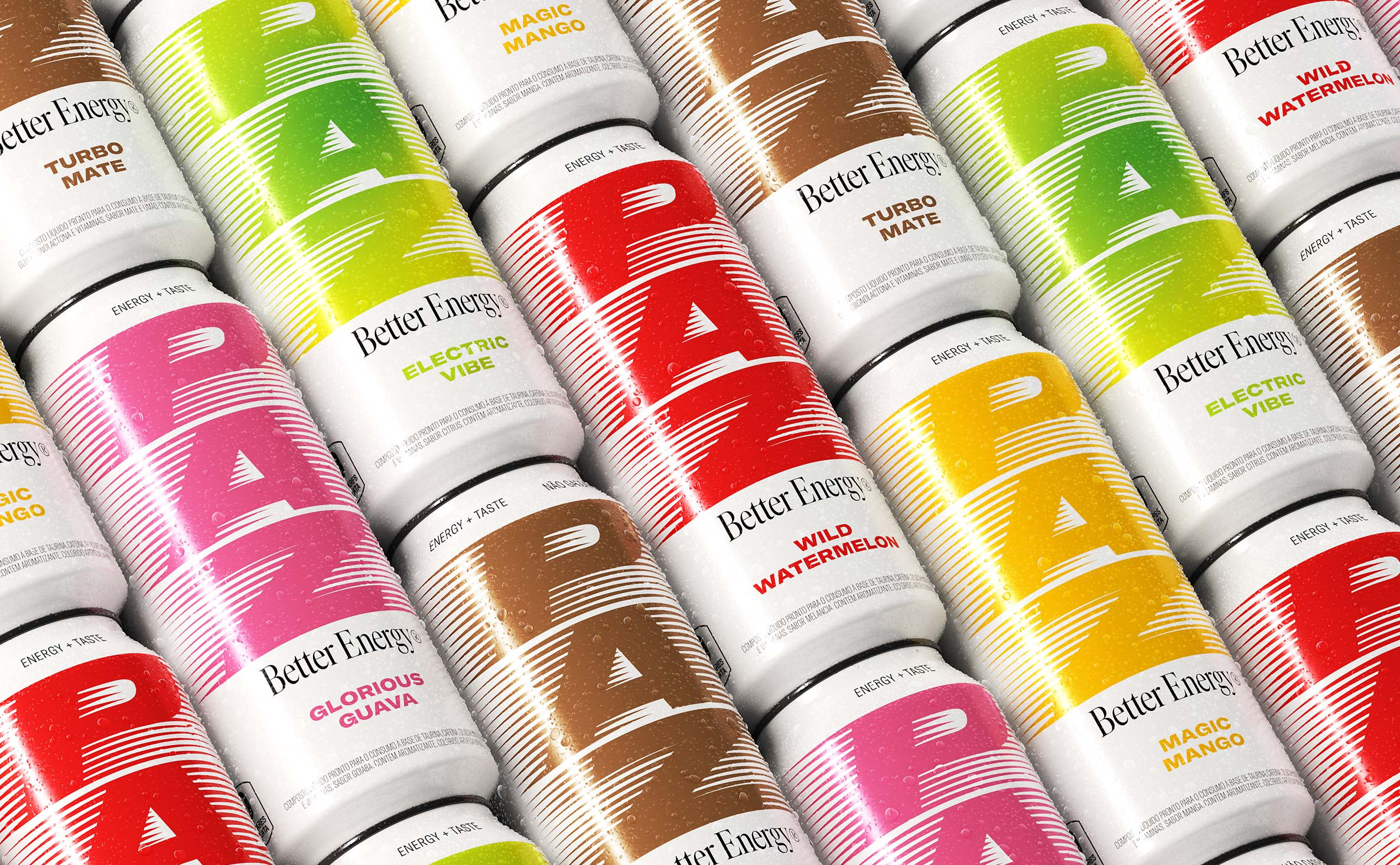
On the packaging, the visual language of bib numbers takes center stage. The graphic system uses references from the world of running to organize information, highlight product attributes and create a clear, functional hierarchy. At the same time, it incorporates cues from leading sports brands to establish a distinctive visual signature capable of supporting future portfolio expansion.
The result is a brand that is born from sport, but goes beyond physical performance. An urban, bold and inspiring identity that transforms the energy of competition into a lifestyle.